You must communicate quickly in a crisis

Every few months at Jetstar we run a business-wide crisis exercise. All the people involved in crisis management take part. Sometimes these exercises are announced in advance, sometimes they’re a surprise. We are presented with a different crisis scenario every time.

We use these exercises to train new team members in our crisis management plan, practice the steps we’ll need to take in a real crisis, and confirm that our crisis checklists and processes are optimised and up-to-date.

Every time we do one of these exercises we learn something new and we continue to improve our approach to crisis management – and, in the case of my team, our approach to crisis communications. Plus we get the opportunity to test and update our systems, checklists, and processes.

In our most recent exercise, social media played a vital role and I was reminded of crisis communications analysis I'd done last year on the '2017 Essendon Airport Beechcraft King Air crash':

On 21 February 2017, at 8:59 am local time, a Beechcraft King Air aircraft operating a charter flight, carrying a pilot and four passengers bound for King Island, crashed seconds after taking off from Essendon Airport in Melbourne.

I’d put this analysis into a graphical timeline to show how the incident had played out on Twitter. I thought it would be useful to share the key lesson from this analysis.

Before I get to that, though, it’s important to remember that one of the key components of any crisis management plan is communications. And, when an incident occurs, you want to be as quick to communicate as you possibly can.

Because you don’t know too much about the incident early on, and you definitely don’t want to say anything that isn’t 100% correct, it’s best to start with just an acknowledgement of the incident and a promise of more information to come. This is what we call a ‘holding statement’ or a ‘holding line’.

When you post your holding line to social media you do two things. First, you reassure people that you are aware of the incident itself. Second, you make yourself part of the discussion early on.

If you don’t post that holding line, all the discussion about the incident takes place without you. And, these days, this discussion happens incredibly quickly – as my analysis showed:

Twitter timeline of 2017 Essendon DFO incident (Ameel Khan)

As you can see from the timeline, the crash occurred at 8:59am and the first tweet about it was posted exactly ten minutes later by talkback radio station 3AW. A passing motorist who had witnessed the crash had called in to talk about what he’d seen.

Two minutes later Channel 7 tweeted that they were diverting their traffic chopper to this area. And, by the time Channel Nine tweeted twenty minutes after that, video from this helicopter was being broadcast on TV and livestreamed by most Australian TV stations on both Facebook and Twitter.

Emergency services had also been tweeting alerts about the incident and the closure of the freeway next to the crash site.

FlightRadar24.com had been tweeting as well. In fact, they tweeted a screenshot of the flight data from their records a little over an hour after the crash.

The Direct Factory Outlets (DFO) shopping mall that the aircraft crashed into didn’t say anything publicly or on social media till almost two hours after the incident. But, given those folks probably don’t do as much intense crisis planning as airlines do, that’s not bad.

The key take-away here is that the bulk of the story about the crash was told within the first sixty to ninety minutes.

The lesson for businesses and for communicators is that, if an incident has anything to do with you, and you don’t jump into the online discussion quickly enough, all the discussion, the speculation, and the apportioning of blame will happen without you.

Basically, you will have lost the opportunity to share the authoritative account of the incident. Instead you’ll be stuck battling the numerous unverified, limited-knowledge stories and opinions that will already be out there.

In the case of the Essendon DFO crash, there was no charter service operator who could jump in and tell the authoritative story because the person who had chartered the aircraft was the pilot himself. So this whole story was told by other people.

If you do manage a business, however, and you find yourself involved in a major incident, then you must jump on to social media very quickly to make yourself a part of the online discussion. That means, if you haven’t created a crisis management plan, create one now. And, if you haven’t practiced yours in a while, you should go ahead and do that sooner rather than later.

To all the communicators out there who will have to deal with crises in the future: I know how difficult a job you have and I wish you all the best!

A new way of looking at my career progression

Several years ago I wrote about my career progression through Microsoft products.

It occurred to me recently that I can also map my career progression through the functions I've performed and responsibilities I've had in each of my jobs (a list of which you can see on my LinkedIn profile, by the way):

Makes sense, doesn't it? Particularly these last six years as Social Media Manager at Jetstar in which strategy has played such a major role, along with a good dose of project/vendor management and a bit of internal consulting.

Melbourne Business School MBA ranked #9 by BloombergBusinessweek

Melbourne Business School (MBS) has one of the best MBA programs in the world but, for whatever reason, it hasn't always gotten as much recognition as it deserves.

That's changed this year because MBS is at #9 in BloombergBusinessweek's 2016 International MBA rankings

It's also the only Australian B-school to be ranked by BloombergBusinessweek.

Students love it, too, because MBS achieved the #3 position in the student survey rank: 

This is excellent news for MBS and it makes me super happy to see how well they're doing. 

(For more on this, also check out Professor Mark Ritson's write-up: 'Melbourne Business School rated in International Top 10 for MBA for 2016'.)

Communicating with Pie Charts

Dark Horse Analytics are back with the third instalment of their 'Data Looks Better Naked' series. This time they're improving the pie chart

I don't quite agree with their conclusion because pie charts are a useful communications tool when you want to communicate simple part-to-whole relationships without having to talk through the numbers.

Using charts to tell a quick story

For example, I find pie charts useful when showing the proportion of men vs women in a particular sample set. Or the results of a series of yes/no questions.

Take a look at these pie and bar charts: 

If I was going to use these charts to tell a story during a presentation, I'd much rather put those pie charts up on the screen and say something like: "Most people voted 'yes' in Question 1; about two-thirds voted 'yes' in Question 2; but a little under half voted 'yes' in Question 3". That explanation wouldn't work as well if I had used the bar charts, instead.

On the other hand, if I had wanted to talk about the actual number of yes-vs-no votes cast for each question (or their percentage values), then I'd use the bar charts.

Of course if I wasn't going to show this on a big screen at all, but was instead including the results in a written report, then I might not even use charts. I might just put all those numbers in a table.

Communicating a rough sense of the numbers

The other situation in which pie charts are useful to me is when I want to communicate approximate results for a slightly larger data series but, again, without having to talk about the actual numbers.

For example, every Tuesday at work I email around a social media activity report that tells my colleagues how we did on our various social media channels over the previous week. One of the charts I include in my report is a Twitter sentiment pie chart for various geographical regions. This chart gives you an idea of how people felt about us on Twitter over the previous week.

The thing is: the people I send this report to don't particularly care whether 15% or 20% of people expressed excitement about our brand on Twitter last week. They really just want an approximate sense of how things went. They want to be able to say "a lot of people were positive about us on Twitter last week" or "people didn't like us very much on Twitter last week." And the pie charts I get from Hootsuite (one of the social media management tools we use) helps them reach that single-sentence conclusion pretty quickly.

Here are the Twitter sentiment charts for three of the regions we keep an eye on. The 3-D pie chart plus data table combo in the top row is what we get from Hootsuite (and is what I include in my reports). Below that I've converted this data into stacked 100% column charts and into bar charts: 

Each of these charts tells a slightly different story. The pie chart plus data table combo is nice because you can quickly look at the charts and think: "Okay, not too much dark red or dark green for Region 1; so a mostly average week there. Quite a bit of orange, but no dark red, for Region 2; so people were unhappy, but not angry. And plenty of dark red and dark green for Region 3; which suggests some people were very happy but some people were very upset. And I know that last week we had a great sale but a bunch of flight delays in Region 3 so this result makes sense."

The stacked column charts help you tell a similar story but, in my opinion, it's harder to judge the proportion of one colour to the whole in this type of chart so you're forced to look at the numbers to give you additional context. So you'd look at Region 3's chart and think: "Okay, 24+8 = 28%, so a little over quarter of the people were unhappy. And 21+12 = 33%, so about a third were happy." But now you're stuck comparing 33% green to 28% red instead of just getting a sense of what people thought, and then moving on.

The bar chart at the bottom does possibly the best job of comparing one colour/sentiment with another - but what you're missing here is the relative proportion of that colour compared to the whole. So, for example, you'd look at the Region 2 chart and think: "Okay, light orange is the highest bar so a lot of people were unhappy with us." But then you'd have to add 42% and 17% to see that about half the people were unhappy (though not angry) last week. You could reach that same conclusion with a single glance at the pie chart which shows that it's about half light+dark orange.

In my opinion the pie chart plus data table combo works best. If you just want to get a feeling for the data you only need to look at the pie chart and get a sense of the colour spread. But, if you want to dive deeper it's easy to move on to the table and add the numbers to do a more detailed analysis.

But no other pie chart use

Those are the only two situations in which I use pie charts. In most other situations I'm showing a data trend (as opposed to a snapshot) or a larger series of values - both of which require a different kind of explanation and, therefore, a different kind of chart.

So what I'd recommend is that, if you're ever not sure about which chart type to use, just chart your data in multiple different ways and then try use each type to tell your story. The one that works best (i.e. tells the best story, is the easiest to explain, and has the least chance of being misinterpreted) is the one you should go with. And if this happens to be a pie chart, then so be it. 

My Career Progression Through Microsoft Products

It occurred to me today that I can roughly track my career progression using the components of the extended Microsoft Office suite. That is, you can tell where I was based on which Microsoft software product I was using the most at that time.


Word & Access

When I first started my career, for example, the two components I used the most were Access to Word. This was when most of my work was technical in nature and I was the guy who built things - like Access databases - from the ground up. I then documented them and wrote manuals about them in Word.

Project

When I moved into more of a senior developer or project lead role my focus shifted from Access to Project. This is because I wasn't building things any more, I was tracking the progress of my team and the products we were building.

Excel

My next step up was into an analyst role and in this I used a lot of Excel. I used that for both analysis (technical, business, and financial) and reporting (productivity, web traffic stats, budgets, and so on).

Outlook

Later, after my MBA, I did more of the same but this time I was also a big user of Outlook. That was my step up from the start-up and nonprofit world into the corporate and enterprise world.

PowerPoint

Now what I use the most is PowerPoint. I still use all the other tools, of course - though not Access and not too much Project these days - but I've gone from being purely a professional to being a manager and an ideas person, hence the need for good presentations.

Come to think of it, I can also track my career progression just by talking about what I used Word for. That is, I went from using it to document and write manuals to writing proposals and reports to writing policies and strategies.

Neat, huh? :)


Analytics & Tracking on Online News Sites

Ever wondered how you're tracked online? In my continued research on online news sites (e.g.  here's a chart on how much they traffic they get every month) here are a couple of charts that tell you which tracking tools Australia's top online news sites use.

This list was generated using Ghostery so it covers everything from web analytics tools and beacons to ad serving tools and social network platform connectors - basically, anything that's capable of tracking you on the web. 

You can find out more about these tools in this Digital Trends article and in this 'Tracking the trackers' map by the Guardian (part of their larger 'Battle for the internet' series).


Alphabetical List of Trackers

Source: Ghostery tracker alerts on each news website
Pro Tip: To view full-size, right-click and open image in new tab

List of Trackers by Popularity

Source: Ghostery tracker alerts on each news website
Pro Tip: To view full-size, right-click and open image in new tab

Facebook Serves Me Ads

As someone who works in social media I look at the ads I get served on Facebook with a professional interest. Given that I haven't actually put that much information about myself on Facebook, it's fun to see how good (or bad) a job marketers and ad buyers have done in targeting those ads to me.

Of course Facebook does have a lot of my demographic data as well as my detailed social graph (though I do keep getting asked to "complete my profile", which is entertaining). It also has a history of all my likes, comments, and shares; each of which probably has multiple keyword and category associations. 

So, in what I'm hoping is the first of an ongoing series, here are the ads Facebook served me today and my thoughts on them:   

What ads do you get served on Facebook? And are they any good? 

Where do I go for News and Opinion?

While trying to decide whether I’d sign up for a Fairfax Digital Subscription or not (I ultimately decided not to) I thought it would be fun to document my news media consumption habits. (Being a nerd is so much fun!)

Here’s what I came up with.

Breaking News 

Where do I go to get breaking news? 

When a news tory breaks the first site I check is Twitter.

I then move on to Reddit to see what news content has been aggregated and bubbled-up by the online community. There I get both first-hand news and news that’s been collected by various outlets.

Next I check the BBC because they'll always have the most reliable and least biased story.

Finally, I go to Google News because that service quickly aggregates lots of news stories from multiple online sources, covering multiple angles.

If the breaking news is Australia- or Melbourne-specific I also check the Age and the ABC (though, in most cases, their news stories get captured pretty quickly by Google News anyway). I sometimes also check the online streaming versions of ABC News 24 and a few radio stations like ABC NewsRadio, 774 Melbourne, and 3AW.

More in-depth news and editorial opinion

What if I want more depth? 

When I want a little more depth to a news story my first stop is usually the BBC. Those folk not only excel at presenting an overview of what’s going but they also give a bit of background and then flesh out those bits of the story that are important at the time. (I usually follow this up by a few quick searches on Google and Wikipedia if I want more information.)

However, if want a much deeper analysis or some high-quality editorial opinion on a particular topic or story then the sites I go first to are academic news outlets like the Conversation, a bunch topic-specific blogs (I subscribe to a lot of blogs via RSS), and sites with strong editorial voices and traditions like the Guardian and the Economist.

I then visit a bunch of independent news outlets or, categorizing them more broadly, sites from which I get smart, well written, and mature news reports, opinion, and discussion. These include ProPublica, The Global Mail, New Matilda, Salon, Slate, the Atlantic, and a handful of others. 

Aside from those major sources I also read some blogs and feature pieces on the ABC and Fairfax websites (e.g. stuff written by Lauren Rosewarne or Sam de Brito). However, ABC and Fairfax don’t have the depth of coverage that the sites mentioned previously do; nor do they have as many contributors whose editorial opinions I value that much.

Local News & Opinion

What if the story is local? 

When a news story is local my preferred sources are the Age and the ABC (including, as mentioned above, the online streaming versions of ABC News 24, ABC NewsRadio, and 774 Melbourne). Though, increasingly, the Guardian with its new Australian edition is becoming a bigger part of my regular local media consumption.

Meanwhile, 3AW and the Conversation, while good sources, don’t cover as much as the Age and ABC do.

Daily Media Consumption

Speaking of my regular media consumption, these are the news sites I check on the tram both to and from work every day and also on weekend afternoons:

Daily Media Consumption.png

The top four are the important ones: I check the Age for updates on what’s happening in the city and around the country. I check the BBC and the Guardian to find out what’s going on in the world. And, I check the ABC to read more about what’s going on in both Australia and the world.

If I have time left in my commute then I then close that folder and check Reddit (the app in the background in the top left hand corner).

And if after that I still have more time I sometimes check my RSS feeds via NewsBlur and occasionally read the stories I’d saved earlier in Pocket.

As you can see, restricting my Fairfax consumption to thirty articles per month isn't going to be difficult because Fairfax is already a pretty small part of my news media consumption mix. This despite the fact that I check the Age website every morning because, when I do, I only occasionally click-through to read a whole article - I usually just skim the headlines.

So there you have it, my media consumption preferences. What sites do you visit to get news and opinion? 

Cost of a Fairfax Digital Subscription

Before deciding that I wouldn't be signing up for a Fairfax Digital Subscription I did some research to try to figure out what one of these subscriptions was actually worth.

Since I'll take any opportunity to make a good chart, here's a comparison of news outlet subscription rates (annualized so they're easier to compare): 

Source: News outlet websites

And how to Australian news media outlets rank in terms of popularity (which might help explain how much they charge for subscriptions)?

Here's another chart showing how much web traffic (unique audience) these sites received in May 2013:

Source: Nielsen (via mUmBRELLA)

Combined, the Age and SMH get over four million uniques a month. That's almost 20% of the Australian popular. Not bad. 

Why I Won’t be Getting a Fairfax Digital Subscription

On 2 July 2013 Fairfax Media will launch its digital subscriptions and erect a paywall around its two major newspaper websites, the Age and Sydney Morning Herald. From that day onwards Australian visitors to those sites will be able to read thirty free articles per month but, should they want to read more, they’ll need to sign up as paying customers.

I won’t be one of those paying customers and this mind map explains why:


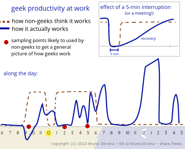
Geek Productivity Chart

This 'Geek Productivity Chart' from Bruno Oliviera is surprisingly accurate at describing how I tend to work (ignoring, of course, the humorous generalization about what non-geeks apparently think): 

I'm most productive at the office from:

  • 11am-1pm, which is when I'm trying to finish stuff off before taking my lunch break
  • 3-5pm, but only if I'm not interrupted and I've timed my caffeine intake right (I usually have a mug of coffee at about 2pm)
  • 6-8pm, which is when most people have left and so the office is relatively distraction free (though at least 2-3 people from my team are regularly there till 7pm so I'm usually wearing my headphones during this period)

At home I'm incredibly productive from about 9pm to midnight, which is when I do most of my big-picture, strategic thinking and planning. (And blogging.)

You Can’t Build a Free Global PR Wiki Like This

MyPRGenie, a social-media focused PR firm, wants to create a “free global PR wiki” that will crowdsource contact information for “journalists, bloggers and media gatekeepers”.

Free global PR wiki to crowdsource media contact details

A crowdsourced listing of media contacts is set to launch, providing the PR industry with a database of information on journalists and media professionals.

Launching out of New York in March, the wiki-style platform will be open to PR professionals who contribute to the community by sharing information they’ve collected on journalists, bloggers and media gatekeepers. By sharing their contacts, users earn points which can then be spent to gain access to the global database.

Interesting concept. Probably won’t be successful, though.

Why?

Free

The only free global wiki that’s ever managed to collect a large amount of quality information is Wikipedia – and Wikipedia is run by a non-profit foundation whose philosophy revolves around cataloguing and freely sharing information.

From the sounds of it MyPRGenie’s service will be “free” (i.e. available for you to use) only if you contribute to it yourself; and presumably even then there will be some additional restrictions to what you can access or do once you have that information. Which, of course, means that, unlike the Wikipedia style service they want to be associating themselves with, their service not actually free.

Global

MyPRGenie say they already have a database of over half a million “journalists, bloggers, and content creators” which my guess is they’ll use to seed their wiki. While that number is large I’m not sure this endeavour is a pure numbers game.

When you hire a PR firm to work for you, you pick one based on their knowledge of your industry and the local media market, plus their relationships with various media people. You don’t pick them because they have the largest contacts database.

If I worked for a rival PR agency my argument against using this service would be: “Why would you want to use that? They’ll just send your press releases to a bunch of media and social media people. I’m on a first name basis with the influencers in your specific industry and in your specific market so when I send them something they know it’ll be worth their while.”

PR Wiki

Possibly the biggest problem they’ll face is that I don’t think many PR departments or agencies will want to participate – certainly not major companies with a large contacts databases. Why on earth would companies (or agencies) want to share their PR relationship IP with the rest of the world (which, of course, includes their competitors)?

Wrong Business Plan?

MyPRGenie’s business plan for this service seems to be “build it and they will come (to crowdsource)”. That doesn’t works unless you do things like offer fabulous incentives for sharing IP, have dedicated editors maintaining content quality, and don’t blatantly make money off the data you collect. Now they might actually do all these things and the resulting service might end up being useful to small and medium-sized companies with limited PR budgets and limited relationships with the media. But that’s probably about it.

Basically, I don’t think you can crowdsource this kind of information unless you make it completely free and open like Wikipedia or you run a freemium model like IMDb or LinkedIn in which you get both the demand and supply side to pay for the professional, fee-based version of that otherwise free service.

MyPRGenie seem to be trying a third approach to this information cataloguing problem – one that relies on a few assumptions that I don’t think are particularly valid. It’d be nice to be proven wrong but I don’t think I will be.

Working at Jetstar is Like Working at a Startup

I'm not sure if this applies to all Low-Cost Carriers (LCCs) but working at Jetstar feels like you’re working at a startup. This, of course, is one of the reasons why I love working here.

In a guest post on Venture Beat Elli Sharef wrote about the ‘5 Things You Need to Know Before Working at a Startup’. Three of these apply directly to life at Jetstar:

Ownership

Working at Jetstar you really have to own what you do and, of course, believe strongly in what you're doing. So, for example, if you're the one who comes up with a great idea then you're the one who has to implement it. Sometimes you get to do this literally all on your own from start to finish.

And when you're given ownership on one part of the business – in my case, Jetstar's social media presence – it's all yours to do with whatever you want (given, of course, that what you do makes business sense and fits well with what others are doing; and, if it’s something drastically different, is approved by senior executives).

This level of ownership, control, and direct responsibility is both exciting and terrifying.

Mentoring and Guidance

Because in a startup you're often doing stuff that is new and innovative you don't really have people who can guide and mentor you in your role based on their years of experience in this field. Case in point: before Jetstar no other full-service carrier (in our case, Qantas) had launched a low-cost subsidiary that was as successful as Jetstar is now.

On the social media side of things, for example, I certainly don't know of any other large, customer-focused, seven-year-old Australian company that, while partnering with a large sixty-year-old Japanese company, is providing customer service to people in Japan in Japanese via Facebook and Twitter.

A lot of what we’re doing here is new and innovative. This is stuff that no one or very few people have done before and it’s incredibly exciting to be at this leading edge.

Pressure

This third point is important because it determines whether you'll be at Jetstar for six months or five years. Sharef puts it really well:

The pressure to achieve results, hit metrics, achieve growth, and get more traction can be overwhelming for many. We’ve seen lots of people quit startups because they realized the emotional pressures were simply too much for them. It’s awesome to know your work can help make or break the business, but with great opportunity comes great responsibility!

The good thing is that, while the pressure may be high, the rush I get from making a real difference to what Jetstar does on social media is incredibly rewarding. Certainly at this point in my career I can't think of anything else I'd rather be doing and anywhere else I’d rather be working.

My 0.4 Cents on Click Frenzy

Today is the much-hyped-in-the-media Click Frenzy sale. Here are my 0.4 cents [1] on this ‘event’.

Cart Before Horse?

Cyber Monday, which Click Frenzy is based on, was a term coined after US retailers noticed a spike in online shopping on the Monday after Thanksgiving. That is, this behaviour (the increase in online sales) existed before the term describing it (Cyber Monday) was coined. That term ended up reinforcing this behaviour, yes, but I think it’s important to remember that the behaviour came first.

The folks behind Click Frenzy, on the other hand, are trying to create a behaviour. They are trying to lightning rod a lot of October and November retail sales into a single day because, as consumer behaviour research tells us, people respond positively to time-limited offers (regardless of whether those offers are genuine or not) as well as sales (regardless of whether those sales are good or not).

Creating behaviours – particularly online behaviours of this kind – is difficult.

The organizers of Click Frenzy do have a few things going for them, though:

For starters, they’re using Cyber Monday as a reference so the whole single-day-online-sale concept isn’t something they have to explain to consumers in too much detail.

They have a lot of brands on board so, at the very least, they’ve got everyone’s attention.

They’ve also built a bit of hype around the event – which is crucial if you want to change behaviour. A lot of that hype is offline, though, and that is both good (they’ll have reached a larger audience) and potentially bad (a lot of that larger audience might not be the online shopping type).

They have a single point of entry for these sales which should, in theory, make it easier to find the deals you’re looking for. (Unless, of course, that single point of entry becomes a bottleneck.)

They also have a bunch of things going against them:

While being secretive about actual sale details works well for building excitement and curiosity, the fact is that we don’t know what deals will be on offer and how good they will be. Online shoppers are smart enough to shop around.

The way I understand it, most online shoppers in Australia buy stuff from overseas retailers because:

  • equivalent items are much more expensive when bought from Australian stores (sometimes costing two or three times as much)
  • there’s more variety in overseas stores
  • the online shopping experience of many local retailers is poor (assuming an online store exists in the first place)
  • the in-store shopping experience (including customer service) of many local stores is also poor

So, for Click Frenzy to be truly successful it will have to give Australian shoppers all of these benefits. That is:

  • the prices will have to be good (and potentially better than Cyber Monday prices that customers can make the most of if, again, they buy from overseas)
  • the variety of goods on sale will have to be considerable (and items will need to be in stock)
  • the online experience will have to be exceptional

Do You Even Lift?

Do you even liftWill Click Frenzy deliver on all those fronts? I have my doubts.

Why? Because I don’t quite trust the Australian retail industry to get it right.

They’ve already demonstrated that they don’t understand ecommerce all that well (aside from a few possible exceptions). If they did, they might not have participated in Click Frenzy in the first place. (For more analysis on one aspect of this topic I recommend you read Michael Pascoe’s article in the Age called: ‘Myer, DJs’ online plans: tell ‘em they’re dreaming’).

I am also of the opinion that many Australian retailers simply aren’t all that good at marketing. They seem to be much more sales-oriented than marketing- or brand-oriented. That is, instead of deeply understanding and then tightly targeting their chosen customer groups, they tend to adopt a warehouse approach to selling stuff. That’s great if you’re selling in bulk (e.g. you’re Dan Murphy’s) but not so good otherwise.

My fear is that Click Frenzy is a bunch of retailers jumping on the ecommerce bandwagon without basing their decision on a proper, well-researched, well-thought-out, innovative (for them) approach to online selling. Because of this lack of understanding and lack of underlying strategy these retailers won’t have a suitable online offering during Click Frenzy and, as a result, they won’t see any benefit from participating in future Click Frenzies or, worse, ecommerce in general. I sincerely hope that’s not the case, but I have my doubts.

The other aspect of Click Frenzy that doesn’t bode well is that it seems, once again, these retailers’ strategies revolve around an increase in sales being the solution to their problems. Participating in Click Frenzy certainly won’t help them target their customers or build their brands. So while this might give them a short term boost in sales, it’s probably not a good long-term fix.

There is Hope

On the other hand, there is hope. If Click Frenzy does go well this might encourage retailers to finally hire the right people and lift their ecommerce game. We might finally get a good proportion of quality online stores with a decent ecommerce strategy behind them.

I’m not going to hold my breath, but I’m not all that jaded and pessimistic about the whole thing either. Here’s hoping.

Further Reading

Here are some other thoughts on Click Frenzy that are worth reading:

--

[1] 0.4 cents is 80% off from my usual 2 cents.