My favourite typefaces (April 2024)

UPDATE: My favourite typefaces (December 2024)

I’d compiled this list for myself and figured I might as well share it online, so…

It’s April 2024 and, out of the typefaces I currently have a licence for, these my favourites and the ones that I use most often.

Sans serif

A graphic titled ‘Sans serif’ with three columns of typefaces under the headings ‘used frequently’, ‘used infrequently’, and ‘used when needed’.

Used frequently in documents, presentations, and graphics: Whitney (Wikipedia), Whitney Narrow, Fact (MyFonts), Ideal Sans, Avenir Next LT (Microsoft, Wikipedia), Source Sans 3 (GitHub, Wikipedia)

Used infrequently for specific purposes (eg headings, graphics, presentations) and for specific applications (eg Verdana for email): Verdana (Microsoft, Wikipedia), Public Sans (GitHub, Wikipedia), Fira Sans (GitHub, Wikipedia), DIN Next (Wikipedia)

Used when needed for specific purposes (eg presentations, graphics): General Sans, Neue Haas Unica (Wikipedia), Neue Haas Grotesk (Microsoft, MyFonts, Wikipedia), Inter (Story, GitHub, Wikipedia), Jost* (Wikipedia), Cooper Hewitt, URW Dock, Libre Franklin (Wikipedia), Trade Gothic Next (Wikipedia), Gill Sans Nova (Microsoft, Wikipedia)

Serif

A graphic titled ‘Serif’ with three columns of typefaces under the headings ‘used frequently’, ‘used infrequently’, and ‘used when needed’.

Used frequently in documents, presentations, and graphics: Mercury, Source Serif 4 (Wikipedia, GitHub), Charter (ITC Charter), TT Jenevers (MyFonts), Stempel Garamond LT (Wikipedia)

Used infrequently for specific purposes (eg printed documents): Crimson Pro (GitHub), Vollkorn (Story), Sabon Next LT (Microsoft, Wikipedia)

Used when needed for specific purposes (eg presentations, graphics): Malabar, Alegreya, PT Astra Serif, Gentium Plus

Monospace, slab serif, reading, website

A graphic with four columns of typefaces under the headings ‘monospace’, ‘slab serif’, ‘reading’, and ‘website’.

Monospace used for coding (JetBrains Mono), note taking (Berkeley Mono), writing, and graphics: JetBrains Mono (GitHub), Berkeley Mono, Drafting* Mono, Fira Mono (GitHub, Wikipedia), Source Code Pro (GitHub), Cascadia Code (Wikipedia, Microsoft)

Slab serif used mostly for headings and graphics: Sentinel, Bitter (GitHub), Zilla Slab (Wikipedia, GitHub), Klinic Slab, Tisa Offc Serif (Microsoft, MyFonts)

Typefaces used for reading on devices (eg Bookerly on Kindle), websites (eg Whitney on NewsBlur), and apps (eg Vollkorn in Aquile Reader): Literata (Wikipedia, GitHub), Bookerly (Wikipedia), Whitney, Vollkorn (Story)

Typefaces used on websites (eg Chaparral and Myriad Condensed on this website): Chaparral, Myriad (Wikipedia), Myriad Condensed, Noto Serif (Wikipedia, Story, GitHub), Noto Sans (Wikipedia, Story, GitHub), Merriweather (GitHub), Oswald

Commentary

Don’t worry, I’m not going to explain why these are my favourite typefaces! That would be tedious and self indulgent of me. I just wanted to document this list somewhere.

I’m always on the lookout for more typefaces to explore and try, by the way. So what are your favourites? I’d love to know!

What you didn’t know about Verdana

I wrote in my last post about how the original Franklin Gothic ‘family’ was three fonts in a trench coat.

It occurred to me that the same can be said about Verdana.

Verdana was created by Matthew Carter for Microsoft and released in 1996. It was designed to be readable at small text sizes on the low-resolution screens available at the time.

You can trace its lineage from typefaces like Akzidenz Grotesk, Frutiger, and Franklin Gothic.

If you’ve spent any time on the internet, you’ll have seen Verdana in action.

What you probably didn’t know about Verdana is that you can use Verdana, Tahoma, and Nina together as a de facto typeface family.

At this point you’re probably thinking, “okay, Tahoma I know – but what the hell is Nina?”.

Like Verdana and Tahoma (the latter released at the same time as Verdana), Nina was created by Mattew Carter. You can buy it online but, if you’re a Windows user, you can just download it for free from the Microsoft Store.

The description for Nina on the Microsoft Store does say, “The design isn't close enough to call it Verdana Condensed, but the two typefaces are very closely related.”

But you know what? I say go ahead and use Tahoma as the de facto Verdana Condensed and Nina as the de facto Verdana Compressed. Almost no one will notice and, frankly, I don’t think anyone will care!
You’re welcome :)

Franklin Gothic alternatives

UPDATE (Oct 2024): In the first 1 minute, 12 seconds of this video on YouTube I show you my four free and four paid recommended alternatives (with download links in the description).

Since we’ve talked about alternatives to a typeface I don’t like (Times New Roman) and I typeface I adore (Frutiger), let’s now talk about alternatives to a typeface I like, but haven’t used much: Franklin Gothic.

Graphic titled ‘Franklin Gothic’ with the phrase ‘Quickbeam’ shown in large letters in the middle. Two features of this typeface are called-out: extra bold display weight and curled tail on the uppercase ‘Q’.

The reason I haven’t used Franklin Gothic much historically is because the only font you get with Windows is Franklin Gothic Medium and that’s not general-purpose enough for most of my needs.

You do get access to the larger Franklin Gothic family of Book, Medium, Demi, and Heavy if you purchase Microsoft Office, but for one reason or another I’ve never gotten around to using it. I think this is mainly because I rarely create the poster and editorial designs that Franklin Gothic is known for. And while Franklin Gothic Book is a good typeface for body text, its Bold version isn’t particularly bold so you have to manually switch to Demi every time.

So assuming you don’t want to spend a few hundred dollars on buying the full Franklin Gothic typeface family, let’s talk about alternatives.

But first we need to talk about Franklin Gothic itself.

Franklin Gothic is three typefaces in a trench coat

Morris Fuller Benton designed Franklin Gothic for American Type Founders in 1902 in just one extra-bold display weight. Then in 1903 he designed Alternate Gothic, a compressed and moderately-bold version of Franklin Gothic that was made available in three numbered widths. Finally in 1908 he designed News Gothic, which is a lighter-weight version of Franklin Gothic.

So if you were to talk about the Franklin Gothic ‘family’ of typefaces at the start of the 20th century, you’d include all three of those in your discussion.

Graphic showing the phrase ‘Quickbeam’ in large text in Franklin Gothic, Alternate Gothic No.3, and News Gothic.

These days there are multiple versions of those individual typefaces available, each one fleshed out to a full family with several weights:

But for now let’s just focus on the ones readily available to me:

The good news for all of us is that high quality alternatives to all those typefaces are readily available, and several of them are free to use.

Franklin Gothic alternatives

If you’re looking for alternative-alternatives to Franklin Gothic – meaning something that is similar, but not the same – then check out Jeremiah Shoaf’s top-ten-alternatives list on Typewolf.

But if you’re looking for an excellent free and open source replacement to Franklin Gothic, then your best bet is Libre Franklin.

Libre Franklin comes in nine weights, so its regular weight is a good alternative to Franklin Gothic Book. Its letterforms are a little larger than Franklin Gothic, though, so you’ll need to reduce Libre Franklin’s font size to about 90% if you want a drop-in replacement.

Graphic showing the phrase ‘Quickbeam’ in large text in Franklin Gothic Book, Libre Franklin, and Libre Franklin with the font size reduced to 90%.

Similarly, Libre Franklin Medium is a good alternative to Franklin Gothic Medium – though you’ll have to reduce Libre Franklin’s font size to about 92% if you want a drop-in replacement.

Graphic showing the phrase ‘Quickbeam’ in large text in Franklin Gothic Medium, Libre Franklin Medium, and Libre Franklin Medium with the font size reduced to 92%.

A couple of minor tweaks to Libre Franklin’s font size and line height are all you need for this typeface family to be a drop-in replacement for the other Franklin Gothic weights as well.

Graphic showing two columns of short text blocks and large heading and title text. The left column shows these in Franklin Gothic Book, Franklin Gothic Medium, and Franklin Gothic Heavy. The right column shows these in Libre Franklin, Libre Franklin Medium, and Libre Franklin Black. A note below the right column reads, “Font sizes and line spacing adjusted to match”.

So that was easy.

Alternate Gothic alternatives

The original Alternate Gothic came in three numbered widths.

Graphic showing the phrase ‘Quickbeam’ in large text in Alternate Gothic No.1, Alternate Gothic No.2, and Alternate Gothic No.3.

It’s modern digital version no longer has numbered widths, but if you buy that you do get forty fonts at four different widths – so that’s cool.

But if you’re not after one of the particularly compressed versions, then Oswald is an excellent free and open source alternative. As with Libre Franklin, you’ll need to reduce its font size a bit if you’re after a drop-in replacement.

Graphic showing the phrase ‘Quickbeam’ in large text in Alternate Gothic No.3, Oswald, and Oswald with the font size reduced to 88%.

I really like Oswald and for the longest time used it as the heading typeface on this blog. It’s not great for running text, but it’s okay for short text blocks.

Graphic showing two columns of short text blocks and large heading and title text. The left column shows these in Alternate Gothic No.3. The right column shows these in Oswald. A note below the right column reads, “Font sizes adjusted to match”.

More recently I used Oswald Light in the letterhead design for my sister’s clinical practice.

Screenshot of the top of a letterhead that reads, “Dr. Asha Bedar, clinical psychologist”.

News Gothic alternatives

News Gothic is interesting because American Type Founders (who Morris Fuller Benton designed all these typefaces for) no longer sells this typeface. Instead you use Franklin Gothic Light. So all we have of the original typeface these days are versions and direct descendants from other type foundries.

I listed News Gothic’s various non-American Type Founders versions above and its most notable descendant is Benton Sans – which is fantastic, but expensive.

My preferred News Gothic alternative is Public Sans – which is excellent, free, and open source.

Graphic showing the phrase ‘Quickbeam’ in large text in News Gothic and Public Sans.

The thing I like most about Public Sans is that its characters are less ambiguous than News Gothic. For example, you can’t confuse its uppercase ‘i’ with its lowercase ‘l’ because the lowercase ‘l’ has that little curve at the bottom (like you can see in the word ‘Franklin’ below).

Graphic showing two columns of short text blocks and large heading and title text. The left column shows these in News Gothic. The right column shows these in Public Sans.

My favourite alternatives

While I really like and recommend Libre Franklin, Oswald, and Public Sans, those actually aren’t the alternatives I use most often.

My favourite alternatives to Franklin Gothic are Trade Gothic Next, Whitney Narrow, and Source Sans 3.

Graphic showing the phrase ‘Quickbeam’ in large text in Franklin Gothic Book, Trade Gothic Next, Whitney Narrow, and Source Sans 3.

Trade Gothic Next is Linotype’s alternative to Franklin Gothic. Its Regular weight is similar to Franklin Gothic, its Light weight is similar to News Gothic, and its Compressed and Condensed weights are similar to Alternate Gothic. It is an expensive typeface family, but I got its Regular weight as part of a sale bundle and have enjoyed using it since.

Whitney is one of my all-time favourite typefaces, and its Whitney Narrow variant is a modern and more friendly alternative to Franklin Gothic. These are both paid typefaces, but I think they’re worth every penny.

Source Sans 3, on the other hand, is a free typeface. It too is a friendlier and more modern version of Franklin Gothic. It’s also one I’ve used most often because it is so easily available on the web (eg in Google Docs and Google Fonts).

Graphic showing four short text blocks set in Franklin Gothic Book, Trade Gothic Next, Whitney Narrow, and Source Sans 3.

Concluding thoughts

Over the years I’ve looked at Franklin Gothic, News Gothic, and a bunch of other American gothics and though, “I should try to figure all this out” and now I’ve been able to do that.

I don’t expect I’ll use Franklin Gothic any more than I have in the past, but at least I now know what to use if I want that express that kind of feeling!


Frutiger alternatives

In my last post I talked about Times New Roman alternatives because (a) everyone has access to Times New Roman and (b) it has alternatives that are both superior and readily available.

Now I’m going to talk about some alternatives to Frutiger because (a) very few people have access to Frutiger and (b) it is an excellent typeface that is also one of my all-time favorites.

Graphic titled ‘Frutiger’ with the phrase ‘Multivac QA1’ shown in large letters in the middle. A few features of this typeface are called-out: higher x-height, square dots, double storey lowercase ‘a’, open apertures, diagonal serif on the digit ‘1’, low bar on the uppercase ‘A’, stroke only below circle on the uppercase ‘Q’, and centre stroke descends to base on the uppercase ‘M’.

Why an alternative?

If Frutiger is such a great typeface, why even talk about alternatives? Shouldn’t I just recommend that people go out and buy a license to Frutiger itself?

*sigh* I wish.

Unlike Helvetica, Times New Roman, Baskerville, and Garamond, none of the operating systems or word processors that we all use today license Frutiger to its users at no additional cost. If you want to use Frutiger, you have go buy it for yourself.

And there’s the rub. Here are the current prices for Frutiger in US Dollars:

So, yeah. Unless you have a lot of money lying around or you’re a designer for whom this type of business expense makes sense, it’s best to look for an alternative.

Screenshot from the MyFonts.com website showing the Frutiger Next family with individual styles from $83.28 and the complete family of 21 fonts for $846.84.

But why Frutiger?

Why make all this effort for Frutiger? Aren’t the typefaces that come with Windows, macOS, Microsoft Office, and LibreOffice enough?

Well, yes. You could live your life using only the typefaces you get out of the box – and those are excellent typefaces. But where’s the fun in looking like everyone else in the world? :)

And to explain the “why Frutiger?” bit, let’s talk about its design.

Why Frutiger looks the way it does

Frutiger was designed Adrian Frutiger in 1972 as a wayfinding typeface for Roissy Airport (now Charles de Gaulle Airport) in Paris, France. A few years later, in 1976, it was released publicly as a commercially available typeface.

But Frutiger comes from a much older tradition of ‘grotesk’ (ie sans serif) typefaces.

One of the original grotesks is Akzidenz Grotesk from 1898. This typeface heavily influenced Helvetica and Univers, with the latter having been designed by Adrian Frutiger himself. Both Helvetica and Univers were instant hits when they were released in 1957 and you still see them everywhere these days.

Graphic showing the phrase ‘Multivac QA1’ in large text in Akzidenz Grotesk, Helvetica, and Univers. There are arrows pointing from Akzidenz Grotesk to both Helvetica and Universe.

Another older grotesk is Johnston (1916) and this is what the hugely popular Gill Sans (1926) is based on. Gill Sans is the friendly typeface you see in the London Underground and on things like Penguin Books.

When Adrian Frutiger created his Frutiger typeface, he based it on “the rationality and cleanliness of Univers” and “the organic and proportional aspects of Gill Sans”. [1]

Graphic showing the phrase ‘Multivac QA1’ in large text in Univers, Gill Sans, and Frutiger. There are arrows pointing from both Universe and Gill Sans to Frutiger.

Frutiger is the best of both worlds

That combination is what I love about Frutiger:

  • It feels somewhat rational, which in typeface design parlance refers to vertical shapes and closed apertures (eg openings in letters like the lowercase ‘c’). It gets this vibe from Univers, Helvetica, and Akzidenz Grotesk.

  • But it also feels organic, meaning more handwriting-like and with open apertures. It gets this vibe from Gill Sans.

You don’t get that combination of vibes from typefaces like Helvetica, Arial, Verdana, and the like – all of which feel mostly neutral and rational, maybe even cold and impersonal.

Frutiger is upright and authoritative, yes, but it also feels somewhat warm and friendly – all while remaining highly legible and readable at all sizes.

Two official versions of digital Frutiger

I should mention that there are two official, modern versions of the digital Frutiger typeface: Neue Frutiger and Frutiger Next. Both were design by, or co-designed with, Adrian Frutiger and both have their uses.

Neue Frutiger (2009) is closer to the 1976 public release. This is what you should use if you want an expanded digital version of the original.

Frutiger Next (1999) is a modernised version of the original with a higher x-height, narrower letterspacing, more pronounced ascenders, and true italics (italics that look calligraphic, as opposed to italics that are just oblique version of the regular, upright letterforms). This is what you should use if you’re going to set Frutiger in large blocks of text.

Graphic showing two text blocks, one set in Neue Frutiger and the other set in Frutiger Next. The text in Neue Frutiger is wider and larger. .

With that out of the way, let’s talk about alternatives.

Large-foundry alternatives

If we’re not going to spend over eight hundred dollars on Frutiger, regardless of how much we love it, what are our options?

The first thing I do in situations like this is see if any large foundries have typefaces that are similar. And, as it happens…

Myriad Pro from Adobe

Myriad from Adobe is a friendlier and slightly more elegant version of Frutiger. It was released in 1992 and Apple started using it in its logo and corporate design in 2002.

You can buy the Myriad Pro 10-font family for US$353 or the complete 40-font Myriad family for US$1,413. So the normal Myriad Pro family is already a much more affordable option.

Segoe and Segoe UI from Monotype

Segoe from Agfa Monotype (now Monotype Imaging) is another friendlier and slightly more elegant version of Frutiger. Microsoft started using Segoe in its logo and corporate design in 2003.

Unfortunately, Segoe isn’t available for sale. But if you’re a Windows user, there is a sub-family of Segoe called Segoe UI that you can use right now for free.

Graphic showing four short text blocks that are set in Neue Frutiger, Frutiger Next, Myriad Pro, and Segoe UI. There are comments written under each heading. Under Neue Frutiger the comment reads, “Closer to the original”. Under Frutiger Next the comment reads, “Modernised, with true italics”. Under Myriad Pro the comment reads, “Friendlier version of Frutiger Next”. Under Segoe UI the comment reads, “Friendlier Frutiger Next, optimised for UI”.

Myriad is closer to the design of Frutiger Next, the more modernised version of Frutiger, and Segoe UI falls somewhere between Frutiger Next and Neue Frutiger. Both take things a step in the friendlier direction, with features like the rounded dot in the lowercase ‘i’ and the more curved stroke in the uppercase ‘Q’. Segoe UI is also optimized for user interfaces (UI) so its letterspacing is a bit wider.

Graphic showing the phrase ‘Multivac QA1’ in large text in Neue Frutiger (2009), Frutiger Next (1999), Myriad Pro (1992), and Segoe UI (2003).

So, if you want a more affordable, slightly friendlier version of Frutiger Next, then Myriad Pro is a decent alternative. I myself love Myriad Pro. In fact, the headings in this blog are set in Myriad Pro Condensed.

And if you’re a Windows user, then you could just go ahead and use Segoe UI instead. However, you will have to make a bunch of manual tweaks (like tighter letterspacing) and that might be too much of a hassle for most people.

Graphic showing four text blocks that are set in Neue Frutiger, Frutiger Next, Myriad Pro, and Segoe UI. The text set in Myriad Pro and Segoe UI looks more like the text set in Frutiger Next than the text set in Neue Frutiger.

Free alternatives

The next thing I do when looking for alternatives is to see if there are any free ones available.

You can sometimes get:

  • Close-enough alternatives from type designers and independent type foundries that you can use in certain designs.

  • Open-source versions (some even drop-in replacements) of older typefaces that aren’t under copyright. (Sometimes these modern versions are even better than the originals, like in the case of Times New Roman.)

  • Multilingual versions created by multilingual type designers and type foundries with support for their specific languages.

Frutiger has one-and-a-half of these.

Hind from Indian Type Foundry

Hind is a version of Frutiger Next created by Indian Type Foundry that supports the Devanagari and Latin scripts. However this typeface is optimised for use in user interfaces and it has no italics, so it’s not good for general-purpose use.

If you need a Frutiger version for signage and UI, then this might work for you.

Roboto from Google

Roboto is a “Frankenfont” that borrows heavily from the Helvetica, Myriad, Univers, FF DIN, and Ronnia typefaces – though its v2.0 is more unified in its design [2]. It was developed completely inhouse at Google [3].

While only parts of Roboto borrow from Univers and Myriad (both of which are related to Frutiger), if you needed a non-Helvetica, non-Arial, general-purpose typeface, Roboto is a reasonable choice.

Graphic showing the phrase ‘Multivac QA1’ in large text in Neue Frutiger, Frutiger Next, Hind, and Robot.

That said, I would not recommend Hind or Roboto to most people who are looking for Frutiger alternatives: Hind because it’s not a complete, general-purpose typeface and Roboto because it’s not really Frutiger. (Also because Roboto is the most-used Google Font and we’re, you know, trying to not follow the crowd here.)

Smaller-foundry alternatives

Our last option is typefaces with designs inspired by Frutiger that have been created by smaller type foundries.

Epoca by Hoftype

Epoca is a slightly more elegant version of Frutiger Next. It is the only typeface inspired by Frutiger that keeps the square dot over the lowercase ‘i’ and ‘j’. But then it adds design features like a slightly slanted upward stroke on the uppercase ‘M’ and a higher cross-bar on the uppercase ‘A’. So not quite Frutiger, but close enough.

You can buy the Epoca 8-font family for US$307. If you think Myriad is too modern and friendly (round dots!) and you want to spend $50 less, then this typeface is for you. 

Fact by Paratype

Fact is a friendlier version of Frutiger Next, complete with round dots. What’s cool about this typeface is that it’s a full type system of 98 fonts across six weights – plus a variable font – that supports 100 languages.

You can buy the Fact Normal 16-font family right now for just US$23 from MyFonts. Or you can buy its complete 98-font family from Paratype for US$330.

Graphic showing the phrase ‘Multivac QA1’ in large text in Neue Frutiger, Frutiger Next, Epoca, and Fact.

My recommendation

What would I recommend as an alternative to Frutiger then?

Well I wouldn’t recommend any of the free alternatives. Out-of-copyright typefaces like Franklin Gothic (1912) have excellent open-source versions like Libre Franklin. Typefaces like Frutiger do not.

I’d be tempted to recommend Myriad. It’s a more modern and, dare I say it, slightly cooler version of Frutiger Next. But its regular, 10-font family costs US$353 and its complete, 40-font family costs US$1,413. Epoca is more cost effective (US$307 for its 10-font family), but I haven’t used so I don’t have any personal experience with it. It does have a slightly different vibe from Frutiger though. And while Segoe UI is a good alternative for Windows users, it is a screen-first font that’s designed for user interfaces, so you might need to tweak it a bit to fit your various needs.

So the only alternative I would recommend is, in fact, Fact. Fact fits somewhere between Neue Frutiger and Frutiger Next, and its design is subtly cool in its own way. It’s Normal, 16-font family currently costs a measly US$26 and you can get its complete, 98-font family for US$330 – which $23 is less than just the regular version of Myriad!

Graphic showing four short text blocks that are set in Neue Frutiger, Frutiger Next, Myriad Pro, and Segoe UI. There are comments written under each heading. Under Neue Frutiger the comment reads, “Closer to the original”. Under Frutiger Next the comment reads, “Modernised, with true italics”. Under Myriad Pro the comment reads, “Friendlier version of Frutiger Next”. Under Fact the comment reads, “Friendlier Frutiger Next/Neue Frutiger”.

Fact is very readable at all sizes and, because it has so many weights in its narrower and expanded variations, you can fit it into pretty much whatever it is that you’re doing.

Graphic showing four text blocks that are set in Neue Frutiger, Frutiger Next, Myriad Pro, and Segoe UI. The text set in Myriad Pro looks more like the text set in Frutiger Next than the text set in Neue Frutiger. The text set in Fact looks to be somewhere between the text set in Frutiger Next and Neue Frutiger.

I’ve been using Fact since last year and it has quickly become my go-to typeface for a whole range of uses.

Will I still purchase Frutiger if I, like, win the lottery or get a big bonus at work? Absolutely. Though even then I’ll likely end up using both Fact and Frutiger in different situations. But I’m happy with where I am right now and I am no longer hankering for Frutiger like I used to in the past.

Concluding thoughts

I had a lot of fun research, compiling, and writing this. I’m afraid that means you’ll see more of these types of posts in the future. Hopefully not too many – I know most of you aren’t typography nerds like I am! – but we’ll see how we go.

Let me know if there’s a typeface you want me to dive into in a future post. I’m happy to take requests :)

In the meantime, have fun with your typography!

Times New Roman alternatives – follow-up

UPDATE (Sep 2024): In the first 1 minute, 11 seconds of this video on YouTube I show you my four recommended alternatives (with download links in the description).

I thought I was done with my inadvertent deep-dive into Times New Roman alternatives, but then I talked about all this on social media and got some interesting responses. So here’s a quick follow-up for completeness’ sake.

Before I go forward, though, I need to go back for a quick sec…

Alternatives I’d recommended

What I use

In my earlier post I’d talked about the two typefaces I use instead of Times New Roman. This is for when I’m writing reports, articles, letters, etc that require a non-nonsense, neutral serif typeface that’s suitable for both screen and print [1].

The typefaces I use are:

Neither looks like Times New Roman and neither is a drop-in replacement for Times New Roman, but both are excellent typefaces [2].

Graphic showing two short text blocks that are set in Source Serif 4 and Mercury. There are comments written under each heading. Under Source Serif 4 the comment reads, “Friendlier, wider, larger”. Under Mercury the comment reads, “More modern, larger, darker text”.

Drop-in replacements I recommend

I recommended two drop-in replacements for Times New Roman as well, both of which are also excellent typefaces:

Graphic showing two short text blocks that are set in PT Astra Serif and Equity Text A. There are comments written under each heading. Under PT Astra Serif the comment reads, “Friendlier (less sharp)”. Under Equity Text A the comment reads, “More readable (less sharp, darker text)”.

Drop-in replacements I didn’t recommend

There are, of course, a few drop-in replacements I didn’t recommend, like:

Tinos is nice (though I like PT Astra Serif better) but the others are too much like Times New Roman for me to recommend as superior alternatives.

Graphic showing two text blocks, one set in Times New Roman and the other set in Tinos. The text block in Tinos is easier to read because the characters are wider and larger than the ones set in Times New Roman.

What others recommended

This brings me to the two main suggestions I got from folks on social media.

One suggestion was Linux Libertine which, again, is too much like Times New Roman for me to recommend.

But the other was Spectral, which is actually quite good.

Graphic titled ‘Spectral’ with the word ‘Wintermute’ shown in large letters in the middle. A few features of this typeface are called-out: lower stroke contrast, angled brackets, angled terminals, wedge serifs, more open apertures, relatively wider letterspacing.

Spectral is not a drop-in replacement for Times New Roman (it is more widely spaced) but it does look like Times New Roman. If you made Times New Roman slightly thicker and replaced its curves with angles (compare the lowercase ‘t’ and ‘r’ below) you would get Spectral.

Graphic showing the word ‘Wintermute’ in large text in Times New Roman and Spectral. The two typefaces are similar to each other, though the word is wider when set in Spectral.

These design choices make sense, since Spectral was commissioned by Google for use in Google Docs and Sheets, both of which are screen-first products with less of a focus on creating printable materials. Times New Roman, on the other hand, was designed for high-speed printing in space-constrained newspapers and so it is crisp, narrow, and tightly letterspaced.

When you compare the two typefaces in blocks of text on a screen, Spectral is therefore the more readable of the two.

Graphic showing two text blocks, one set in Times New Roman and the other set in Spectral. The text in Spectral is wider, larger, and easier to read because it was designed to be read on the screen.

So does learning about Spectral change any of my recommendations? Actually, no.

If we are not aiming for a drop-in replacement for Times New Roman, then think Source Serif 4 is still the better, more versatile alternative typeface.

Graphic showing two text blocks, one set in Source Serif 4 and the other set in Spectral. The text block in Source Serif 4 is easier to read because the spacing between the letters is smaller.

But there is another contender…

That said, Production Type – the same type foundry that created Spectral (2017) – was commissioned by Google again to create another serif typeface: Newsreader (2020). And Newsreader does give Times New Roman a run for its money.

Graphic titled ‘Newsreader Text’ with the word ‘Wintermute’ shown in large letters in the middle. A few features of this typeface are called-out: lower stroke contrast, straight brackets, rounded terminals, wedge serifs, more open apertures, slightly less condensed letterspacing.

What I like about Newsreader is that, while it is a screen-first typeface, it works just as well in print. And what’s particularly cool about it is that it comes in three optical sizes: Display, Text, and Caption.

So if you are going to be creating, say, a report or a website with large-sized headings of various sizes, normal-sized body text, and small-sized image/table captions, then you can make the most of the different typeface variations of Newsreader that were designed specifically to be used at those optical sizes.

Graphic showing the word ‘Wintermute’ in large text in Times New Roman, Newsreader Display, Newsreader Text, and Newsreader Caption. The word is about the same width in Times New Roman and Newsreader Text. The word is darker and thicker in Newsreader Display and much chunkier and wider in Newsreader Caption.

You can see how much of a difference this makes in the text-block comparison below. Large-sized Times New Roman Bold makes for an insipid heading and small-sized Times New Roman Regular makes for a mostly-unreadable caption. Newsreader Display and Newsreader Caption, on the other hand, are up to the task.

Meanwhile Newsreader Text, despite having wider letterforms, is so well letterspaced that is actually takes up slightly less space on the page than Times New Roman does!

Graphic showing two text blocks, one set in Times New Roman and the other set in Newsreader Display, Text, and Caption. The text block in Newsreader is easier to read, partly because of the wider letter spacing in Newsreader Text and Caption.

Updating my recommendations

This then does change my recommendations. But instead of removing a recommended typeface, I’m going to add one.

For the average user

Writing a report, article, or letter that needs a typeface like Times New Roman?

Use PT Astra Serif which is a like-for-like replacement.

Installing and then swapping one typeface for another is something the average user can easily do and should totally do.

For the typography enthusiast

Writing a report or article that needs a typeface like Times New Roman, but your document has lots of headings and captions and you want to be a little ~*extra*~?

Use Newsreader Text for a like-for-like body text replacement and then use Newsreader Display and Newsreader Caption to create better titles/headings and captions.

This is something that folks who care about typography and design should do.

For the professional

Writing reports, articles, or letters professionally that need a typeface like Times New Roman?

Purchase Equity Text and use that as a like-for-like body text replacement. You can even pick between two shade grades – Equity Text A, which is darker, and Equity Text B, which is lighter – based on which one looks better when you print it out. And if you use all-capital letters anywhere (which lawyers use all the time, for example) then use the included Equity Small Caps variation instead because that looks significantly better.

An average user won’t pay for a typeface, but that is something a professional who wants to stand out from the crowd definitely should do.

Graphic showing four text blocks that are set in Times New Roman, PT Astra Serif, Newsreader, and Equity Text A. The text blocks all take up about the same amount of space, but the text set in Times New Roman is the least readable on screen.

Concluding thoughts

For a typeface I haven’t used in sixteen years, I’ve sure written a lot about Times New Roman recently! Hopefully this is all I’ll have to say on the matter for a while.

All I can say to conclude this chapter in my life is: please don’t use Times New Roman. There are several superior options available these days. Get with the program.


[1] If I didn’t need to use a no-nonsense, neutral serif typeface, there are many other typefaces I would pick instead (over and above Source Serif 4 and Mercury, of course). Typefaces like Chaparral (beautiful, friendly), Charter (solid, friendly), Crimson Pro (beautiful, warm), Merriweather (solid, friendly), Sabon Next (classic, neutral), Stempel Garamond LT (classic, neutral), and TT Jenevers (friendly, warm) to name a few.

[2] If I need to send someone a Word version of my document I always use Source Serif 4, but if I’m able to send a PDF then I’m more inclined to use Mercury.

[Photo walk] Along the Yarra River #2

On this week’s photo walk I decided to use only my long lens (50-230mm APSC, which is 77-352mm full-frame). This let me really zoom-in and isolate my subjects in the frame, which can be challenging, but is fun to do.

Parks VIC boat and runabout on the Yarra River

Photo of a green-and-cream, flat-bottom boat towing a runabout next to it as it makes its way down an urban river. The boat is about to pass underneath an eight-lane road bridge.

Bicycle hoops in Docklands, Melbourne

Black-and-white photo of maybe twenty metal bicycle hoops installed in a covered area outside an office building. There is one bicycle locked to a hoop about two-thirds of the way down.

Collins, Bourke, and La Trobe Street crossings over Wurundjeri Way and Southern Cross train lines

Photo that shows three vehicle and pedestrian bridges across a road and several train lines.

I don’t do drama, I do nails

Photo of an advertising chalkboard placed outside a nail salon that reads, in bright, stylised, chalk colours, “I don’t do drama, I do nails”.

Frankston train crossing the Melbourne Aquarium building

Close-up photo of a yellow-and-blue train train travelling down an elevated train line next to a blue building.

Let them out!!!

Photo of a sign on a building that reads, “Melbourne SEALIFE Aquarium” below which someone has graffitied, in all capital letters, “let them out!!!”.

Guiding boat renters back to the dock

Photo of a woman standing at the end of a short dock on an urban river. The woman is talking to some people on a boat that’s just off-camera.

Getting new boat renters on their way

Photo of a man standing at the end of a short dock on an urban river. The man is talking to some people on a boat that’s just off-camera. In the foreground are four people sitting on a small boat that has a large table build into the middle of it. This and several other identical rental boat are docked along the river.

Go-Boat ‘GOBO’ docked along the Yarra River

Photo of a motorboat docked on its own alongside a short dock on an urban river.

Checking her phone while heading slowly down the Yarra River

Photo of a woman piloting a motorboat down the middle of an urban river. The woman is looking down at the phone she is holding in her hand.

Killing time while waiting for friends

Photo of a man sitting in a river-viewing area next to some trees. The man is looking down at the phone in his hands.

Chatting on the Evan Walker Bridge across the Yarra River

Photo of a man and woman standing on a pedestrian bridge across an urban river, chatting with each other. The man is leaning back onto the railing. Another man, wearing earphones and looking at his phone, is walking along the bridge near them.

Sweep rowing training on the Yarra River

Close-up photo of two sets of sweep rowers (in which each person holds only one oar with both hands) from the Australian national team rowing along an urban river.

Sweep rowers on the Yarra River

Photo of two sets of sweep rowers (in which each person holds only one oar with both hands) from the Australian national team rowing along an urban river. In the background, and parked along the farther bank, is a low, flat, blue-and-white, river cruise boat with a ‘Melbourne River Cruises’ sign painted on it.

Guiding the sweep rowers on the Yarra River

Photo of a motorboat with three rowing coaches/trainers making their way along an urban river.

Piloting the Yarra Duchess along the Yarra River in Melbourne

Photo of a man piloting a blue-and-white coloured, flat-bottomed, river cruise boat along an urban river.

Barista at AFLOAT pouring a beer from the tap

Photo of a barista at AFLOAT, a floating bar and restaurant on the Yarra River in Melbourne, pouring a beer while chatting to one of the servers.

Don't forget life.

Photo of a postcard-sized, zine-like, printed poem stuck with tape to the pillar of a green-coloured outdoor stairway. The poem reads, “Life is frantic chaos. But there are still roses for you to stop and smell. Don’t forget life”. It is signed @jaidynpoetry.

Times New Roman alternatives

UPDATE (Sep 2024): In the first 1 minute, 11 seconds of this video on YouTube I show you my four recommended alternatives (with download links in the description).

I don’t like using Times New Roman, even though I’ve used it a lot over the years (mainly for school and university assignments in the 1990s and 2000s).

This is partly because it was the original default typeface in Microsoft Word and it’s easy to get tired of defaults [1]. But also because I find it too thin (because of its high stroke contrast), too sharp (because of its serifs), and too condensed (because of its narrow letters and tight letterspacing).

Graphic titled ‘Times New Roman’ with the word ‘Wintermute’ shown in large letters in the middle. A few features of this typeface are called-out: higher stroke contrast, curved brackets, rounded terminals, sharp serifs, closed apertures, relatively condensed letterspacing.

Its thinness, sharpness, and condensed-ness works well for newspaper printing where you’re trying to squeeze a lot of text into a small space while also minimising your use of ink. But that isn’t always the best choice when you’re writing letters, reports, and assignments.

And it doesn’t even look nice on the screen when you’re writing in it in Microsoft Word.

Fortunately, my professional work ended up being all digital and web-based, so I don’t think I’ve written anything in Times New Roman since I finished my MBA in 2008.

My go-to alternative: Source Serif

Of course I have needed to write formal letters in a serif typeface since 2008, and for that my go-to serif has been Source Serif – originally Source Serif Pro, now Source Serif 4.

I also always use this typeface when I have to send someone a Word version of my document (into which I embed these fonts) and not a PDF.

Graphic titled ‘Source Serif 4’ with the word ‘Wintermute’ shown in large letters in the middle. A few features of this typeface are called-out: lower stroke contrast, straight brackets, rounded terminals, thicker serifs, closed apertures, relatively wider letterspacing.

I love Source Serif because it has a lower stroke contrast and thicker serifs, and because its characters and letterspacing are a little wider.

Graphic showing the word ‘Wintermute’ in large text in both Times New Roman and Source Serif 4. The Source Serif 4 letters and letterspacing are both wider, so the word takes up more horizontal space on the line.

That letterspacing can be an issue though. That’s because, at the same point size, your text ends up being longer overall. I don’t usually mind, because the resulting text looks friendlier and more solid, and overall has a darker shade.

Graphic showing two text blocks, one set in Times New Roman and the other set in Source Serif 4. The text block in Source Serif 4 looks darker, is easier to read, and takes up more space.

A new contender appears: PT Astra Serif

Last week, however, I came across PT Astra Serif. This is supposed to be a drop-in replacement for Times New Roman. And because it was created by Paratype, a type foundry I quite like, I thought I’d install it and take a look.

Graphic titled ‘PT Astra Serif’ with the word ‘Wintermute’ shown in large letters in the middle. A few features of this typeface are called-out: lower stroke contrast, straight brackets, sharper terminals, wedge serifs, more open apertures, relatively condensed letterspacing.

There are several things I like about PT Astra Serif. Compared to Times New Roman its:

  • stroke contrast is lower,

  • brackets are straighter,

  • terminals are sharper,

  • serifs are thicker, and

  • apertures are more open.

And size-wise it is, indeed, a drop-in replacement.

Graphic showing the word ‘Wintermute’ in large text in Times New Roman, Source Serif 4, and PT Astra Serif. The Source Serif 4 letters and letterspacing are both wider, so the word takes up more horizontal space on the line. The word is about the same overall width in Times New Roman and PT Astra Serif.

That means text written in PT Astra Serif is friendlier and darker, but otherwise pretty much the same size as Times New Roman.

Graphic showing two text blocks, one set in Times New Roman and the other set in PT Astra Serif. The text block in PT Astra Serif looks darker, is easier to read, and takes up the same amount of space as the text block set in Times New Roman.

So maybe going forward PT Astra Serif will be my alternative to writing documents in a Times New Roman-like typeface? I guess I’ll have to try it in a real-world scenario and see.

If we were going to get professional: Equity Text

Of course if I was writing these types of documents professionally, I would use MB Type’s Equity Text instead. Specifically I’d use Equity Text A, which is the slightly darker version.

Graphic titled ‘Equity Text A’ with the word ‘Wintermute’ shown in large letters in the middle. A few features of this typeface are called-out: lower stroke contrast, curved brackets, teardrop terminals, wedge serifs, more open apertures, relatively condensed letterspacing.

This too is a drop-in replacement that, while a smidge wider in the example below (because of better kerning, tbh), is otherwise closer to the design of Times New Roman itself.

Graphic showing the word ‘Wintermute’ in large text in Times New Roman, Equity Text A, and PT Astra Serif. The word is about the same overall width in all three typefaces, though the Equity Text A word is fractionally wider.

Which means that, while text blocks written in Equity Text A have a darker shade and are considerably more readable, they take up about the same amount of space on the page as Times New Roman does.

Graphic showing two text blocks, one set in Times New Roman and the other set in Equity Text A. The text block in Equity Text A looks darker, is easier to read, and takes up the same amount of space as the text block set in Times New Roman.

Putting it all together…

The slight differences between these typefaces become clearer when you put them all next to each other.

Graphic showing four short text blocks that are set in Times New Roman, PT Astra Serif, Equity Text A, and Source Serif 4. There are comments written under each heading. Under Times New Roman the comment reads, “Sharp, narrow, tightly-spaced”. Under PT Astra Serif the comment reads, “Friendlier (less sharp)”. Under Equity Text A the comment reads, “More readable (less sharp, darker text)”. Under Source Serif 4 the comment reads, “Friendlier (less sharp), wider, larger”.

When you look at the text blocks below, you can see why Equity Text is the obvious best choice (at least it is to me).

Graphic showing four text blocks that are set in Times New Roman, PT Astra Serif, Equity Text A, and Source Serif 4. The text block in Equity Text A takes up the same amount of space as the Times New Roman and PT Astra Serif text blocks, but it is the easiest to read.

As a professional I’d be thrilled with Equity Text because my work would look significantly nicer than the work of all the other shmucks who were still using boring old Times New Roman :) And that’s something I’d be happy to pay for, especially since Equity Text is surprisingly affordable as typefaces go.

My other preferred alternative: Mercury

Fortunately, I am not a professional who needs to use that style of typeface. So what I actually end up using in my serif-text-block PDFs is Hoefler&Co’s Mercury – another typeface created for print newspaper publishing (though this one in the late 1990s).

Mercury is considerably larger and wider than Times New Roman, and even wider than Source Serif 4.

Graphic showing the word ‘Wintermute’ in large text in Times New Roman, Source Serif 4, and Mercury. The Source Serif 4 letters and letterspacing are both wider, so the word takes up more horizontal space on the line. The Mercury letters and letterspacing are even wider than that, so this word takes up even more horizontal space on the line.

But the cool thing is that when you drop its size down by 2 points and gently nudge its line spacing to be a little higher, you can make it fit about the same amount of space as Times New Roman.

Graphic showing two text blocks, one set in Times New Roman and the other set in Mercury. The text block in PT Astra Serif looks darker, is easier to read, and takes up the same amount of space as the text block set in Times New Roman. A note under the Mercury text box reads, “Note: This text is 2pt smaller than the text on the left, with 5% higher line spacing (ie x1.05 line spacing)”.

Of course when you do this you completely change the vibe of your text – which, in my case, is very much intentional!

Bottom line

Through all this one thing is clear: unless you’re printing a newspaper that needs to look like it came from the 1930s to 1970s, it is time to leave Time New Roman behind and embrace any other typeface for your serif-y writing.

And if you’re ready to leave Times New Roman behind, perhaps you’re considering alternatives to other default system typefaces as well? If so, read about my journey of moving away from default typefaces. Though really you should read the ‘Font recommendations’ chapter of Matthew Butterick’s Practical Typography  instead [2]. That whole book is free and readily available on the web. And if you’re even slightly into typography, I would highly recommend you read it.

(Matthew Butterick, by the way, is a lawyer, typographer, and the designer of Equity Text.)

Whatever you do, have fun and enjoy the wonderful world of modern, digital typography that we all have at our fingertips these days.


[1] Times New Roman was replaced by Calibri as the default typeface in Microsoft Word in 2007. That, in turn, was replaced by Aptos as the new default in 2024.

[2] Maybe if you’re a lawyer you should read Typography for Lawyers instead – even if it is a little US-focused.


Typography dives

Every few months one of my favourite type foundries or digital typography distributors (large or indie) will have a sale. This makes type nerds like me very happy.

Many of the high quality, expensive typefaces I have in my collection I bought on sale. So whenever there’s a chance for me to grow my collection without spending too much, I always take a good look to see what’s on offer.

Even if I don’t end up buying anything during these sales (which is what usually happens) I do end up taking a dive – sometimes a deep dive – back into the world of typography.

Screenshot of an email that reads, “Spring sale is on! Foundry-wide sales up to 75% off. March 20-26. Spring is here and our sale is blooming! Our foundry-wide sales, with 50 top foundries participating is on till tomorrow only. We’re featuring 10 top foundries every day. Let’s get straight to it! Happy shopping!”. The email is signed “ILT” (which stands for I Love Typography).

Diving into Times New Roman, of all things

Last week, for example, I ended up downloading and trying out a bunch of indie typefaces – some free, some pay-what-you-like.

One of the typefaces I came across was PT Astra Serif, which is a drop-in replacement for Times New Roman that’s been released under the SIL Open Font License (OFL).

Digital poster with “PT Astra Serif” written in big text in the centre. A line below this reads, “Regular, Italic, Bold, and Bold Italic” in regular, italic, bold, and bold italic font.

Why on earth did someone create an OFL version of Times New Roman? Especially when there are a bunch of open-license alternatives already available, like:

Well, it turns out PT Astra Serif was created for Astra Linux. That’s a secure version of the Linux operating system that the Russian Federation has been developing and deploying over several years in order to replace Microsoft Windows. And so the creation of this OS-specific typeface that will be compatible with what the rest of the world uses makes sense.

Now I don’t use Times New Roman anymore. And if I had to write a formal document that required this specific style of typeface, I already have a couple of typefaces that I would use instead.

But since PT Astra Serif was created by Paratype, a type foundry I quite like, I wondered: just how does PT Astra Serif compare to Times New Roman and my current alternatives? And thus began a fun, semi-deep dive into these Times New Roman alternatives that I will document in my next post.

So yay for typographic nerdiness, type sales, and the resulting deep dives into things that will never affect my day-to-day but are fun to explore nonetheless :)

Nadia's book is back in stock at Readings, Carlton

Nadia’s book, The Djinn Hunters, is back in stock at Readings in Carlton (stock is running low in their other stores).

You’ll find in the Australian poetry section.

It’s the one with the gorgeous blue cover, from Fauzia Minallah’s Sheema Kermani Inspiration series of paintings.

Since you’re probably always looking for an excuse to visit a bookshop, this is your prompt to go get your copy today! (Or, of course, just order it online.)

Family cats

Growing up in Lahore in the 1970s and 80s we had both cats and dogs as pets – with dogs in the front yard and cats (all of them adopted strays) in the back yard.

These days Nadia and I are the only siblings with a dog while most everyone else has cats. Nadia and I would love to get a cat as well, it’s just that Nadia is allergic to them.

On our recent trip back home I got the chance to spend some time with some of our family cats and, of course, take lots of photos of them :)

Toffee

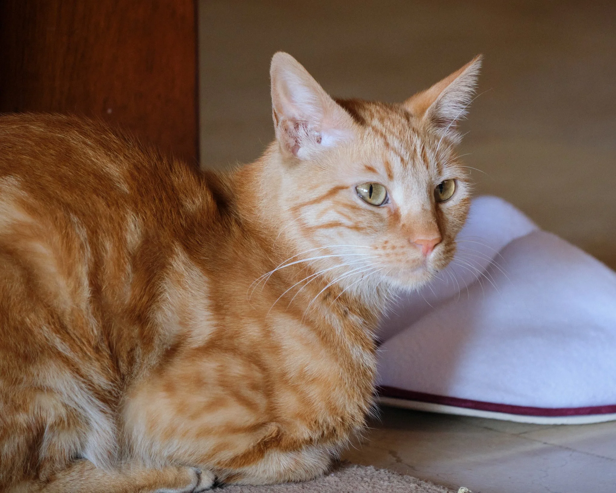
My younger sister’s orange tabby cat. Very friendly. Loves to sleep on the corner table in the living room.

Toffee portrait

Photo of an orange tabby cat standing at the edge of a balcony, looking down the lens of the photographer's camera.

Toffee is not impressed with my photography

Photo of an orange tabby cat standing at the edge of a balcony, looking at the photographer behind the camera.

Henry

My younger sister’s white cat with blue/yellow odd coloured eyes. Not very friendly, but very happy for you to open the door to let him in and out of the room.

Henry eating his kibble

Photo of a white cat eating kibble out a bowl that's lying on a counter.

Henry interrupted

Photo of a white cat interrupted by the photographer while eating it was eating its kibble out a bowl that's lying on a counter. The cat has one blue and one yellow eye.

Henry at rest

Photo of a white cat with blue/yellow odd coloured eyes stretched out on a window seat in the sun.

Uloo

My older sister’s orange, black, and white calico cat. Very friendly, curious, and quite demanding when she wants pats and scratches.

Uloo is very interested in something off camera

Close-up photo of an orange, black, and white calico cat looking at something off camera.

Uloo at rest

Photo of an orange, black, and white calico cat sitting half on a marble floor and half on a little rug.

Nunu

My older sister’s black cat. Not particularly friendly with non-family members, so not easy to get photos of. But she is a lovely looking cat.

Nunu keeping an eye on things

Photo of a black cat sitting on a marble floor, next to a chair.

Billi/Billy

My aunt’s medium-haired tabby, a friendly adopted stray who hangs around the garden. I didn’t get to spend any time with her/him, but she/he very much wanted to spend time with us while we were visiting.

Billi/Billy wants to be let inside the house (or for us to come out and play!)

Photo of a medium-haired tabby cat sitting prettily on the verandah of a house, looking in through a sliding glass door.

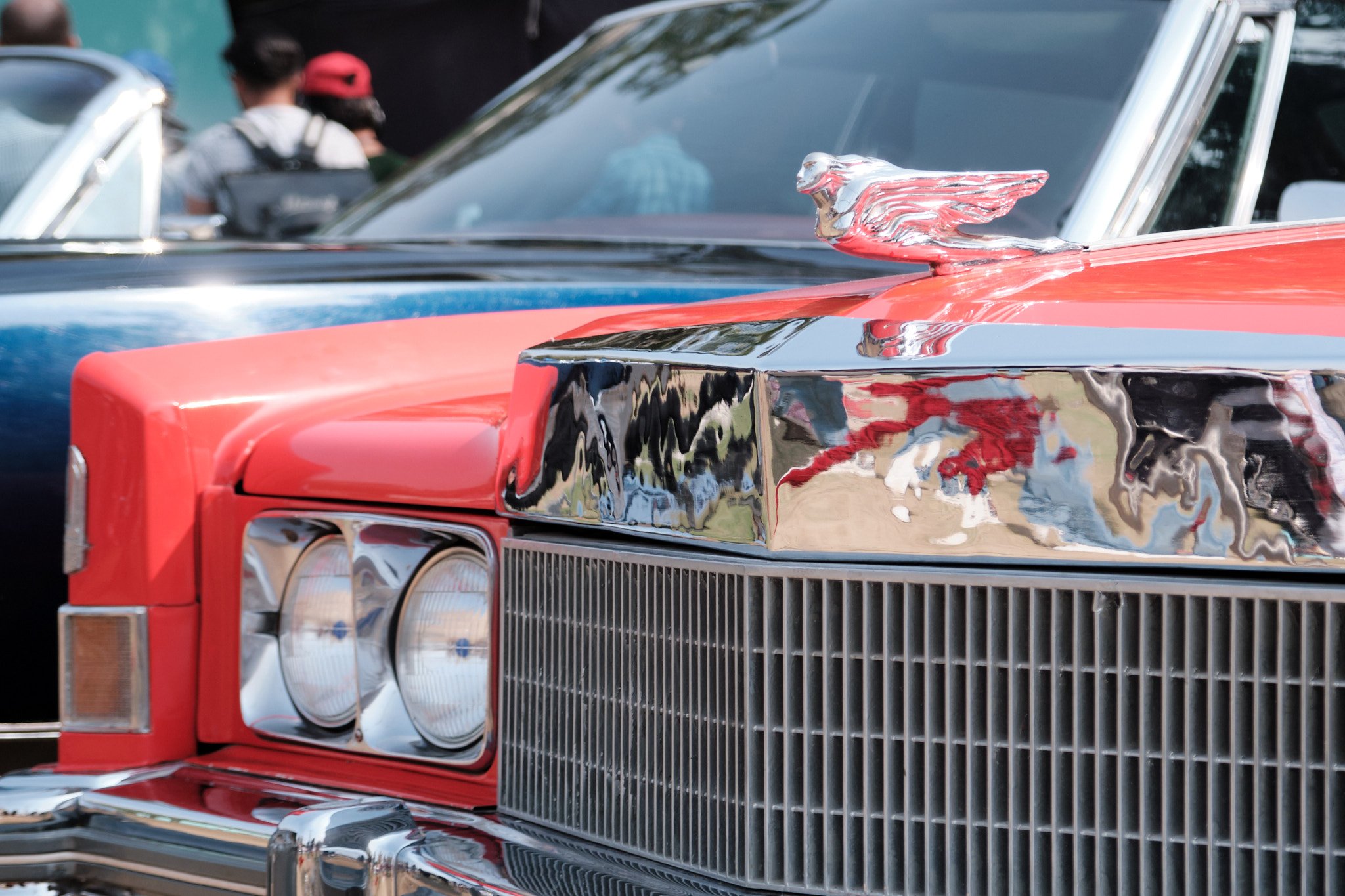
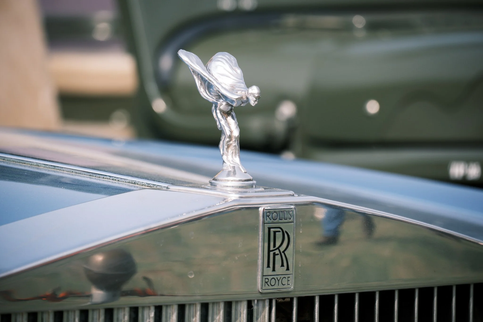
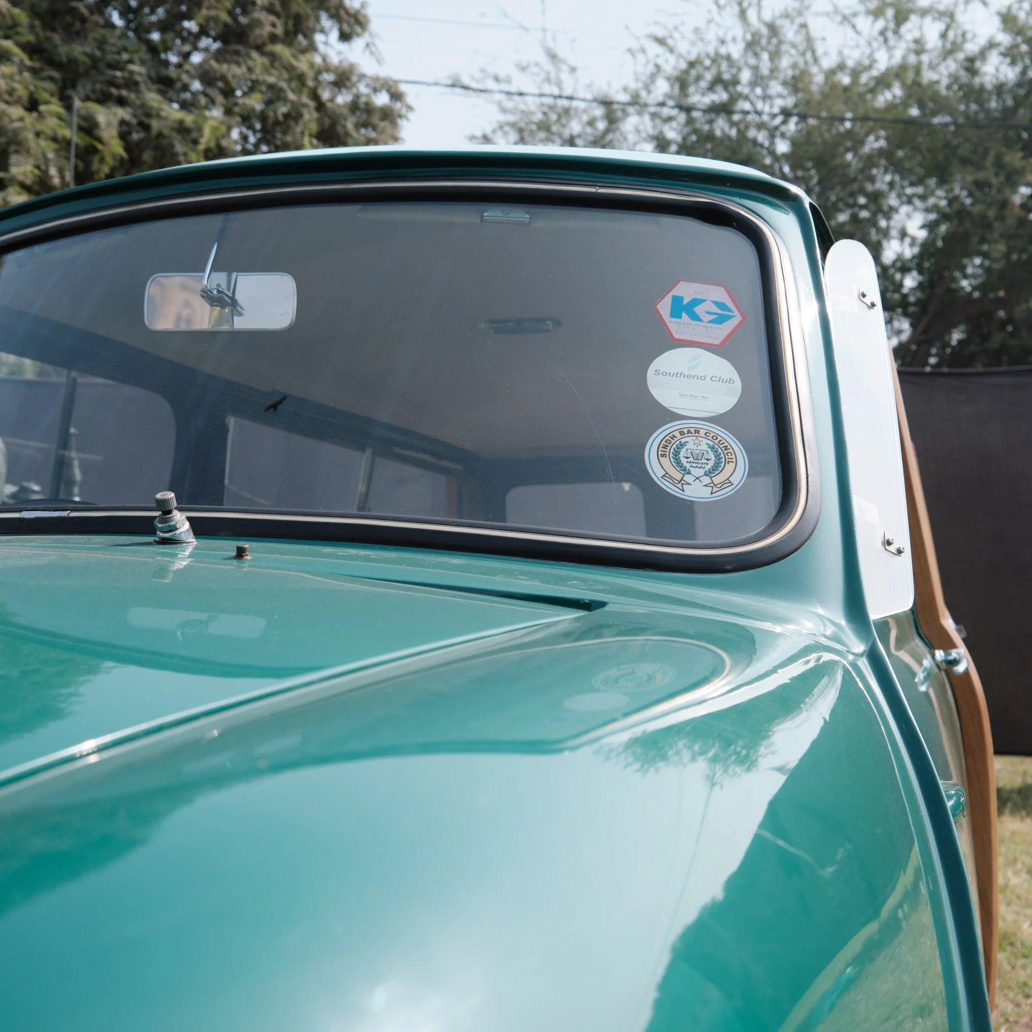
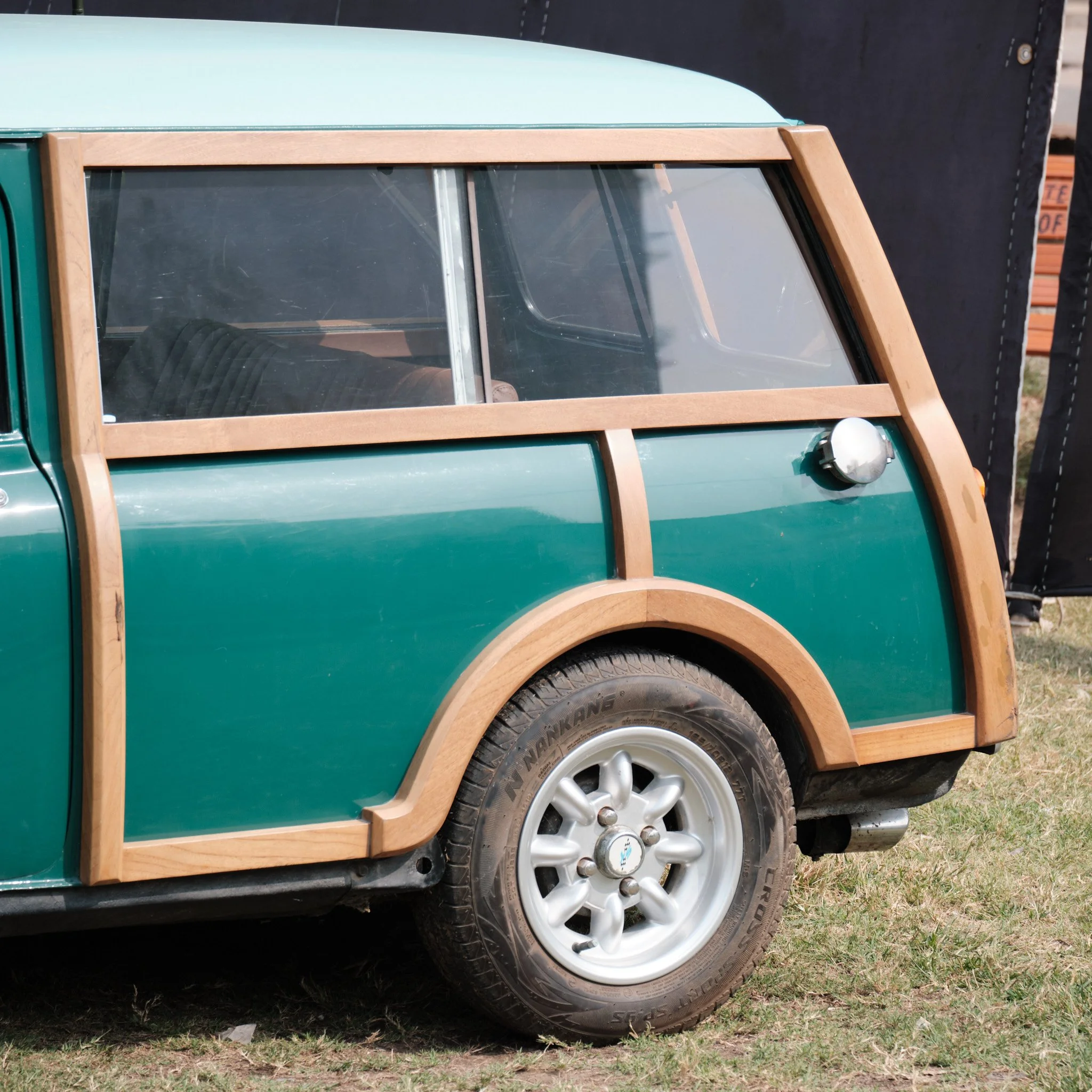
Vintage Car Show Karachi 2024

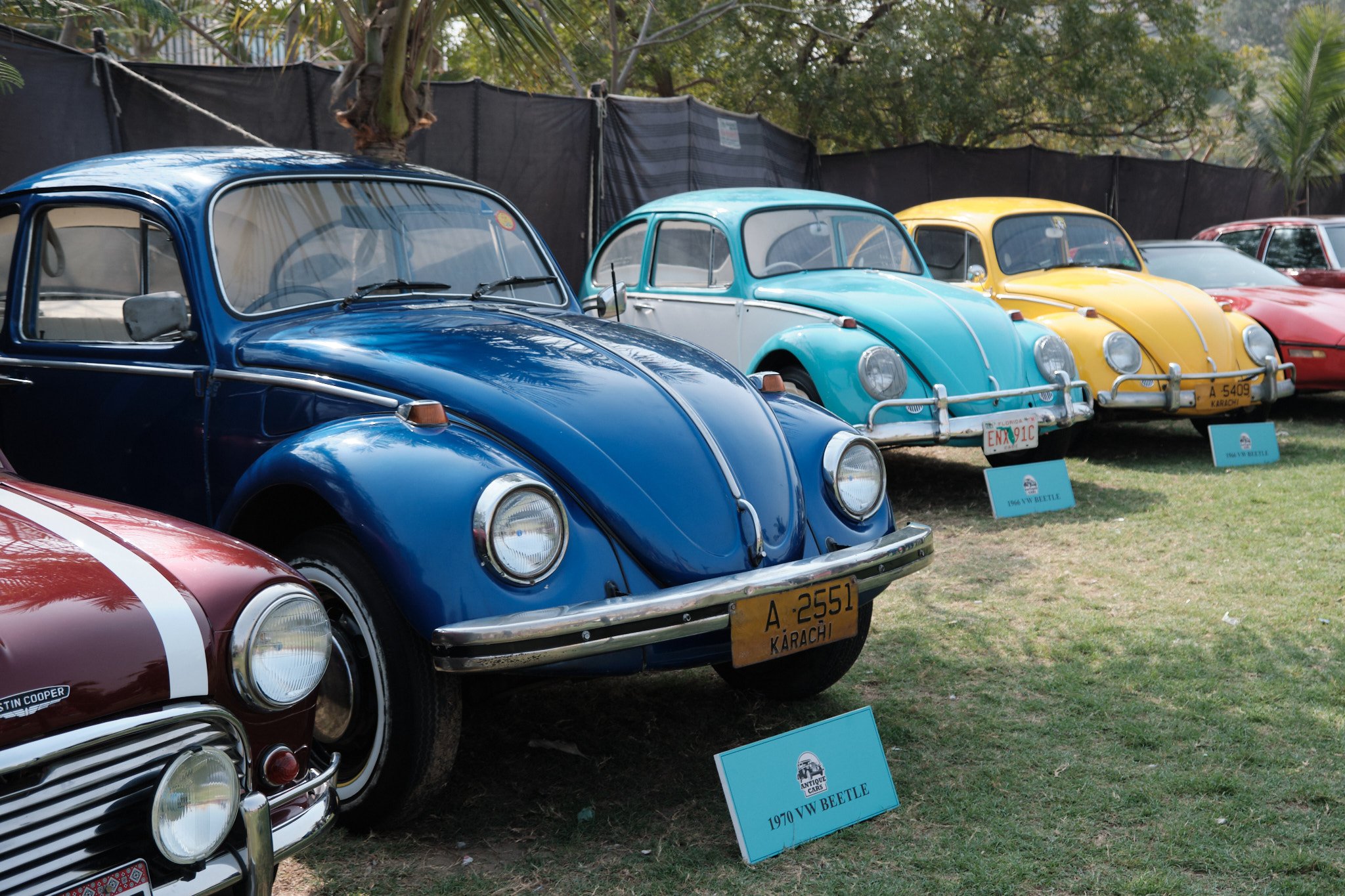
I happened to be in Karachi for this year’s Vintage Car Show so I brought along my camera and took a few photos.

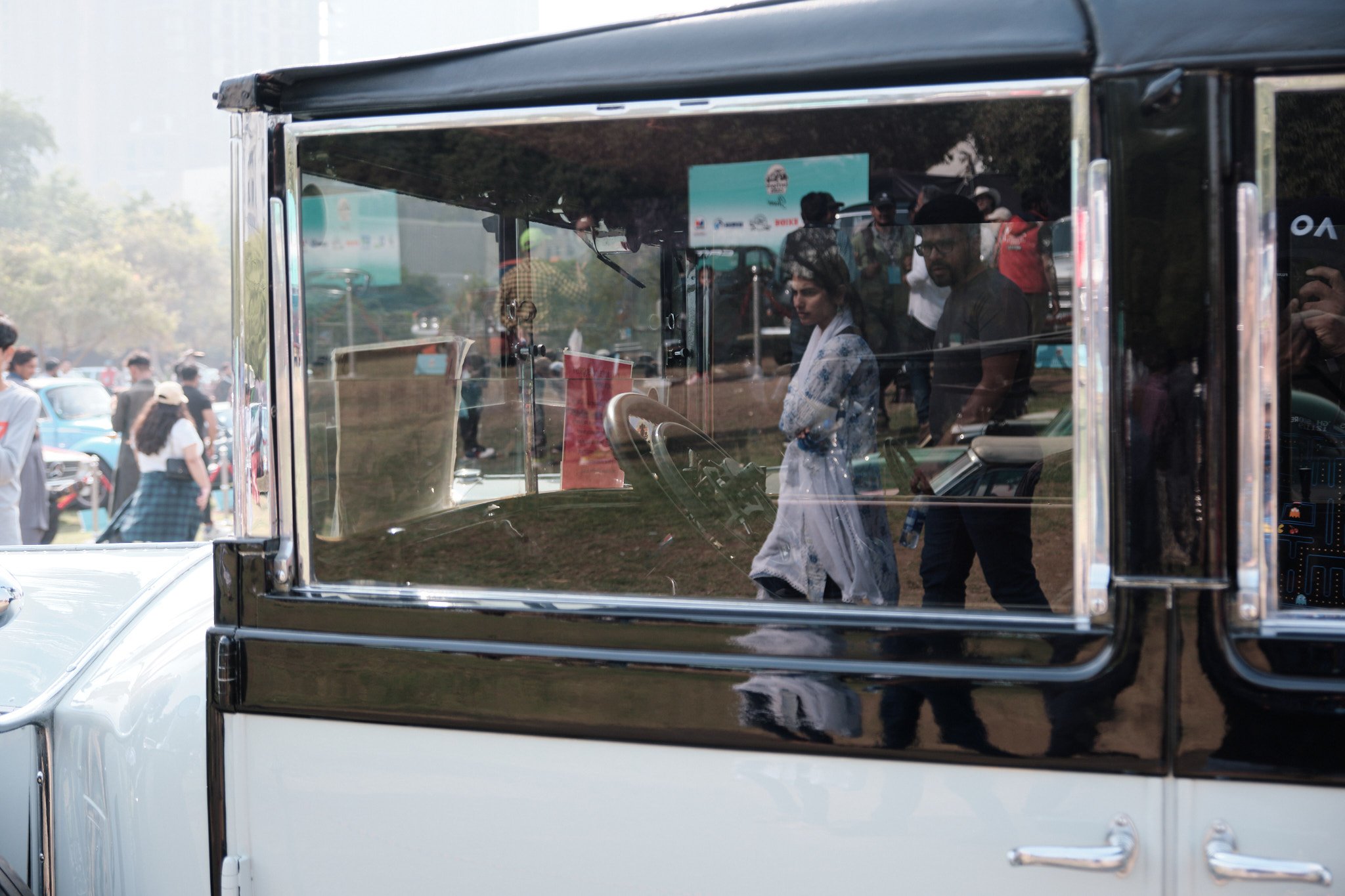
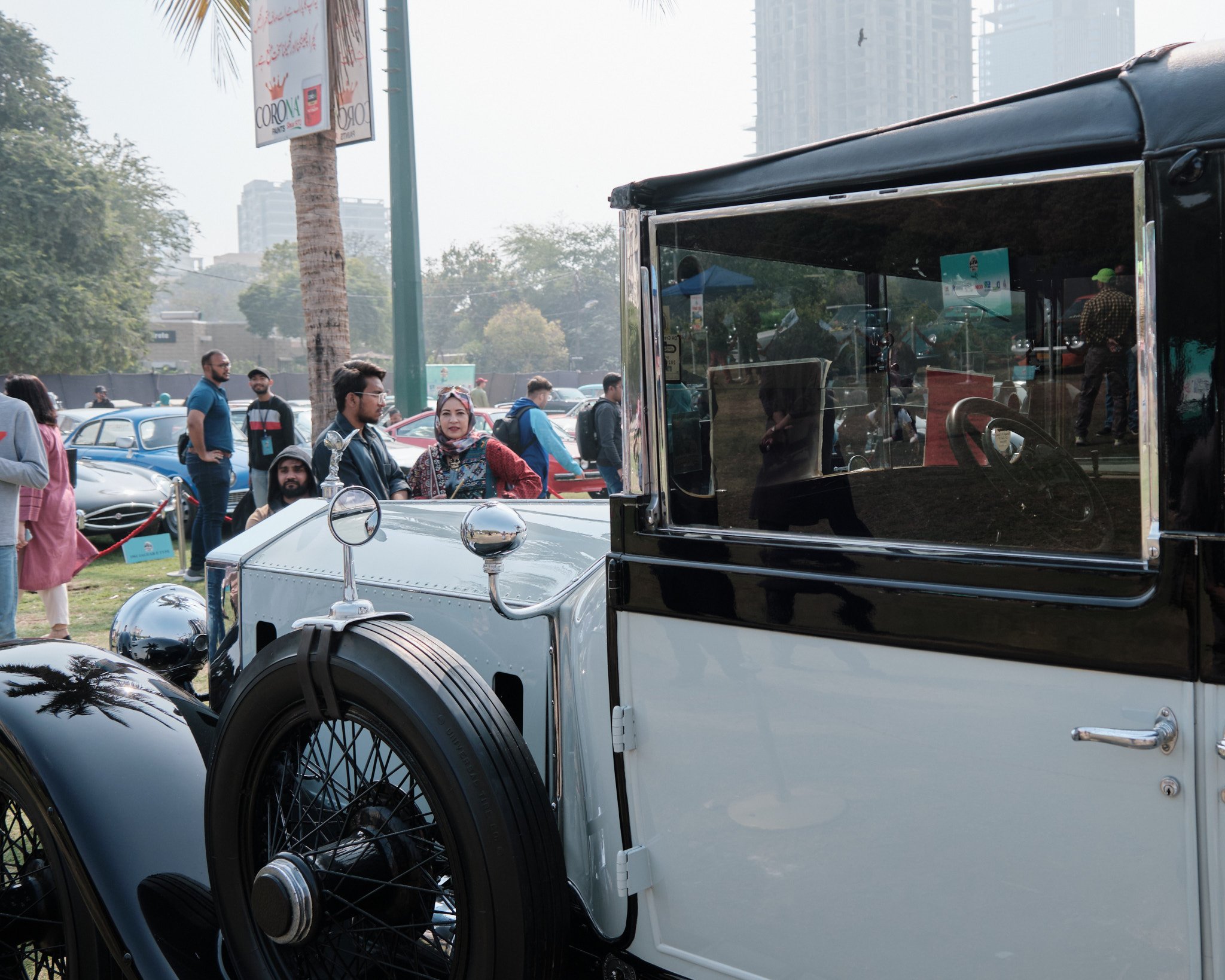
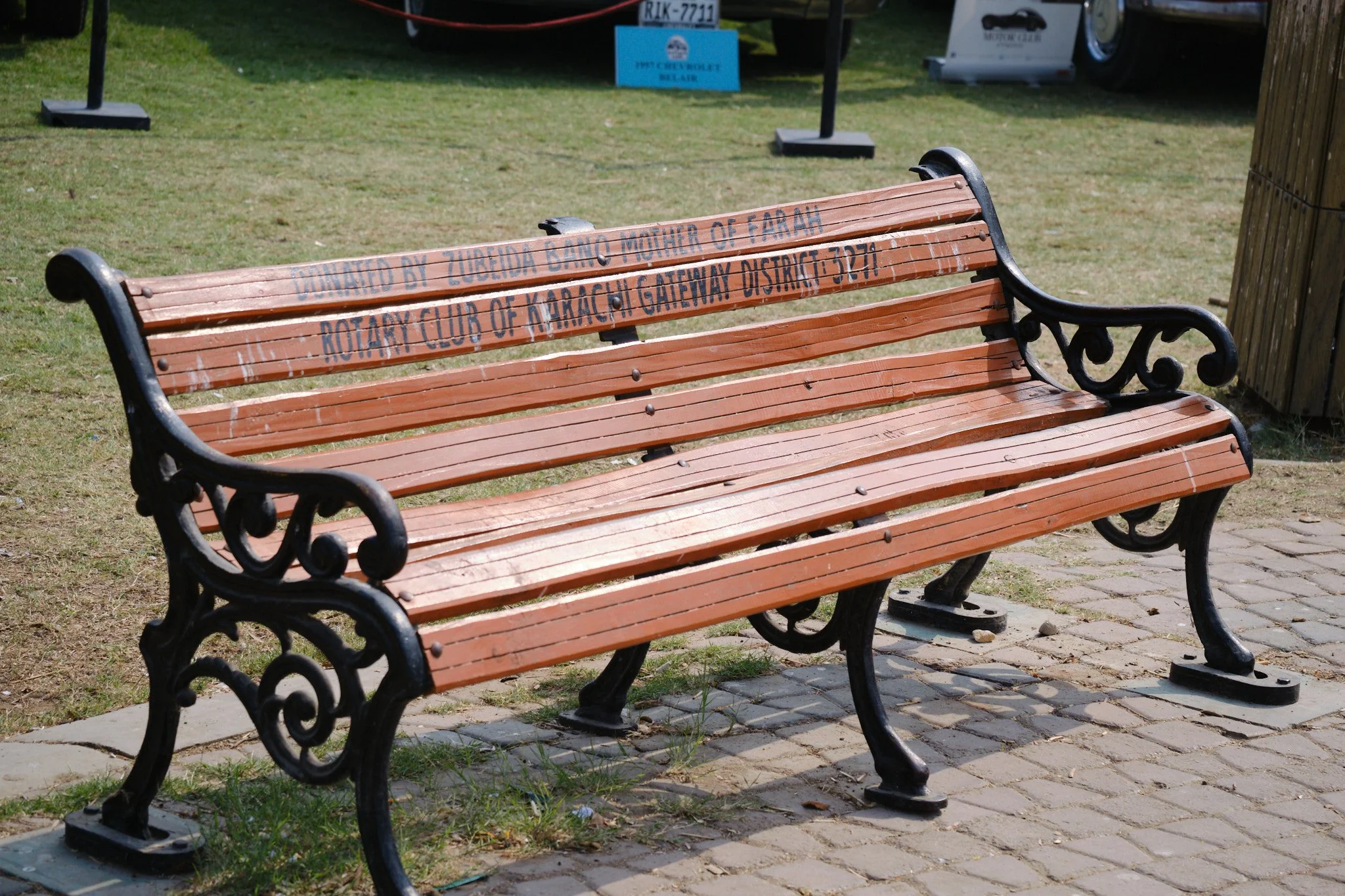
These are my two favourites. The rest I’ve included in galleries below, which means you’ll have to click each one to see its full, non-square-cropped version.

Favourites

Headlamp

Close-up photo of a headlamp of a silver coloured classic car.

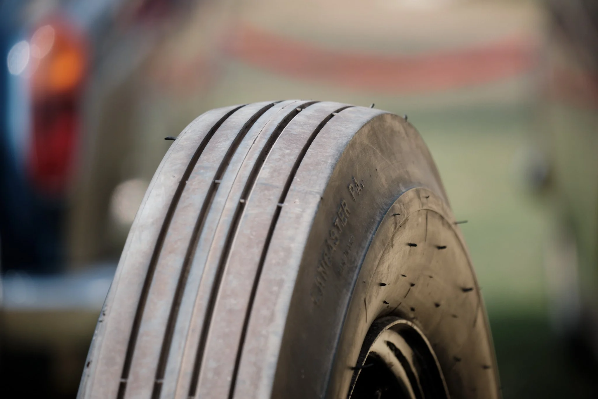
Rolls Royce tyre and visitors

Photo of the front-left tyre of a classic Rolls Royce car. In the background of the photos are two preteen children looking at the various cars on display at this car show.

Cars

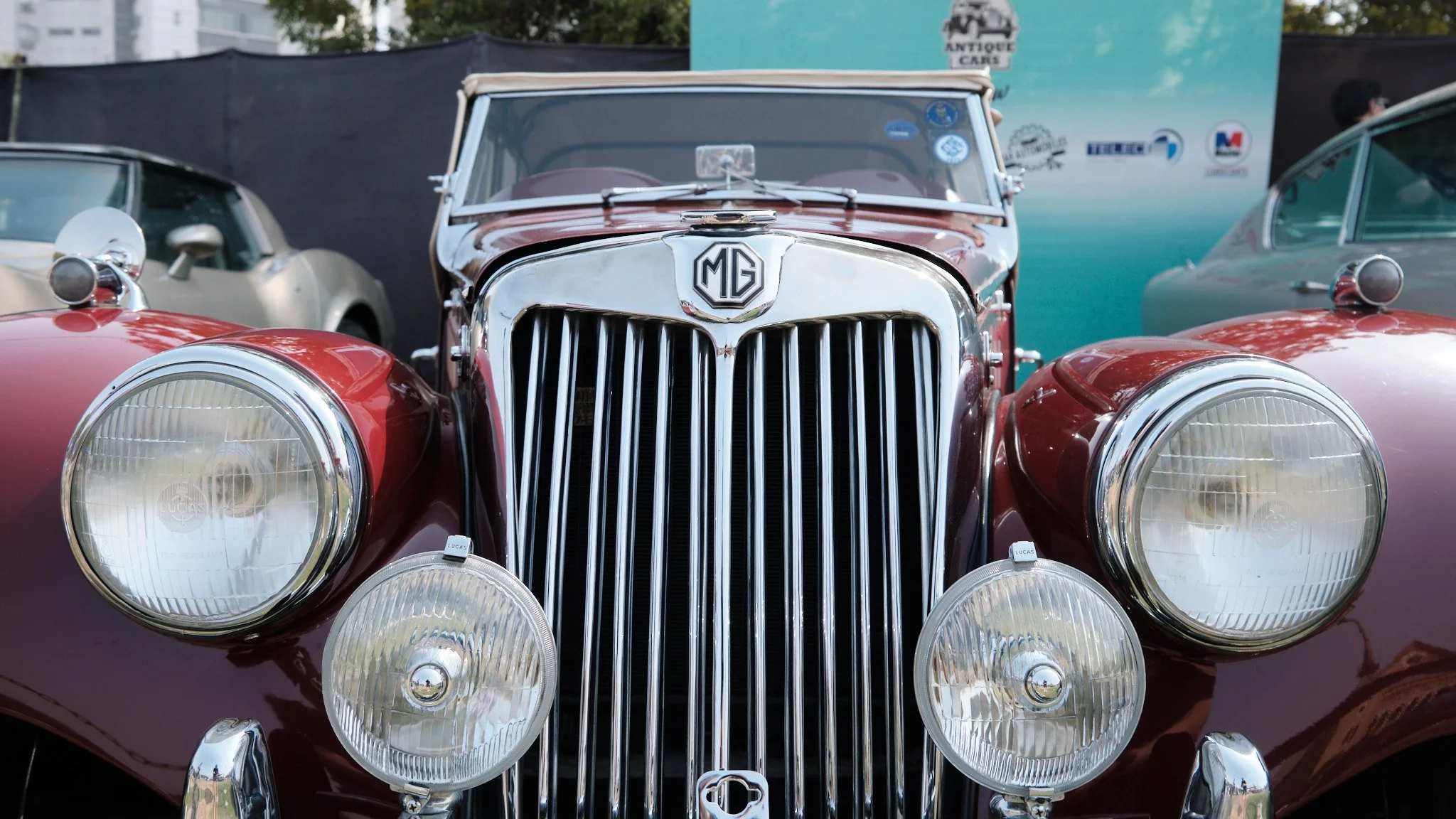
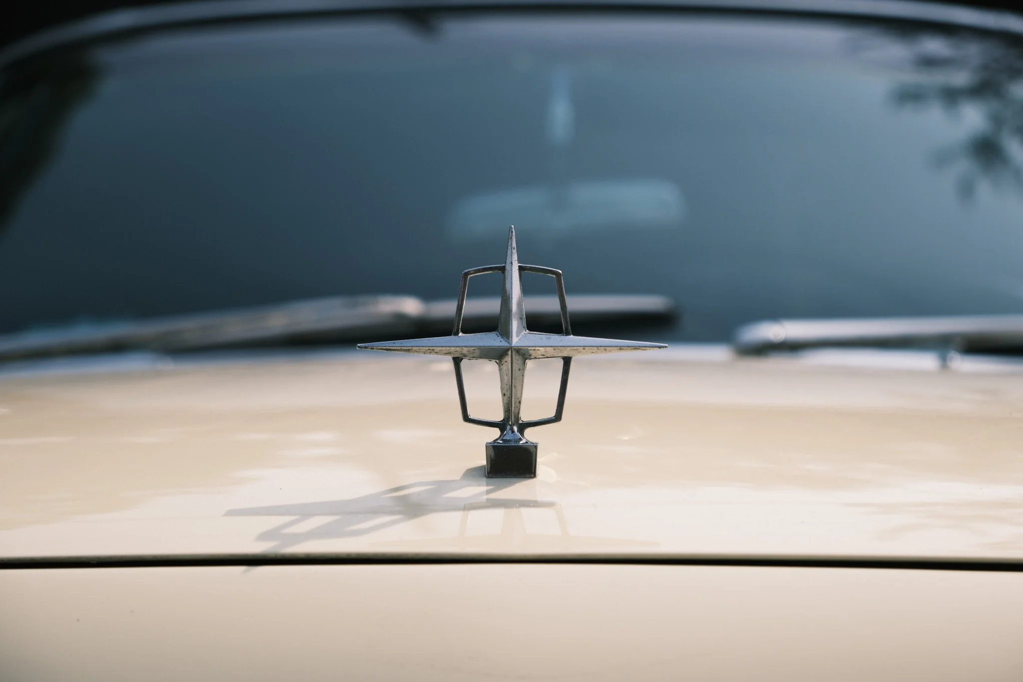
Hood ornaments and logos

Zooming in on details

Location and visitors

Trip to Pakistan 2024: places

I’m an aviation geek. That means I don’t just take photos of people, I also take photos of the places I go to. Or, well, go through :)

Melbourne Airport

Ground staff member waiting for the luggage containers to turn up

Photo of an airport apron that has a wide-body aircraft parked on it. The aircraft is in the process of being loaded with catering supplies. A roller ramp has been parked to the side of the aircraft. A member of the ground staff is sitting on the corner of this roller ramp, waiting for the luggage containers to arrive so they can be loaded into the aircraft hold.

The Etihad Boeing 777 that flew us from Melbourne to Abu Dhabi

Wide-angle photo of a wide-body Boeing 777 aircraft parked at the gate of an airport terminal.

Abu Dhabi Airport

This corner of Terminal A at Abu Dhabi Airport is quite empty at 2am

Wide-angle photo of large, high-ceiling, shiny, brand new airport terminal building. One one side of the building are windows that go from the ground to the fourth floor. From the angle the photo is taken you can see parts of all four floors, all of which are connected by escalators and elevators.

Waiting at at empty departure gate at Abu Dhabi Airport Terminal A

Photo of a large, heigh-ceiling, mostly empty airport departure gate. This section of the building is at least two storeys high, with a wide, elevated walkway running through the centre. In the departure are are several round-backed single-seater sofas for waiting passengers to sit on.

Walnut crescent cookie shaped lights at Abu Dhabi Airport Terminal A departure gates

Wide-angle photo looking up at a large, crescent shaped, white-and-cream coloured light fixture. This light fixture is mounted on a tall pillar along a first-floor walkway in a high-ceiling airport terminal building.

Walnut crescent cookie shaped lights at the new Abu Dhabi Airport Terminal A

Photo looking up at a large, crescent shaped, white-and-cream coloured light fixture. This light fixture is mounted on a tall pillar along a first-floor walkway in a high-ceiling airport terminal building.

Etihad Airways Airbus A320 aircraft taxiing to its gate at Abu Dhabi Airport

This was the Airbus A320 that flew us from Abu Dhabi to Karachi.

Photo of a narrow-body Airbus A320 aircraft in Etihad Airways livery taxiing to its gate.

Airbus A320 approaching Abu Dhabi Airport Terminal A gate 640

Photo of a narrow-body Airbus A320 aircraft in Etihad Airways livery slowly approaching a terminal boarding gate.

Airbus A320 getting settled at Abu Dhabi Airport Terminal A gate 640

Photo of a narrow-body Airbus A320 aircraft in Etihad Airways livery parked at a terminal boarding gate. The passenger boarding bridge (aka air bridge) from the terminal is in the process of being extended towards the front-left door of the aircraft and there are several ground operations team members walking around below the aircraft. And ‘Airside Operations Leader’ car is parked in front of the gate at which this aircraft has parked.

The Boeing 787 that took us from Abu Dhabi to Melbourne

Photo taken through large floor-to-ceiling windows of an airport terminal building of a wide-body aircraft in Etihad Airways livery parked at a gate. In the background you can see the airport’s weather radar and control tower.

The Boeing 787 that took us from Abu Dhabi to Melbourne

Photo of a wide-body aircraft parked at an airport gate. It is connected from its left side to the terminal building via a passenger boarding bridge (aka air bridge). On its right side luggage is being loaded onto it. In the background are the other terminal buildings of Abu Dhabi Airport Terminal A.

Karachi Airport

Heading from Karachi to Islamabad

Photo of an airport apron taken from inside a passenger boarding bridge (aka air bridge). The gate next to this one is empty.

Islamabad Airport

The Fly Jinnah Airbus A320 that took us from Islamabad to Karachi

Photo of a narrow-body Airbus A320 aircraft in Fly Jinnah livery parked on the apron at an airport. Several ground staff are walking around the aircraft, getting it ready to start deplaning its passengers and cargo.

Trip to Pakistan 2024: people

Nadia and I took three weeks off to go visit friends and family in Pakistan. Naturally I took several photos as we travelled from one place to the next :)

Selfie at Melbourne Airport before heading off on our holiday

We had an almost-10pm flight out of Melbourne, so we had dinner at Melbourne Airport right after we checked-in.

Selfie of a man and woman, both wearing black t-shirts, backpacks, and face masks, standing in an airport terminal.

All set to fly from Melbourne to Abu Dhabi

Neither of us minds having seats near the bathroom and neither of us minds sitting right at the back of the plane, so we picked seats in the second-last row of this Boeing 777 since that row has just two seats on the window side :)

Selfie of a man and woman, both wearing black t-shirts and face masks, seated in an aircraft. The two are giving a thumbs-up to the camera.

Selfie along the C-gates arm at Abu Dhabi Airport Terminal A

Abu Dhabi Airport’s brand new Terminal A is quite roomy (having been built for future growth) and is a surprisingly comfortable place to hang out for a ten-hour layover.

Selfie of a man wearing a bright orange jacket standing in the middle of a long terminal corridor, between gates C28 and C29.

Selfie to celebrate our arrival at Karachi Airport

Yay Karachi!

Selfie of a man and a woman, both wearing black t-shirts and face masks, standing next to their luggage at the international arrivals gate of an airport.

Ready for the first of our three flights back to Melbourne, this one from Islamabad to Karachi

It took us almost forty hours to get back from Islamabad to Melbourne (via Karachi and Abu Dhabi). This was the start of our first leg.

Selfie of a man and a woman, both wearing black t-shirts and face masks, seated inside an aircraft cabin during boarding.

Ready for the second of our three flights back to Melbourne, this one from Karachi to Abu Dhabi

This was the start of our second leg, waiting in the international departure lounge.

Selfie of a man and a woman, both wearing black t-shirts and face masks, seated in a departure lounge at an airport.

Waiting for breakfast at Abu Dhabi Airport Terminal A

This is towards the end of our twelve hour layover in Abu Dhabi.

Photo of a woman, wearing a black hoodie and face mask, leaning on a restaurant table in an airport. Behind her is a floor-to-ceiling window that looks out onto and airport terminal apron.

Selfie before boarding our flight to Melbourne

We’re making sure to stretch our legs and stand as much as we can before our non-stop, thirteen hour flight to Melbourne.

Selfie of a man and a woman, both wearing black tops and face masks, standing in a departure lounge at an airport.

Ready for the third of our three flights back to Melbourne, this one from Abu Dhabi to Melbourne

All aboard and ready to boogie (aka sleep) on this lovely Boeing 787 (yay!).

Selfie of a man and a woman, both wearing black t-shirts and face masks, seated inside an aircraft cabin during boarding.

We hadn’t been back to Pakistan since late 2019, so this trip was very much overdue and it was a great way to start the year.

The life of Maggie: walking and napping

Time to share a few photos of Maggie I’ve taken over the last few weeks. (You’re welcome.)

Turning a corner

Photo of a red/brown dog walking down the residential footpath, with just its head and one if its forelegs visible from around the corner of a fence.

Comfortable afternoon nap

Photo of a red/brown dog asleep on its side in a dog bed that’s lying in a carpeted room.

Ready for her daily walk

Photo looking down at a red/brown dog wearing a black and red harness. The dog has its nose to the front door of a house, waiting for it to open so she can run out.

20th anniversary

On 1 February 2004, Nadia and I got married at the Serena Hotel in Islamabad, Pakistan.

Twenty years later we went back there to take a couple of selfies :)

Selfie of a man and a woman in their forties standing in a nook in a hotel lobby.

Selfie of a man and a woman in their forties standing outside a large hotel.

Later that day we celebrated with food and, importantly, with cake.

Photo of a man and woman in their forties standing in a dining room along one corner of a large, rectangular dining table. In front of them is a caramel cake with “Happy Anniversary Nadia & Ameel” written on it. The woman is holding up the large knife with which she is going to cut the cake.

That cake, while delicious, wasn’t quite as fancy as the one we cut at our actual reception.

Photo of a man and a woman in South Asian wedding attire surrounded by their families on their wedding day. The couple are in the process of cutting a large, fancy cake that’s been placed on a table in front of them.

Nor did we make a meme out of the cake-cutting, like we did for our tenth anniversary :)

Photo of a man and a woman in South Asian wedding attire surrounded by their families on their wedding day. The couple are in the process of cutting a large, fancy cake that’s been placed on a table in front of them. The couple and several of their family members are laughing at a joke that’s just been told by someone off-camera. Written in Comic Sans font across the photo in a seemingly haphazard fashion are several phrases in broken English that represent a kind of inner monologue. This type of internet meme, known as Doge, was popular in 2013 and 2014. These phrases are “so marriage”, “much decade”, “giggle”. “wow”, “many love”, “very bliss”, “caaaaake”, “10/10 would marry”, and (bizarrely) “once even flow alive why go black jeremy oceans porch garden deep release” (which is the song list from Pearl Jam’s debut album, ‘Ten’, in case you’re wondering).

20 years later

The last time we were at the Serena Hotel in Islamabad we were dressed, well, a little differently :)

Collage of two photos, on above the other. The first photo, dated 1 Feb 2004, is of a man and a woman seated on stage and dressed in traditional Pakistani wedding outfits. The second photo, dated 1 Feb 2024, is of the same man and woman taking a selfie in a hotel lobby.

Happy 20th wedding anniversary Nadia!

One year with a mirrorless camera

Here’s what I’ve learned after owning a mirrorless, interchangeable-lens camera for just over one year. (I got my camera on Boxing Day 2022 but didn’t start taking any decent photos will it till at least the middle of January 2023.)

This is based on the 438 share-worthy photos I uploaded to Flickr in 2023.

Photos I like taking

Aside from typical life and event/travel photos, I seem to like taking photos that tell micro stories of people and places. I do this mainly through three types of photos…

Interesting everyday

These are photos looking up, down, and around at things you stop noticing when you live somewhere for a long time. These are architectural photos, photos of objects, or photos of people going about their lives doing things I find interesting.

Looking up along light tower 5 at Melbourne Cricket Ground. Photo looking straight up along the side of a large, white, stadium light tower on a partly cloudy day.

Questions about people

These are photos that make you wonder what the person/people in the photo are doing, thinking, or talking about.

Tourists checking out Melbourne’s office-building architecture. Photo of a couple standing on the other side of the road from the photographer. They have their arms around each other and are looking up at the top of a building across the street from them. A green-and-white tram is about to cross in front of them.

Atmosphere

These are photos that (hopefully) communicate the vibe of the place in which I took the photo or maybe what I was feeling when I took it.

I want to touch the nose again! (Avalon Airshow 2023). Photo of a man at an airshow carrying a little boy in his lap (presumably his son). The man is standing next to the nose of a military transport aircraft. Next to the man is a little girl (presumably his daughter) who wants to be picked up so she can touch the nose of the aircraft again.

Most frequently used focal lengths

When I wasn’t doing my ‘one focal length at a time exercise’, my favourite focal lengths were 27mm, 85mm, and 345mm. These represent both extremes of my two zoom lenses: 27-85mm for my main lens and 80-345mm for my second lens. The 85mm bar in the chart below covers the 80-85mm range where my two lenses overlap, and so that’s why this bar is the longest.

Graphic titled ‘Focal length usage 2023 (full-frame equivalent)’. Below this is a chart titled ‘Normal zoom-lens usage’ that shows a bar chart with bars ranging from 27mm to 300-345mm. The three longest bars in this chart are for 85mm (28% of all photos), 27mm (23%), and 300-345mm (11%).

What have I learned from this?

  • 27mm end: I like taking architectural photos (the wide angle helps you capture more of the building/location) and I often like taking photos that capture the context around my primary subject (eg their location or where they’re headed). Also, in the early days I was still getting used to composing good shots with my new camera, so I would do a looser composition while taking the photo and then crop-in later during editing.

  • The other ends: I like to zoom in on specific parts of architecture (like the tops of buildings) and I like to simplify my photographs by isolating my subjects within the frame (so it’s easier to focus on the specific object or the person I’m photographing).

Part of the point of the ‘one focal length at a time’ exercise I did over October-December 2023 was to force me to get away from these extremes and try the most popular intermediate focal lengths instead.

Graphic titled ‘Focal length usage 2023 (full-frame equivalent)’. Below this is a chart titled “‘One focal length at a time’ exercise” that shows a bar chart with bars ranging from 27mm to 85mm. The two longest bars in this chart are for 27mm and 40mm (both at 27%). This is followed by 50mm (19%), 85mm (18%), and 35mm (9%).

Aside from all the creative learning I did during my ‘one focal length at a time’ exercise, I learned that 27mm and 40mm are the focal lengths at which I am the most successful (and comfortable shooting). That’s why, when I do buy an everyday-carry prime lens, those are the two I’ll get first (starting with 40mm).

Where to from here?

The end of the year is a good time for reflection and learning, and it’s been fun going through all the photos I’ve taken this year. Importantly, I noted how I improved as a photographer over the last twelve months and what I still need to get better at.

In 2024 I’m going to keep doing what I’m doing right now: taking regular photo walks in and around Melbourne and photographing life, events, and travel. I have a lot of experience to gain and still plenty of incremental improvement to do before I start to plateau both creatively and skill-wise.

So here’s to another fun year of photography!

2023 Boxing Day test at the MCG

Since moving to Australia in 2006, this is only the second time that Pakistan has played Australia in the Boxing Day Test at the MCG.

Nadia and I attended day three of the last test match, back in 2016.

Photo of the grounds at a massive cricket stadium, taken from an under-cover seat some distance away from the field.

This year I attended day one of the match with a bunch of family friends.

Selfie of four people seated in a row at a cricket match, three of whom are wearing Pakistan cricket team gear.

Here are some of the photos I took while I was there.

Lots of ways to get to Melbourne Cricket Ground

Photo of a sign post at the Melbourne Cricket ground showing the walking time and distance (in kilometres) from this post to Jolimont Railway Station, tram routes 48 and 75 along Wellington Parade, Flinders Street Railway Station, tram route 70 along Swan Street, and Richmond Railway Station.

Train tracks between the MCG and Melbourne & Olympic Parks

Photo taken through a wire mesh fence of half a dozen train tracks running between where the photographer is standing and several buildings and sports centres on the other side. A blue-and-yellow Metro train is running along one of these tracks. A covered, elevated walkway runs above the tracks.

Welcome to the Boxing Day test

Photo of an entry gate at Melbourne Cricket Ground, which about two dozen people waiting in short queues to get through security and ticketing. A large digital sign above the gate reads, in all capital letters, “Welcome to the boxing day test”.

Qantas Choir getting ready to sing the Australian national anthem

Photo of three rows of young women, all wearing an identical uniform of black shoes, black pants, and cream coloured tops, standing in choir formation inside a massive cricket stadium.

Qantas Choir singing the Australian national anthem

Photo of three rows of young women, all wearing an identical uniform of black shoes, black pants, and cream coloured tops, standing in choir formation inside a massive cricket stadium. On the other side of the large ground are the cricket players standing next to their respective country flags.

Cricketer Shaheen Afridi warming up before his bowling spell

Photo of a male cricket player, wearing an all-white kit, jumping in the air as part of his warm-up routine.

Cricketer David Warner batting

Photo of a male cricket player, wearing an all-white kit, standing at the crease and ready to face ball that is being bowled to him.

Young Pakistani supporter

Photo of a young boy in a while t-shirt and a green coloured Pakistan team hat watching a cricket match.

Cricketer Shaheen Afridi bowling

Photo of a male cricket player, wearing an all-white kit, about to release the ball he is bowling.

Melbourne Cricket Club Members Reserve stand

Photo of four tiers of cricket stands, each with a café, bar, or corporate suites behind them. A large sign on one of these seating tiers reads, ‘Melbourne Cricket Club’.

DJ Ash bringing the music to the MCG outfield

Photo of a male music DJ standing at his console while he chats to a man dressed in a bright, multi-coloured ‘Squad Pakistan’ shirt with a large dhol slung across his back.

Karachi Street Food stall outside the MCG

Photo of an outdoor food stall set up in a large garden. A sign above the stall reads, in all capital letters, ‘Karachi street food’. There are several people milling around the food stand, and a line to the food stand extends off-camera.

Long lunch-time line for the Karachi Street Food stall outside the MCG

Photo of an outdoor food stall set up in a large garden with picnic tables placed around it. A sign above the stall reads, in all capital letters, ‘Karachi street food’. A stall in the background has a sign that reads, ‘Sugarcane Juice’. There are several people standing in the garden, and a long line of people queuing at the food stand extends off-camera.

Light towers at Melbourne Cricket Ground

The light towers at Melbourne Cricket Ground are as iconic as the stadium itself, and this month marks 39 years since they were first installed and switched on.

Light tower 1

Photo looking up at the top of a large, stadium light tower on a partly cloudy day. The trapezium-shaped array of powerful lights has been placed on a thick, white coloured tower that has the number 1 written on it.

Light tower 5, next to the Ponsford Stand

Photo looking up, along the side of a massive sports stadium, at a light tower on a partly cloudy day. The tower has the number 5 written on it.

Seats, lights, and flags

Photo looking almost straight up along the side of a sports stadium. In the left of the photo is the underside of a seating stand (the Ponsford Stand), in the centre is a tall light tower, on the right (at the very top of the stadium wall) is a set of five flagpoles with various flags on them.

Looking up along light tower 5

Photo looking straight up along the side of a large, white, stadium light tower on a partly cloudy day.

Light tower 2

Photo of a stadium light tower taken from inside a sports stadium. A large number 2 is written at the top of the light tower. In front of this tower is the top of the stadium, on which there are flags flying on five flagpoles.

Maggie, around the house

Maggie is enjoying the return of summer. She has arthritis so she needs to be warm, and she she’s always loved soaking up the sun. I think her bones also appreciate the memory-foam dog bed we have for her our living room.

Scratching her back after napping in the sun

Photo, taken through a window pane, of a red/brown dog in a residential garden. The dog is twisting around in the garden, all four legs up in the air, while she scratches her back on the dirt and grass.

Fast asleep after her morning walk

Photo of a red/brown dog fast asleep in a large grey coloured dog bed on the floor of a living room. The dog's face is smushed into a blanket lying on one side of the dog bed.

Blearily noticing that I just took her photo

Photo of a red/brown dog in a large grey coloured dog bed on the floor of a living room. The dog is looking blearily into the camera because she has just been woken by her photo being taken.

When she is tired but still follows you from room to room, so you pee with the door open

Photo of a red/brown dog lying on her side, with her head right in front of an open bathroom door. The photo is taken from inside the bathroom.

When we got Maggie all those years ago, we’d take her for hour-long walks every day and she’d still have an endless supply of energy afterwards.

As she got older, she’d start to get tired after forty-five minutes of walking, so we dropped her walk time down to thirty-ish minutes.

These days she still has the mental enthusiasm for half-hour walks, but if we walk for too long in one go, her body pays for it the next day. So we’re now down to fifteen-ish minute walks every morning; with maybe a five or ten minute walk in the evening if she’s up for it.

Not that she minds. She still loves walking through our neighbourhood and foraging for whatever she can eat. But she’s become a lot more chill as she’s gotten older, with fewer fucks to give about the world. And, as long as she knows where we are, she’s no longer in a mad rush to follow us from room-to-room as we move around the house. Unless it’s nearing her walk time or dinner time, of course, in which case she’ll make her presence know no matter where we are and what we’re up to! But otherwise she’s content with her slower pace of life.