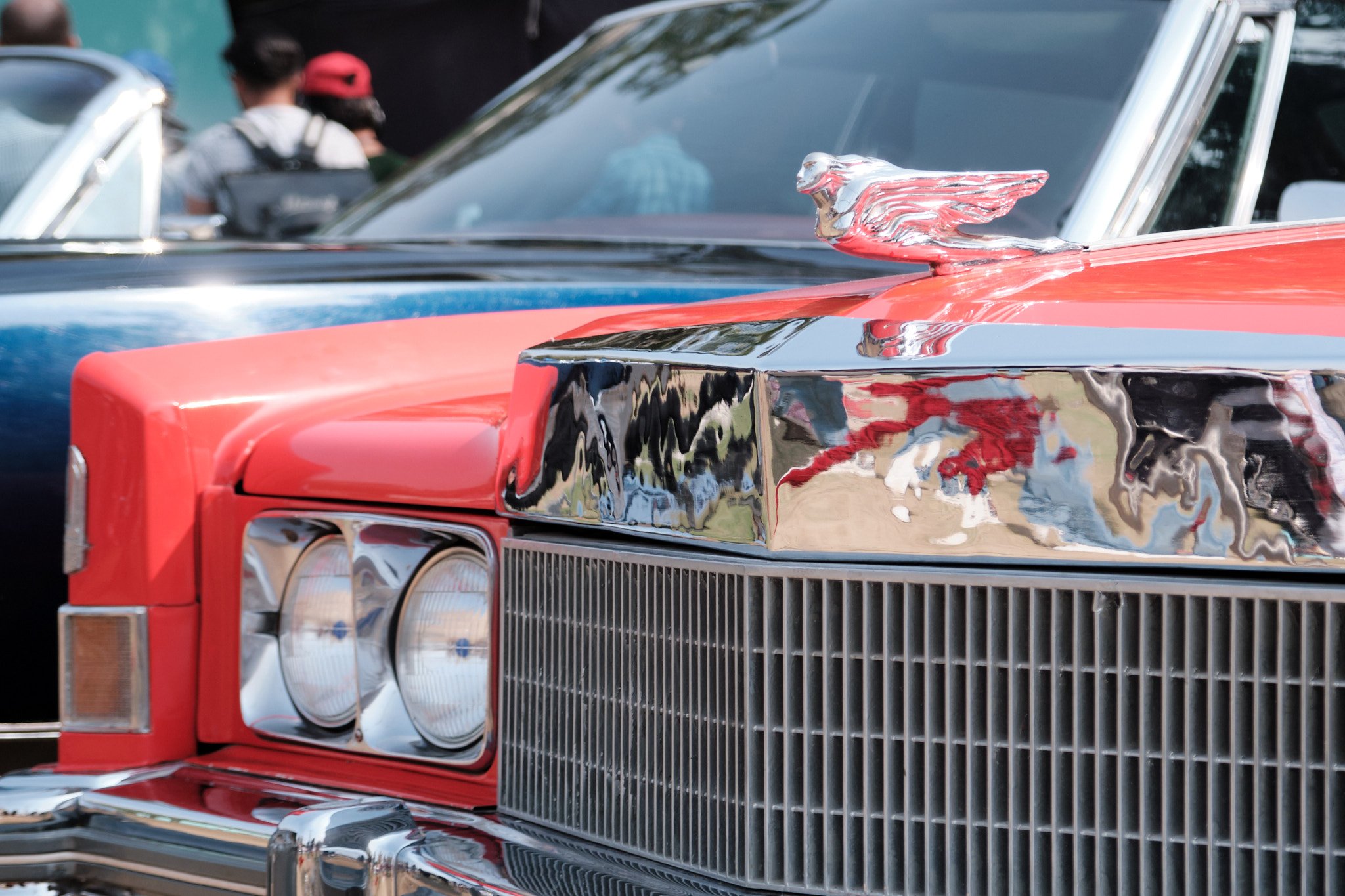
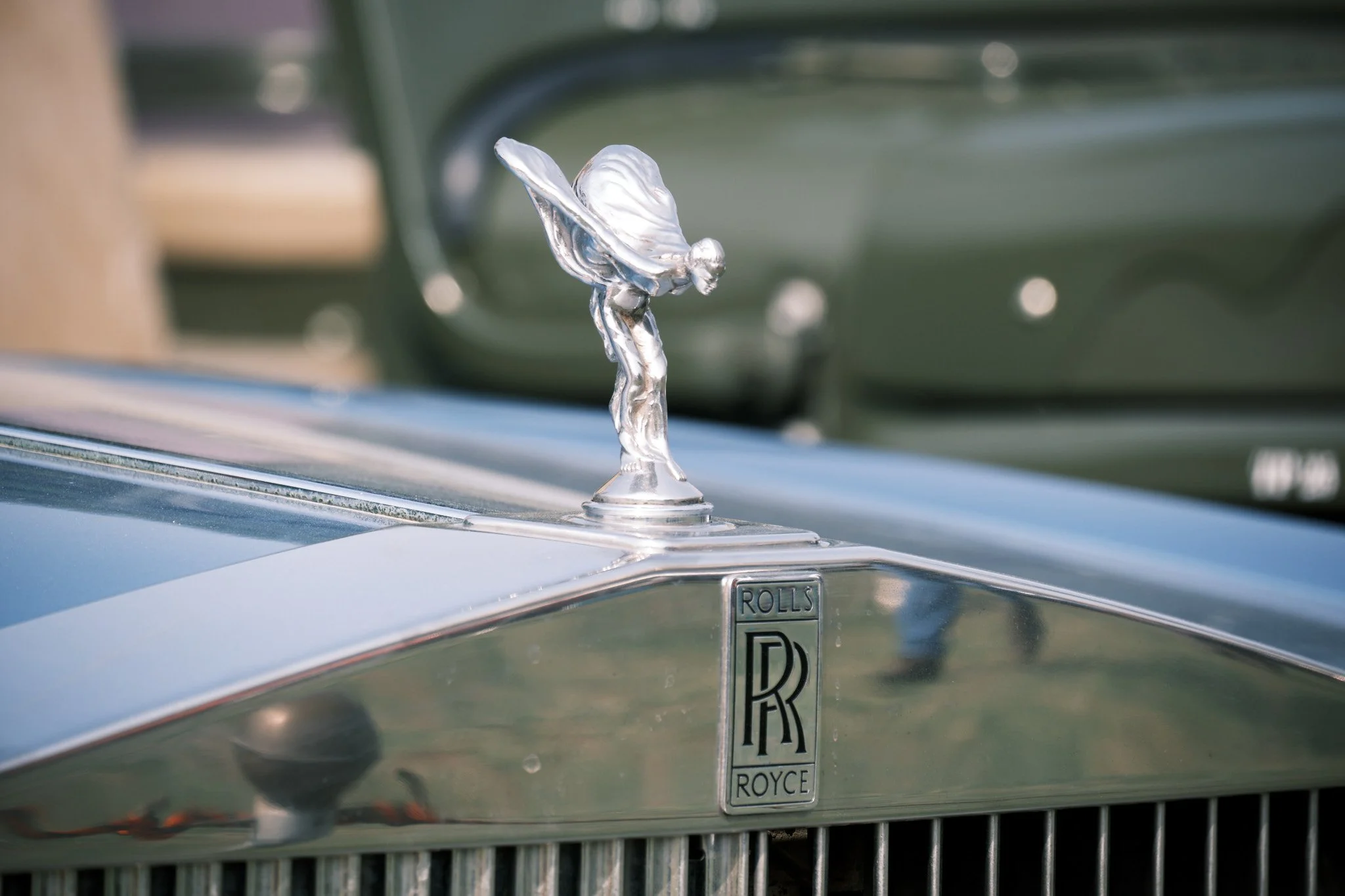
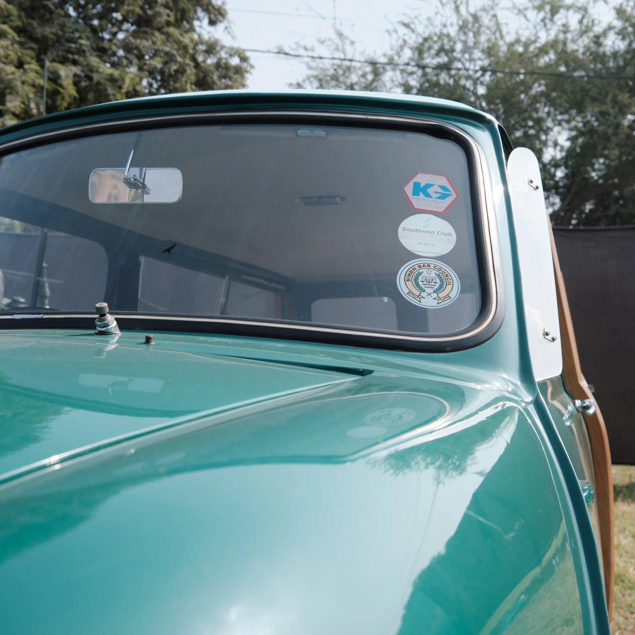
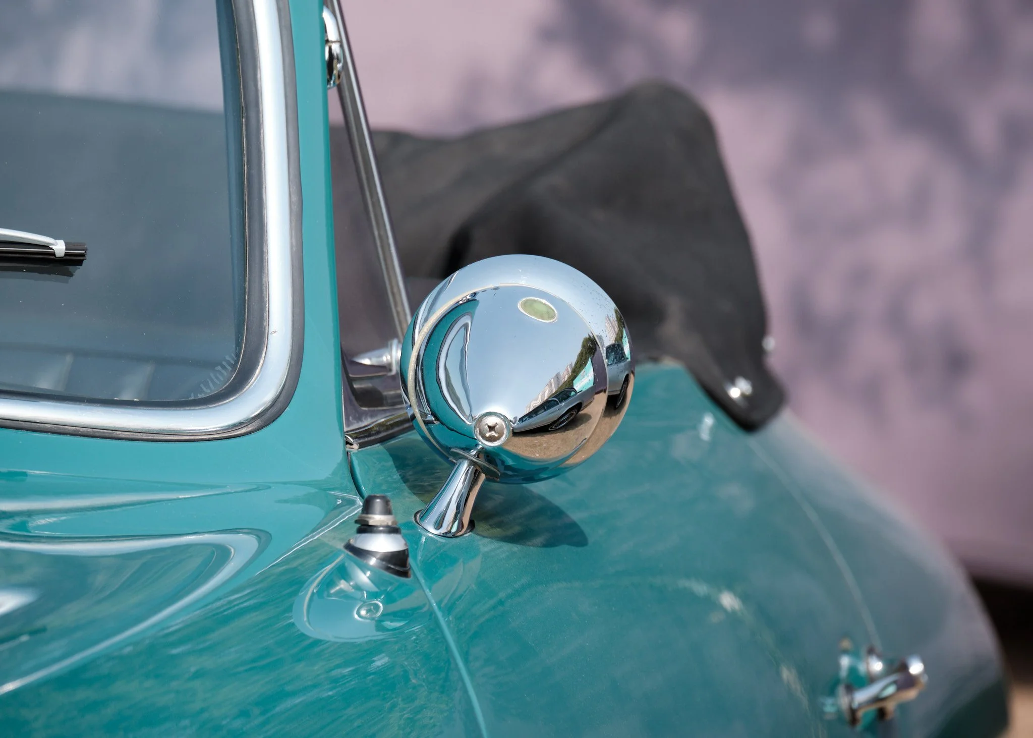
Vintage Car Show Karachi 2024

I happened to be in Karachi for this year’s Vintage Car Show so I brought along my camera and took a few photos.

These are my two favourites. The rest I’ve included in galleries below, which means you’ll have to click each one to see its full, non-square-cropped version.

Favourites

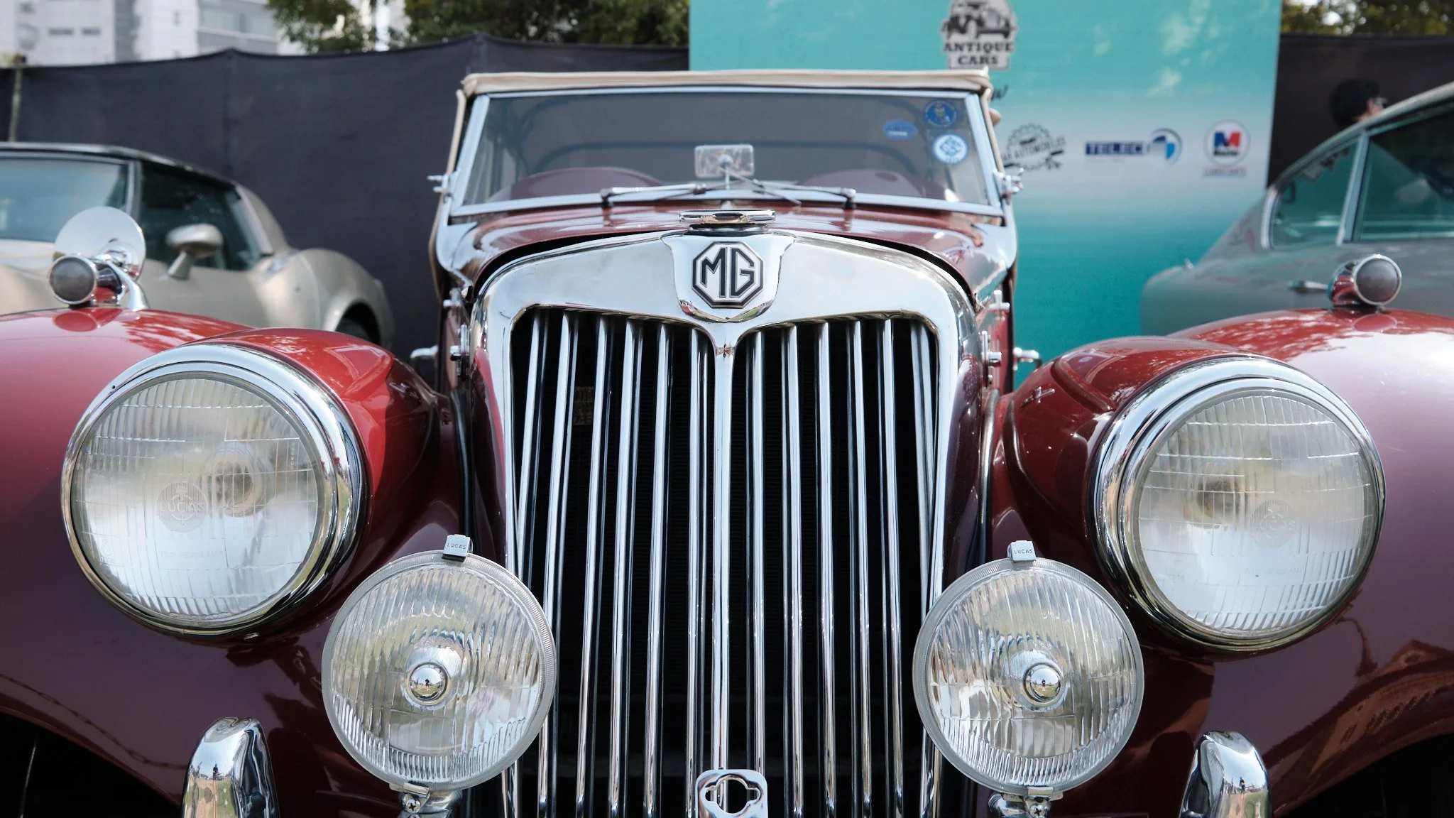
Headlamp

Close-up photo of a headlamp of a silver coloured classic car.

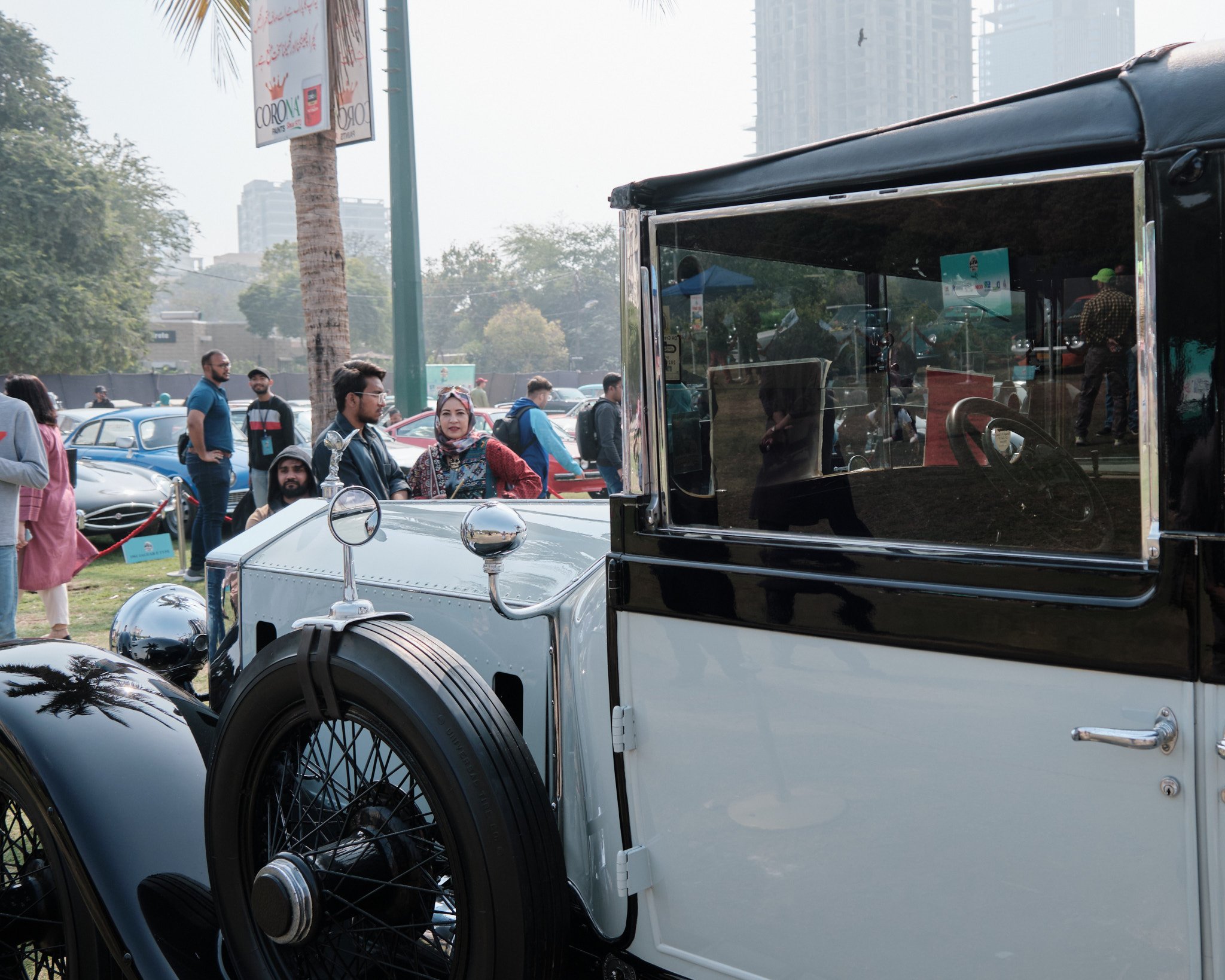
Rolls Royce tyre and visitors

Photo of the front-left tyre of a classic Rolls Royce car. In the background of the photos are two preteen children looking at the various cars on display at this car show.

Cars

Hood ornaments and logos

Zooming in on details

Location and visitors

Trip to Pakistan 2024: places

I’m an aviation geek. That means I don’t just take photos of people, I also take photos of the places I go to. Or, well, go through :)

Melbourne Airport

Ground staff member waiting for the luggage containers to turn up

Photo of an airport apron that has a wide-body aircraft parked on it. The aircraft is in the process of being loaded with catering supplies. A roller ramp has been parked to the side of the aircraft. A member of the ground staff is sitting on the corner of this roller ramp, waiting for the luggage containers to arrive so they can be loaded into the aircraft hold.

The Etihad Boeing 777 that flew us from Melbourne to Abu Dhabi

Wide-angle photo of a wide-body Boeing 777 aircraft parked at the gate of an airport terminal.

Abu Dhabi Airport

This corner of Terminal A at Abu Dhabi Airport is quite empty at 2am

Wide-angle photo of large, high-ceiling, shiny, brand new airport terminal building. One one side of the building are windows that go from the ground to the fourth floor. From the angle the photo is taken you can see parts of all four floors, all of which are connected by escalators and elevators.

Waiting at at empty departure gate at Abu Dhabi Airport Terminal A

Photo of a large, heigh-ceiling, mostly empty airport departure gate. This section of the building is at least two storeys high, with a wide, elevated walkway running through the centre. In the departure are are several round-backed single-seater sofas for waiting passengers to sit on.

Walnut crescent cookie shaped lights at Abu Dhabi Airport Terminal A departure gates

Wide-angle photo looking up at a large, crescent shaped, white-and-cream coloured light fixture. This light fixture is mounted on a tall pillar along a first-floor walkway in a high-ceiling airport terminal building.

Walnut crescent cookie shaped lights at the new Abu Dhabi Airport Terminal A

Photo looking up at a large, crescent shaped, white-and-cream coloured light fixture. This light fixture is mounted on a tall pillar along a first-floor walkway in a high-ceiling airport terminal building.

Etihad Airways Airbus A320 aircraft taxiing to its gate at Abu Dhabi Airport

This was the Airbus A320 that flew us from Abu Dhabi to Karachi.

Photo of a narrow-body Airbus A320 aircraft in Etihad Airways livery taxiing to its gate.

Airbus A320 approaching Abu Dhabi Airport Terminal A gate 640

Photo of a narrow-body Airbus A320 aircraft in Etihad Airways livery slowly approaching a terminal boarding gate.

Airbus A320 getting settled at Abu Dhabi Airport Terminal A gate 640

Photo of a narrow-body Airbus A320 aircraft in Etihad Airways livery parked at a terminal boarding gate. The passenger boarding bridge (aka air bridge) from the terminal is in the process of being extended towards the front-left door of the aircraft and there are several ground operations team members walking around below the aircraft. And ‘Airside Operations Leader’ car is parked in front of the gate at which this aircraft has parked.

The Boeing 787 that took us from Abu Dhabi to Melbourne

Photo taken through large floor-to-ceiling windows of an airport terminal building of a wide-body aircraft in Etihad Airways livery parked at a gate. In the background you can see the airport’s weather radar and control tower.

The Boeing 787 that took us from Abu Dhabi to Melbourne

Photo of a wide-body aircraft parked at an airport gate. It is connected from its left side to the terminal building via a passenger boarding bridge (aka air bridge). On its right side luggage is being loaded onto it. In the background are the other terminal buildings of Abu Dhabi Airport Terminal A.

Karachi Airport

Heading from Karachi to Islamabad

Photo of an airport apron taken from inside a passenger boarding bridge (aka air bridge). The gate next to this one is empty.

Islamabad Airport

The Fly Jinnah Airbus A320 that took us from Islamabad to Karachi

Photo of a narrow-body Airbus A320 aircraft in Fly Jinnah livery parked on the apron at an airport. Several ground staff are walking around the aircraft, getting it ready to start deplaning its passengers and cargo.

Trip to Pakistan 2024: people

Nadia and I took three weeks off to go visit friends and family in Pakistan. Naturally I took several photos as we travelled from one place to the next :)

Selfie at Melbourne Airport before heading off on our holiday

We had an almost-10pm flight out of Melbourne, so we had dinner at Melbourne Airport right after we checked-in.

Selfie of a man and woman, both wearing black t-shirts, backpacks, and face masks, standing in an airport terminal.

All set to fly from Melbourne to Abu Dhabi

Neither of us minds having seats near the bathroom and neither of us minds sitting right at the back of the plane, so we picked seats in the second-last row of this Boeing 777 since that row has just two seats on the window side :)

Selfie of a man and woman, both wearing black t-shirts and face masks, seated in an aircraft. The two are giving a thumbs-up to the camera.

Selfie along the C-gates arm at Abu Dhabi Airport Terminal A

Abu Dhabi Airport’s brand new Terminal A is quite roomy (having been built for future growth) and is a surprisingly comfortable place to hang out for a ten-hour layover.

Selfie of a man wearing a bright orange jacket standing in the middle of a long terminal corridor, between gates C28 and C29.

Selfie to celebrate our arrival at Karachi Airport

Yay Karachi!

Selfie of a man and a woman, both wearing black t-shirts and face masks, standing next to their luggage at the international arrivals gate of an airport.

Ready for the first of our three flights back to Melbourne, this one from Islamabad to Karachi

It took us almost forty hours to get back from Islamabad to Melbourne (via Karachi and Abu Dhabi). This was the start of our first leg.

Selfie of a man and a woman, both wearing black t-shirts and face masks, seated inside an aircraft cabin during boarding.

Ready for the second of our three flights back to Melbourne, this one from Karachi to Abu Dhabi

This was the start of our second leg, waiting in the international departure lounge.

Selfie of a man and a woman, both wearing black t-shirts and face masks, seated in a departure lounge at an airport.

Waiting for breakfast at Abu Dhabi Airport Terminal A

This is towards the end of our twelve hour layover in Abu Dhabi.

Photo of a woman, wearing a black hoodie and face mask, leaning on a restaurant table in an airport. Behind her is a floor-to-ceiling window that looks out onto and airport terminal apron.

Selfie before boarding our flight to Melbourne

We’re making sure to stretch our legs and stand as much as we can before our non-stop, thirteen hour flight to Melbourne.

Selfie of a man and a woman, both wearing black tops and face masks, standing in a departure lounge at an airport.

Ready for the third of our three flights back to Melbourne, this one from Abu Dhabi to Melbourne

All aboard and ready to boogie (aka sleep) on this lovely Boeing 787 (yay!).

Selfie of a man and a woman, both wearing black t-shirts and face masks, seated inside an aircraft cabin during boarding.

We hadn’t been back to Pakistan since late 2019, so this trip was very much overdue and it was a great way to start the year.

The life of Maggie: walking and napping

Time to share a few photos of Maggie I’ve taken over the last few weeks. (You’re welcome.)

Turning a corner

Photo of a red/brown dog walking down the residential footpath, with just its head and one if its forelegs visible from around the corner of a fence.

Comfortable afternoon nap

Photo of a red/brown dog asleep on its side in a dog bed that’s lying in a carpeted room.

Ready for her daily walk

Photo looking down at a red/brown dog wearing a black and red harness. The dog has its nose to the front door of a house, waiting for it to open so she can run out.

20th anniversary

On 1 February 2004, Nadia and I got married at the Serena Hotel in Islamabad, Pakistan.

Twenty years later we went back there to take a couple of selfies :)

Selfie of a man and a woman in their forties standing in a nook in a hotel lobby.

Selfie of a man and a woman in their forties standing outside a large hotel.

Later that day we celebrated with food and, importantly, with cake.

Photo of a man and woman in their forties standing in a dining room along one corner of a large, rectangular dining table. In front of them is a caramel cake with “Happy Anniversary Nadia & Ameel” written on it. The woman is holding up the large knife with which she is going to cut the cake.

That cake, while delicious, wasn’t quite as fancy as the one we cut at our actual reception.

Photo of a man and a woman in South Asian wedding attire surrounded by their families on their wedding day. The couple are in the process of cutting a large, fancy cake that’s been placed on a table in front of them.

Nor did we make a meme out of the cake-cutting, like we did for our tenth anniversary :)

Photo of a man and a woman in South Asian wedding attire surrounded by their families on their wedding day. The couple are in the process of cutting a large, fancy cake that’s been placed on a table in front of them. The couple and several of their family members are laughing at a joke that’s just been told by someone off-camera. Written in Comic Sans font across the photo in a seemingly haphazard fashion are several phrases in broken English that represent a kind of inner monologue. This type of internet meme, known as Doge, was popular in 2013 and 2014. These phrases are “so marriage”, “much decade”, “giggle”. “wow”, “many love”, “very bliss”, “caaaaake”, “10/10 would marry”, and (bizarrely) “once even flow alive why go black jeremy oceans porch garden deep release” (which is the song list from Pearl Jam’s debut album, ‘Ten’, in case you’re wondering).

20 years later

The last time we were at the Serena Hotel in Islamabad we were dressed, well, a little differently :)

Collage of two photos, on above the other. The first photo, dated 1 Feb 2004, is of a man and a woman seated on stage and dressed in traditional Pakistani wedding outfits. The second photo, dated 1 Feb 2024, is of the same man and woman taking a selfie in a hotel lobby.

Happy 20th wedding anniversary Nadia!

One year with a mirrorless camera

Here’s what I’ve learned after owning a mirrorless, interchangeable-lens camera for just over one year. (I got my camera on Boxing Day 2022 but didn’t start taking any decent photos will it till at least the middle of January 2023.)

This is based on the 438 share-worthy photos I uploaded to Flickr in 2023.

Photos I like taking

Aside from typical life and event/travel photos, I seem to like taking photos that tell micro stories of people and places. I do this mainly through three types of photos…

Interesting everyday

These are photos looking up, down, and around at things you stop noticing when you live somewhere for a long time. These are architectural photos, photos of objects, or photos of people going about their lives doing things I find interesting.

Looking up along light tower 5 at Melbourne Cricket Ground. Photo looking straight up along the side of a large, white, stadium light tower on a partly cloudy day.

Questions about people

These are photos that make you wonder what the person/people in the photo are doing, thinking, or talking about.

Tourists checking out Melbourne’s office-building architecture. Photo of a couple standing on the other side of the road from the photographer. They have their arms around each other and are looking up at the top of a building across the street from them. A green-and-white tram is about to cross in front of them.

Atmosphere

These are photos that (hopefully) communicate the vibe of the place in which I took the photo or maybe what I was feeling when I took it.

I want to touch the nose again! (Avalon Airshow 2023). Photo of a man at an airshow carrying a little boy in his lap (presumably his son). The man is standing next to the nose of a military transport aircraft. Next to the man is a little girl (presumably his daughter) who wants to be picked up so she can touch the nose of the aircraft again.

Most frequently used focal lengths

When I wasn’t doing my ‘one focal length at a time exercise’, my favourite focal lengths were 27mm, 85mm, and 345mm. These represent both extremes of my two zoom lenses: 27-85mm for my main lens and 80-345mm for my second lens. The 85mm bar in the chart below covers the 80-85mm range where my two lenses overlap, and so that’s why this bar is the longest.

Graphic titled ‘Focal length usage 2023 (full-frame equivalent)’. Below this is a chart titled ‘Normal zoom-lens usage’ that shows a bar chart with bars ranging from 27mm to 300-345mm. The three longest bars in this chart are for 85mm (28% of all photos), 27mm (23%), and 300-345mm (11%).

What have I learned from this?

  • 27mm end: I like taking architectural photos (the wide angle helps you capture more of the building/location) and I often like taking photos that capture the context around my primary subject (eg their location or where they’re headed). Also, in the early days I was still getting used to composing good shots with my new camera, so I would do a looser composition while taking the photo and then crop-in later during editing.

  • The other ends: I like to zoom in on specific parts of architecture (like the tops of buildings) and I like to simplify my photographs by isolating my subjects within the frame (so it’s easier to focus on the specific object or the person I’m photographing).

Part of the point of the ‘one focal length at a time’ exercise I did over October-December 2023 was to force me to get away from these extremes and try the most popular intermediate focal lengths instead.

Graphic titled ‘Focal length usage 2023 (full-frame equivalent)’. Below this is a chart titled “‘One focal length at a time’ exercise” that shows a bar chart with bars ranging from 27mm to 85mm. The two longest bars in this chart are for 27mm and 40mm (both at 27%). This is followed by 50mm (19%), 85mm (18%), and 35mm (9%).

Aside from all the creative learning I did during my ‘one focal length at a time’ exercise, I learned that 27mm and 40mm are the focal lengths at which I am the most successful (and comfortable shooting). That’s why, when I do buy an everyday-carry prime lens, those are the two I’ll get first (starting with 40mm).

Where to from here?

The end of the year is a good time for reflection and learning, and it’s been fun going through all the photos I’ve taken this year. Importantly, I noted how I improved as a photographer over the last twelve months and what I still need to get better at.

In 2024 I’m going to keep doing what I’m doing right now: taking regular photo walks in and around Melbourne and photographing life, events, and travel. I have a lot of experience to gain and still plenty of incremental improvement to do before I start to plateau both creatively and skill-wise.

So here’s to another fun year of photography!

2023 Boxing Day test at the MCG

Since moving to Australia in 2006, this is only the second time that Pakistan has played Australia in the Boxing Day Test at the MCG.

Nadia and I attended day three of the last test match, back in 2016.

Photo of the grounds at a massive cricket stadium, taken from an under-cover seat some distance away from the field.

This year I attended day one of the match with a bunch of family friends.

Selfie of four people seated in a row at a cricket match, three of whom are wearing Pakistan cricket team gear.

Here are some of the photos I took while I was there.

Lots of ways to get to Melbourne Cricket Ground

Photo of a sign post at the Melbourne Cricket ground showing the walking time and distance (in kilometres) from this post to Jolimont Railway Station, tram routes 48 and 75 along Wellington Parade, Flinders Street Railway Station, tram route 70 along Swan Street, and Richmond Railway Station.

Train tracks between the MCG and Melbourne & Olympic Parks

Photo taken through a wire mesh fence of half a dozen train tracks running between where the photographer is standing and several buildings and sports centres on the other side. A blue-and-yellow Metro train is running along one of these tracks. A covered, elevated walkway runs above the tracks.

Welcome to the Boxing Day test

Photo of an entry gate at Melbourne Cricket Ground, which about two dozen people waiting in short queues to get through security and ticketing. A large digital sign above the gate reads, in all capital letters, “Welcome to the boxing day test”.

Qantas Choir getting ready to sing the Australian national anthem

Photo of three rows of young women, all wearing an identical uniform of black shoes, black pants, and cream coloured tops, standing in choir formation inside a massive cricket stadium.

Qantas Choir singing the Australian national anthem

Photo of three rows of young women, all wearing an identical uniform of black shoes, black pants, and cream coloured tops, standing in choir formation inside a massive cricket stadium. On the other side of the large ground are the cricket players standing next to their respective country flags.

Cricketer Shaheen Afridi warming up before his bowling spell

Photo of a male cricket player, wearing an all-white kit, jumping in the air as part of his warm-up routine.

Cricketer David Warner batting

Photo of a male cricket player, wearing an all-white kit, standing at the crease and ready to face ball that is being bowled to him.

Young Pakistani supporter

Photo of a young boy in a while t-shirt and a green coloured Pakistan team hat watching a cricket match.

Cricketer Shaheen Afridi bowling

Photo of a male cricket player, wearing an all-white kit, about to release the ball he is bowling.

Melbourne Cricket Club Members Reserve stand

Photo of four tiers of cricket stands, each with a café, bar, or corporate suites behind them. A large sign on one of these seating tiers reads, ‘Melbourne Cricket Club’.

DJ Ash bringing the music to the MCG outfield

Photo of a male music DJ standing at his console while he chats to a man dressed in a bright, multi-coloured ‘Squad Pakistan’ shirt with a large dhol slung across his back.

Karachi Street Food stall outside the MCG

Photo of an outdoor food stall set up in a large garden. A sign above the stall reads, in all capital letters, ‘Karachi street food’. There are several people milling around the food stand, and a line to the food stand extends off-camera.

Long lunch-time line for the Karachi Street Food stall outside the MCG

Photo of an outdoor food stall set up in a large garden with picnic tables placed around it. A sign above the stall reads, in all capital letters, ‘Karachi street food’. A stall in the background has a sign that reads, ‘Sugarcane Juice’. There are several people standing in the garden, and a long line of people queuing at the food stand extends off-camera.

Light towers at Melbourne Cricket Ground

The light towers at Melbourne Cricket Ground are as iconic as the stadium itself, and this month marks 39 years since they were first installed and switched on.

Light tower 1

Photo looking up at the top of a large, stadium light tower on a partly cloudy day. The trapezium-shaped array of powerful lights has been placed on a thick, white coloured tower that has the number 1 written on it.

Light tower 5, next to the Ponsford Stand

Photo looking up, along the side of a massive sports stadium, at a light tower on a partly cloudy day. The tower has the number 5 written on it.

Seats, lights, and flags

Photo looking almost straight up along the side of a sports stadium. In the left of the photo is the underside of a seating stand (the Ponsford Stand), in the centre is a tall light tower, on the right (at the very top of the stadium wall) is a set of five flagpoles with various flags on them.

Looking up along light tower 5

Photo looking straight up along the side of a large, white, stadium light tower on a partly cloudy day.

Light tower 2

Photo of a stadium light tower taken from inside a sports stadium. A large number 2 is written at the top of the light tower. In front of this tower is the top of the stadium, on which there are flags flying on five flagpoles.

Maggie, around the house

Maggie is enjoying the return of summer. She has arthritis so she needs to be warm, and she she’s always loved soaking up the sun. I think her bones also appreciate the memory-foam dog bed we have for her our living room.

Scratching her back after napping in the sun

Photo, taken through a window pane, of a red/brown dog in a residential garden. The dog is twisting around in the garden, all four legs up in the air, while she scratches her back on the dirt and grass.

Fast asleep after her morning walk

Photo of a red/brown dog fast asleep in a large grey coloured dog bed on the floor of a living room. The dog's face is smushed into a blanket lying on one side of the dog bed.

Blearily noticing that I just took her photo

Photo of a red/brown dog in a large grey coloured dog bed on the floor of a living room. The dog is looking blearily into the camera because she has just been woken by her photo being taken.

When she is tired but still follows you from room to room, so you pee with the door open

Photo of a red/brown dog lying on her side, with her head right in front of an open bathroom door. The photo is taken from inside the bathroom.

When we got Maggie all those years ago, we’d take her for hour-long walks every day and she’d still have an endless supply of energy afterwards.

As she got older, she’d start to get tired after forty-five minutes of walking, so we dropped her walk time down to thirty-ish minutes.

These days she still has the mental enthusiasm for half-hour walks, but if we walk for too long in one go, her body pays for it the next day. So we’re now down to fifteen-ish minute walks every morning; with maybe a five or ten minute walk in the evening if she’s up for it.

Not that she minds. She still loves walking through our neighbourhood and foraging for whatever she can eat. But she’s become a lot more chill as she’s gotten older, with fewer fucks to give about the world. And, as long as she knows where we are, she’s no longer in a mad rush to follow us from room-to-room as we move around the house. Unless it’s nearing her walk time or dinner time, of course, in which case she’ll make her presence know no matter where we are and what we’re up to! But otherwise she’s content with her slower pace of life.

Saturday brunch with Nadia

In all of 2023 I think Nadia and I went out to brunch maybe just three or four times. The last time we went, I took a couple of photos :)

Saturday brunch selfie

Selfie of a man and a woman standing by the side of the road. Both are wearing wide-brimmed hats and both are smiling at the camera. The woman is wearing sunglasses and a blue dress. The man is wearing a black t-shirt with blue lettering on it.

Reading the menu

Photo of a woman seated at a café, looking down at a menu that is lying on the table in front of her. The woman is wearing a blue dress and has her sunglasses pushed back onto the top of her head.

Noticing that I just took her photo

Photo of a woman seated at a café, with a menu lying on the table in front of her. The woman is wearing a blue dress and has her sunglasses pushed back onto the top of her head. She is looking up at the photographer because she has just noticed that he had his phone up to take her photo.

Here’s to more bunches in 2024!

[Photo walk] Lonsdale Street (40mm only)

This week I concluded my ‘one focal length at a time’ exercise with a repeat of shooting at only 40mm (which is 26mm on my mirrorless, APS-C camera).

I can now confirm that the first pancake prime lens I will get for myself will indeed be a 40mm one. When I’ll actually go out and get this, I don’t know. But at least I know where I’m going to start :)

Here are the photos I took during my last photo walk of 2023.

Three flights down to Village Street, Docklands

Black-and-white photo of a set of stairs leading down to a street that is three storeys below where the photographer is standing. This staircase is built into the side of the building, with the lowest flight of steps inside the rectangular columns of the building. A woman carrying one large bag and several smaller ones is walking on the pavement that runs along this street.

The curves of the Mövenpick Hotel Melbourne building

Photo looking up from the ground of a very tall, blue-glass covered building. The building has rounded edges and two large curves along its length on either side, making it look somewhat like a fancy water bottle.

Mural at one corner of 246 Spencer Street, Melbourne

Photo of a large, four-storey high, spray-paint mural in several shades of blue. The anime-ish style mural shows an image of a woman with long hair, large eyes, and full lips manipulating energy fields. She has formed a swirl of light in her left hand and there are bits of rock and swirls of more solid looking energy rotating around her face.

Mural at the Lonsdale St corner of 246 Spencer Street, Melbourne

Photo of a large, four-storey high, spray-paint mural in several shades of yellow and pink. The hyper-realistic mural shows an older man and woman, both with white hair and wrinkled, slightly droopy faces. The man has is arm around the woman's shoulder. Both figures are looking straight across the street and, in this case, directly at where the photographer is standing.

Not where I expected to see this argument take place!

Photo of a boarded-up window with the top of a mostly torn off music posted still stuck to it. Several different people have scribbled things on the wooden board in red and black marker. These include text in all-capital letters that reads “anarchy rules”. Below this is a Christian cross with the words ‘remorse’ and ‘pain’ written on it, with text close to this that reads “one rule is pain, the other rule is remorse”. Next to that is a crown with a number ‘666’ written below it and text that reads “eighth and last link to walk this earth”. Two pieces of text in black marker have been crossed off. The first, written below the cross, reads, “The fucking cross you fucking Christians were suppose(d) to bear!!”. The second reads, “We are the Anti Christ and we don’t fuck your children. So can anyone explain Christianity to us? So fuck them, just not with my dick!!”. Written below these crossed-off bits of text is the phrase “Jesus loves you” and a heart symbol. This is repeated on the other side as well. Also written there is “Choose love”, with a heart symbol instead of the word ‘love’. The final bit of text along the top, seemingly in response to this back-and-forth, reads “Have a nice day and do it your way”.

EzyMart is not going to run out of candy anytime soon

Photo looking through the open doorway of a glass-fronted convenience store. Arranged on one entire wall along the side of the store are hundreds of candy packets and bars.

And just how is that working out for y'all, hmmm?

A simple, text-only advertisement painted along the windowless side of an eight storey building. The large, all-white lettering reads, “Create your life’s work”. Below this is the WeWork logo and the text “established 2010”.

This was the first time I’d walked down Lonsdale Street in the CBD to take photos. By restricting myself to shoot at only 40mm I was immediately frustrated by not being able to take good architecture photos, and I take a lot of those types of photos. I guess what I’m saying is that the second prime lens I’ll get will likely be the 27mm pancake prime :) Hopefully I’ll be able to get both in 2024. I guess we’ll see!

Random photos from around the city

I wasn’t able to go on a photo walk this week, so here are some photos I took on my way to various places in the city.

Taking a nap at Federation Square

Photo of a middle age man asleep on a deck chair in a large, outdoor, brick-and-marble, public square. There are people sitting in other deck chairs placed around the square as well.

Looking down into City Hatters, below Flinders Street Station

Black-and-white photo looking down a steep, slightly curved flight of steps that lead to a shop front. Through the open doorway of this glass-fronted hat shop you can see a salesperson adjusting a hat while standing at the payment counter.

Reading a informational brochure on a bus

Black-and-white photo of a man sitting on a bus a few seats in front of the photographer. The man is reading a large, two-page informational brochure which, on the left hand page, has the title “Key benefits of the design”.

City Circle tram in Docklands

Photo of a classic Melbourne tram, with its distinct green-and-yellow livery, waiting at a stop light. A sign painted on the front reads, “City Circle Tram, Melbourne” and shows the number 35 as the tram’s route number. The tram is on a pair of tracks that run parallel to a curving roadway.

I also didn’t get the chance to shoot at a focal length of only 40mm this week. I’ll try to do that next week.

[Photo walk] Southbank, Melbourne (85mm only)

This is my second week of shooting at only 85mm (which is 55mm on my mirrorless, APS-C camera). It was super hot (approaching 32 degrees) when I went out to take these photos, which is why I took a handful.

Cool AF backpacker chilling in the sun

Photo of a middle-aged, dark-skinned man with silver-grey hair styled into a short, soft mohawk with buzz-cut sides. The man is sitting on a long bench next to a tall hedge in an urban park. He is leaning forward, elbows rested on thighs, as he reads a newspaper that he is holding in his hands. On the ground next to him is a large, professional hiking backpack that is full with his gear.

Sir Charles Hotham Hotel building

Photo of the round, domed tower at the corner of a dilapidated, four storey, 111 year old building. The pale yellow paint on this building is cracked and peeling. Long-since faded paint on the side the building reads, “Sir Charles Hotham Hotel”.

Sweep rowing training on the Yarra River

Photo of four sweep rowers (in which each person holds only one oar with both hands) and their coxswain rowing along an urban river. Riding on a motorboat alongside them with a megaphone in their hand is (presumably) their trainer.

Crown Towers Melbourne, as seen through The Guardians artwork

Photo of the top of the Crown Towers building seen through a large ceramic ring that is part of some artwork on the ground floor outside. The artwork in question is ‘The Guardians’ (2000) by local artist Simon Rigg.

Office corners on a Friday afternoon

Close-up photo of the corner of an office building, with two of the floors in frame. On one floor there are tables and chairs set along the windows. On the other floor is an empty, darkened corner office with a large Dyson air purifier visible through the window.

This was the last formal step in my two-and-a-half-month long ‘one focal length at a time’ exercise. Woohoo!

Next week I’ll repeat shooting at only 40mm. If I’m still happy with that focal length, then the first pancake prime lens I get will be a 40mm one. This’ll be great for street, travel, and everyday photography. Especially since it’ll make my camera kit small enough to carry around with me pretty much everywhere I go.

And then I sit and wait till I get a get a good deal on a new (or used) Fujifilm XF 27mm F2.8 R WR lens. Or I just get the TTArtisan AF 27mm F2.8 third-party lens for my Fujifilm camera. I guess we’ll see how things go.

Why the excitement?

You’re probably amused by how excited I am about finally being able to use Chaparral on this website (the typeface, not the California shrubland ecoregion the typeface is named after).

I get it. Most people aren’t typeface nerds.

So I thought I’d explain how, ever since I stopped using ‘web safe’ typefaces when I moved to the Squarespace platform in 2013, I’ve been wanting to use Chaparral for this website’s body text.

But then I realised that, instead of telling you, I could show you.

Here are all the site-header images I’ve created for insanityworks.org since I migrated it to Squarespace. Even the first header image I created was an attempt to use the closest alternative to Chaparral available at the time.

Graphic titled ‘Journey to using Chaparral on my website’. The graphic shows five site-header images that have the phrase “Insanity Works” in white text overlaid on a photo. Each of these images uses a different typeface, and most of the images have a call-out pointing to them. The first image (from 2013) uses the Coustard typeface and its call-out reads, “1. Coustard was one of the early alternatives to Chaparral that I tried (note the similarities)”. The second image (from 2014) uses Oswald and its call-out reads, “2. Switched to using Oswald (the headings typeface) instead”. The third image (from 2019) uses Merriweather Sans, but has no call-out and the typeface name as the word ‘Test’ written next to it. The fourth image (from 2019) is in Merriweather and its call-out reads, “3. Tested the sans option, but then settled on the original (serif) Merriweather”. The fifth and final image (from 2023) is in Chaparral and its call-out reads, “4. Finally able to use Chaparral!”.

Basically, this whole decade has been a journey to Chaparral. And after ten years of wanting to do something, I am finally able to do it. That is why I am so excited to be where we are now :)

Happy days!

The last twenty-four hours have been very exciting for me. At least in terms of typography.

That’s because, years and years after falling in love with the Chaparral typeface, I finally get to use it on my website! That and Myriad, which is the typeface I’m now using for the headings and navigation.

Wait. Something changed?

Before today I was using the excellent Merriweather for this website’s body text and Oswald for the headings and navigation.

Both those typefaces are free and open-source, and both are available through Google Fonts – which is the font collection you could pick from when building a site on Squarespace (the platform this website is running on).

Graphic showing two blocks of text side-by-side. The block on the left has the heading ‘Old’ and uses the Merriweather (body text) and Oswald (heading) typefaces. The block on the right has the heading ‘New’ and uses the Chaparral (body text) and Myriad Condensed (heading) typefaces.

I’d always thought about updating the typefaces on this site, but (a) I love Merriweather and (b) I didn’t want to go through the hassle of trying to see if there was anything better than Merriweather on Google Fonts.

Then last night I discovered that Squarespace now offers the full suite of Adobe Fonts to choose a typeface from, and so here we are :)

The decision about which typeface to use for headings and navigation was pretty easy too. I had a bunch of good options to choose from, like Proxima Nova, League Gothic, Brandon Grotesque, and Alternative Gothic (which both Oswald and League Gothic are reworkings of, by the way).

I ended up going with Myriad because (a) it’s a gorgeous typeface (basically a copy of Frutiger) and (b) both Myriad and Chaparral were created by Carol Twombly (in 1992 and 2000, respectively) when she was a type designer at Adobe. As you can see from the graphic above and, indeed from this website, the two pair really well.

Why is this a big deal to me?

This change in typeface is noteworthy because the only reason I started using Merriweather in the first place was because it is the closest free, high-quality alternative to Chaparral that was available on Google Fonts all those years ago. But now I get to use the typeface I wanted to use all along!

I am particularly pleased that, with just this small change, the vibe of this site has gone from “modern and sturdy, but also warm and readable” to “subtly classy, but also friendly, lively, and readable”.

Yay!  

Happy 10th birthday to Maggie!

When we adopted Maggie in 2016 we were told she was probably two-and-a-half to three years old. And since we needed to nominate a date of birth for her registration, we ended up picking 5 December 2013.

So, at least according to that guesstimate, our now-not-so-little Maggie is ten years old today. Happy birthday!

Here she is making the most of her middle-agedness:

Photo of a red/brown dog fast asleep on her side in a round, fuzzy, orange dog bed. One back paw and one front paw is sticking out over the edge, and the dog’s head is also resting on the edge. The bed is lying in the corner of a carpeted room.

Red heelers like Maggie tend to have a 12-15 year lifespan, though healthy, well cared for, non-working heelers can easily live for 18-20 years. So we have many, many years with her yet.

That said, here’s a side-by-side comparison of how much greyer her muzzle has gotten over the years. ❤️

Nadia and I have gotten greyer over the last decade too, of course, so we’re all a happily middle aged family now :)

[Photo walk] Collins Street, Melbourne #3 (85mm only)

We’re on the final stage of my ‘one focal length at a time’ exercise. That means this fortnight I am shooting only at 85mm (which is 55mm on my mirrorless, APS-C camera).

I like shooting at 85mm because part of what I enjoy doing is capturing specific aspects of the world around me, and this focal length lets me zoom in to isolate the thing I want to highlight.

In this particular photo walk I focused on both people and a building details. The advantage of this focal length, of course, is that you can take photos of people from further away without ‘bruising the scene’ (ie without them noticing you and stopping doing whatever interesting thing they were doing that made you want to take their photo in the first place). Is taking photos like this somewhat voyeuristic? Yes, it is. But as long as you’re not being a creep or an asshole about it, I think it’s okay. I, for example, only take photos of people doing things that I wouldn’t mind being photographed doing myself. Most of the time this is just standing around in a public place.

Here are the photos I took.

Early dinner while stuck in traffic on Collins Street, Docklands

Photo of a man wearing a yellow high visibility vest and an orange turban sitting the the drivers seat of a large, white panel (delivery) van. The van is stuck in bumper-to-bumper traffic and so the man is using a fork to eat something out of a glass storage bowl on his lap.

Grey building reflecting a grey sky

Photo looking up to the top of a very tall, blue-glass covered building. Because the sky is grey and overcast, however, the windows are looking blue-grey instead. The building has rounded edges and two large curves along its length, making it look like a fancy water bottle.

Taking the time to smoke before heading into Southern Cross Railway Station

Photo of a man with pale blonde hair and a long, white beard sitting on a concrete bench outside on the footpath outside a large building. The man, who is wearing dark clothes and shoes, is holding a cigarette up in his right hand. In the background a woman is walking down the footpath.

Tram line inspectors heading to a job along Collins Street

Photo of two people in safety work wear (blue pants with reflective stripes, orange high visibility top with reflective stripes, white hard hats, and safety glasses) standing on top of a retracted scissor lift that’s been built on to the back a large truck. The truck is white and is covered in a Yarra Trams decal. The truck has just crossed an intersection and is proceeding along a tram track running down the centre of a road.

Triple denim, waiting on a bench

Photo of a young woman wearing blue denim jeans, a grey denim jacket, and a grey denim cap sitting on a long wooden bench outside a large building. She has a metal water bottle lying next to her. She is wearing wireless earbuds and is looking down at her phone.

It’s been a long week

Photo of a man wearing blue pants, yellow hoodie, and grey cloth cap who is sitting on a long wooden bench outside a large building. The man has a duffel back by his side and is leaning forward, head down and elbows on his thighs, looking very tired.

Heading out for Friday evening social event

Photo of four people waiting at the pedestrian crossing at an urban intersection. The two men are dressed in dark pants and untucked casual, button-up shirts. One woman is in a long, checkered dress in shades of brown. The other woman stands out because she is in a shorter, frilly, flower-patterned, blue dress.

Waiting for someone while while wearing the Melbourne uniform

Photo of a woman wearing the Melbourne uniform: black boots, black pants, black shirt, and black puffer jacket. The woman is looking down at her phone while waiting outside the steps leading up to an office building.

Keeping physiotherapists employed

Photo of a young man wearing sneakers, blue jeans, and a cream coloured t-shirt sitting on a large, black-painted concrete block outside a building complex. The man is hunched over as he looks at the smartphone he is holding in his hand.

Happy couple heading out for an evening in Melbourne

A woman and a man are walking down a footpath in a city centre with their arms on each others’ backs. They are wearing matching rings on their right ring fingers. In the background of the photo is a flower shop on the wide sidewalk.

Tourists checking out Melbourne's office-building architecture

Photo of a couple standing on the other side of the road from the photographer. They have their arms around each other and are looking up at the top of a building across the street from them. A green-and-white tram is about to cross in front of them.

Stained glass window of the 'Gothic Bank' in Melbourne

Photo of a round stained glass window with an interior seven-petal shape carved out of brownstone. The front façade and spire of this ornate, gothic-revival style, brownstone building is being seen through a gap in the trees across the street.

Front façade of the 'Gothic Bank' in Melbourne

Photo of the front façade and spire of an ornate, gothic-revival style, brownstone building that is being seen through a gap in the trees across the street. The year 1890 is carved into a shield at the top of the central spire.

Taking a selfie in front of Flinders Street Station in Melbourne

Photo of a man and a woman standing in the crowd in front of the steps of a train station. The man has is hand raised as if he has just taken a selfie of the two of them.

Next week I’ll continue shooting at 85mm, and after that I’ll probably repeat a couple of earlier focal lengths.

Since I’m doing all this to potentially buy myself a compact prime lens in this year’s Boxing Day sales, I think I’ll spend the last two weeks before Christmas back at 27mm and 40mm. Those are the two focal lengths at which Fujifilm sells compact primes.

Happily, I really enjoyed shooting at those focal lengths. So if I am going to buy one of those lenses this year – assuming the sale price is good enough or I can get them second-hand – then I should repeat those two to see which one I should go for first.

My favourite typeface pairings

Having talked about my favourite typefaces, I figured I’d also talk about how I pair those typefaces when using them in various projects.

Here I’m talking mostly about pairing body text and heading typefaces for reading (like on websites or in PDFs) and for writing (like when writing blog posts like these in Microsoft Word).

How do you pair typefaces?

Select your body text typeface and then for the heading typeface choose between harmony and contrast…

Harmony

  • Use the same typeface and maybe pick one with a different weight (eg Regular for the body text and Extra Bold for the headings).

  • Pick a typeface from the same superfamily (eg body text in Source Sans and headings in Source Serif), though this isn’t guaranteed to be the best option in every scenario.

  • Stick to the same broad design classification, ie organic (friendly, warm, human) or mechanical (geometric, stiff, regular). Contemporary typefaces sometimes mix features so this works best with older typefaces.

  • Pick a typeface from the same type designer or type foundry. This doesn’t always work with large foundries like Linotype and Monotype, but works with smaller ones like Hoefler&Co.

  • Pick a typeface with the same mood, vibe, or feel.

Contrast

  • Pick a typeface from a different category, ie serifs with sans serif (or semi-serif).

  • Pick a neutral typeface that doesn’t change the vibe of the body text but still provides a visual difference.

  • Pick a typeface that maintains or enhances the vibe of the body text. If your body text is sharp and angular pick something equally (or even more) sharp and angular. This works best if your body text typeface has a distinct or strong character.

  • Pick a typeface that creates its own vibe if the body text you’re using is somewhat neutral, meaning it doesn’t have a distinct or strong character.

  • Pick a typeface that creates design tension. Don’t change the vibe (unless you really know what you’re doing), but you can change the feel. To use an analogy: don’t change cuisines in the middle of your meal, but you can pair something soft with something crunchy.

Whatever you do, do not pick typefaces that are only slightly different from each other. This ends up looking wrong.

(FYI, the Font Matrix is an incredibly useful concept when it comes to pairing typefaces.)

Acquiring these typefaces

I’ve included links to all the typefaces mentioned below in case you want to purchase them or download the free ones:

  • Paid typefaces are in orange with a dollar sign next to them.

  • Default or free typefaces are in blue with a Windows, Mac, or download icon next to them.

And, in case you’re wondering, the text I’m showing in the graphics below is from an anecdote I shared about a work trip to the Gold Coast ten years ago.

Serifs

TT Jenevers

TT Jenevers is one of my favourite typefaces. It works great in text but also works as a display typeface, so I usually pair it with its own Extra Bold weight. If I want an interesting contrast, I’ll pair it with Fact (a modern remake of Frutiger). But if I want something neutral, I’ll pair it with Helvetica.

Graphic showing the typeface TT Jenevers (paid) paired with TT Jenevers Extra Bold (paid), Fact (paid), and Helvetica (default on Windows and Mac).

Mercury

Mercury is designed by Hoefler&Co and I pair it with another one of their typefaces, usually in this order: Whitney (vibe = elegant, modern), Ideal Sans (vibe = warm, human), or Verlag (vibe = classic, art deco).

Graphic showing the typeface Mercury (paid) paired with Whitney (paid), Ideal Sans (paid), and Verlag (paid).

Stempel Garamond

Stempel Garamond is one of my favourite Garamonds and I usually pair it with Fact (a modern remake of Frutiger). If I want something more friendly, I’ll pair it with Gill Sans Nova (a modern remake of Gill Sans). But if I want something fancy, I’ll pair it with Jost* (a modern remake of Futura).

Graphic showing the typeface Stempel Garamond (paid) paired with Fact (paid), Gill Sans Nova (paid, but versions also available on Windows and Mac), and Jost* / Futura (free to download and default on Mac).

Charter

For Charter (which also has an ITC version) I tend to stay neutral and solid, and so I usually pair it with the Extra Bold weight of Public Sans (or Libre Franklin). If I want to be even more neutral, I go with Neue Haas Unica. Or sometimes I go with Inter (which is a remake of Roboto that’s optimised for user interfaces).

Graphic showing the typeface Charter (free to download) paired with Public Sans Extra Bold (free to download), Neue Haas Unica (paid), and Inter (free to download).

Vollkorn

Vollkorn is a down-to-earth typeface, so I don’t pair anything fancy with it – that’s why I usually go with Inter (a modern remake of Roboto) or sometimes Roboto itself. Though if I want a more lively vibe, I go for Neue Haas Unica (a friendlier version of Helvetica).

Graphic showing the typeface Vollkorn (free to download) paired with Inter (free to download), Roboto (free to download), and Neue Haas Unica (paid).

Crimson Pro

Crimson Pro is a contemporary, Garamond-inspired typeface and so I tend to match it with Fact, a contemporary Frutiger-inspired typeface. If I want something more neutral and geometric, I go with Inter (a remake of Roboto). If I want something lively, I go with Neue Haas Unica (a friendlier version of Helvetica).

Graphic showing the typeface Crimson Pro (free to download) paired with Fact (paid), Inter (free to download), and Neue Haas Unica (paid).

Source Serif

Source Serif is inspired by typefaces like Fournier and I almost never pair it with anything other than Source Sans, which is its equivalent in the Source superfamily. If I had to pair it with something else, I’d go with something neutral like Helvetica or Roboto.

Graphic showing the typeface Source Serif (free to download) paired with Source Sans (free to download), Helvetica (default on Windows and Mac), and Roboto (free to download).

Sans serifs

Ideal Sans

Ideal Sans is one of my all-time favourite typefaces. It’s from Hoefler&Co and I pair it with another one of their typefaces, usually in this order: Sentinel (vibe = classic + contemporary), Whitney (vibe = elegant, modern), or Verlag (vibe = classic, art deco).

Graphic showing the typeface Ideal Sans (paid) paired with Sentinel (paid), Whitney (paid), and Verlag (paid).

Whitney

Whitney is also one of my all-time favourite typefaces. It too is from Hoefler&Co and so I pair it with another one of their typefaces, usually in this order: Mercury (vibe = friendly, compact), Verlag (vibe = classic, art deco), or Whitney Narrow (vibe = elegant, modern).

Graphic showing the typeface Whitney (paid) paired with Mercury (paid), Verlag (paid), and Whitney Narrow (paid).

Fact

Fact is a contemporary Frutiger-inspired typeface that I like to pair with TT Jenevers (Extra Bold). If I want something more straightforward I pair it with its own Extra Bold weight. If I want something classic, I pair it with Crimson Pro, a contemporary, Garamond-inspired typeface.

Graphic showing the typeface Fact (paid) paired with TT Jenevers Extra Bold (paid), Fact Extra Bold (paid), and Crimson Pro (free to download).

Fira Sans

Fira Sans is a “wider, calmer” (and free) version of FF Meta, at least according to Erik Spiekermann who created both those typefaces. I like to pair it with TT Jenevers, a Dutch-style serif due to its asymmetrical shapes and ovals that don’t have a uniform slant angle. You’d think this pairing wouldn’t work because they both have their own strong personalities, but the modern Fira Sans works nicely with the classical TT Jenevers. If I don’t want that modern/classical contrast, then I use Merriweather instead – another modern, legible, web-first typeface with its own character. But if I want to go a little more neutral, but still highly legible, I go with General Sans (which I now use wherever I would have otherwise used Montserrat all those years ago).

Graphic showing the typeface Fira Sans (free to download) paired with TT Jenevers Extra Bold (paid), Merriweather (free to download), and General Sans (free to download).

Source Sans

Source Sans is inspired by typefaces like Franklin Gothic (Linotype have their own version of this, which they named Trade Gothic). I almost never pair it with anything other than Source Serif, which is its equivalent in the Source superfamily. If I had do pair it with something else, I’d go with a modern serif like Merriweather or Noto Serif.

Graphic showing the typeface Source Sans (free to download) paired with Source Serif (free to download), Merriweather (free to download), and Noto Serif (free to download).

General Sans

General Sans is a compact (but still readable) geometric typeface that isn’t spiky and expressive like Futura but also isn’t neutral and boring like Roboto. That said, I usually pair it with Jost*, which is a modern remake of Futura. If I want contrast, I go with the matching bigness and orderliness of Noto Serif. But if I want a more interesting contrast, I go with Gill Sans Nova, which is an old-style/geometric hybrid that’s full of character.

Graphic showing the typeface General Sans (free to download) paired with Jost* / Futura (free to download and default on Mac), Noto Serif (free to download), and Gill Sans Nova (paid, but versions also available on Windows and Mac).

Avenir Next LT

Avenir Next LT is a more versatile and fleshed-out version of the original Avenir; while Avenir itself is a more humanist take on the geometric typefaces Futura and Erbar. (I use Avenir Next LT when I want a more geometric version of Whitney but I don’t want something as sharp as Jost*.) I usually pair Avenir Next LT it with Zilla Slab, which brings a nicely contrasting futuristic vibe. If I want something more grounded, then I pair it with Sentinel. Though sometimes I find the best pairing is with Avenir Next LT itself.

Graphic showing the typeface Avenir Next LT (paid, but also included with Microsoft Office since 2019) paired with Zilla Slab (free to download), Sentinel (paid), and Avenir Next LT (paid, but also included with Microsoft Office since 2019).

Slabs

I don’t use slab serif typefaces enough to have a favourites list, but these are the three I use most often:

  • Zilla Slab, an open-source typeface from Mozilla and the one I’ve used in the headings of all the graphics above.

  • Roboto Slab, an open-source typeface from Google that I don’t use often, but is good to have when I need it.

  • Sentinel, which I’ve mentioned above but am including here for completeness’ sake.

Final thoughts

I hope the three of you who made it all the way to the end of this post found it interesting and maybe even useful :)

Since you did make it here, please comment below and tell me what your favourite typeface pairings are and what you use them for. I’d love to know.

FYI, I usually write my blog posts in Microsoft Word with body text in Ideal Sans and headings in Sentinel. But this one I wrote with body text in TT Jenevers and headings in TT Jenevers Extra Bold.

Screenshot showing the top of this blog post as it was written in Microsoft Word using the typefaces TT Jenevers for body text and TT Jenevers Extra Bold for headings.


Note: The Windows, Office, and Mac icons used in the graphics above are by ‘Pixel perfect’, ‘Pixel perfect’ and ‘Freepik’, respectively. Also, if you’re interested, these are the typefaces that come preinstalled with Microsoft Windows and Apple macOS.

4 Jan 2024 update: In the ‘Charter’ section (and the ‘Pairing serif #4: Charter’ graphic) I swapped Trade Gothic (a paid typeface that is, however, downloadable for free on Windows) with Public Sans (a free and open-source typeface).

14 Mar 2024 update: I only recently realised that Avenir Next LT has been included in Microsoft Office since 2019, so I’ve now added my favourite pairings for this typeface as well.

26 Mar 2024 update: Since I added Avernir Next LT as the seventh sans serif typeface on this list, to balance things out I added Source Serif as the seventh serif.

Journey to my favourite typefaces

I have used and played around with many, many typefaces (and their fonts) over the years. These are my current favourites.

Graphic titled ‘Typefaces I like and that I use more than others’ that shows several typefaces categorised under the headings: ‘Sans used frequently’, ‘Sans used when needed’, ‘Sans used when infrequently’, ‘Mono for text, coding apps’, ‘Mix used on our websites’, ‘Serif used frequently’, ‘Serif used when needed’, ‘Serif used when infrequently’, ‘Serif used for reading’, ‘Slab used as needed’.

How did these become my favourites?

I started, like almost everyone does, by using the default typefaces that come with operating systems and word processors.

Not long after, however, I got into typography in a big way. I bought books, did a lot of online learning, and played around with dozens of typefaces and fonts. I used to build and manage websites for a living, so this was partly professionally motivated.

Over time I upgraded to the more interesting, versatile, and practical typefaces listed above. I thought I’d take this opportunity to share some of the mini typographical journeys I took along the way.

Typeface or font?

Before we continue, there is one thing I should clarify:

  • Typeface = the design of the letterforms and accessories (ie numbers, punctuation)

  • Font = the actual item that produces the letterform, meaning everything from the 12-point piece of metal that gets inked and punched into a piece of paper all the way to the digital file that contains the code for, say, ‘Helvetica Neue Italic’.

To use a book analogy: This Is How You Lose the Time War is the typeface while its hardcover, paperback, EPUB, and PDF versions are its fonts.

Most people’s introduction to typefaces is via the fonts installed on their computer though, so non-design folks tend to use the two words interchangeably. I will not.

Mini typographical journeys

Arial: default typeface in Microsoft Word on Microsoft Windows

Graphic titled ‘Upgrading sans #1 - Arial’. The graphic contains four boxes, grouped by default/free typefaces and purchased/paid typefaces. The four featured typefaces are Arial, Avenir Next LT, Whitney, and Inter.

TOP LEFT: Arial is a well-designed and incredibly useful typeface, and I still use it every day at work (though not by choice). It is, however, a boring default that it is now considered the most neutral of typefaces.

TOP RIGHT: Once I became aware of other, more interesting typefaces, I immediately gravitated towards Avenir as the typeface I’d much rather use instead. Unfortunately, Avenir costs several hundred dollars. Fortunately, Avenir Next has been included as part of Microsoft Office since 2019 and so I now have access to a really good version of this typeface.

BOTTOM RIGHT: Not long after I fell in love with Avenir, I discovered Whitney and fell in love with that even more. Whitney is more practical and versatile than Avenir (at least for my purposes) and is also conveniently packaged for office applications (eg Word and PowerPoint). It costs a lot less than Avenir but is still a decently priced typeface. So yay for getting a bonus at work and treating myself to something nice :)

BOTTOM LEFT: More recently I came across the free and open-source typeface Inter, which is an excellent, more interesting alternative to Arial. (Inter is a version of Roboto that’s been optimised for interfaces, by the way. So a good alternative to this would be Roboto itself.)

Helvetica: default typeface in Microsoft Word on Apple Macintosh

Graphic titled ‘Upgrading sans #2 - Helvetica’. The graphic contains four boxes, grouped by default/free typefaces and purchased/paid typefaces. The four featured typefaces are Helvetica, Frutiger Next, Fact, and Inter.

TOP LEFT: Helvetica, the digitised and slightly upgraded version of Neue Haas Grotesk, is another excellent typeface. But, like Arial, it is now an overused default. (FYI Arial and Helvetica are not the same typeface. [1])

TOP RIGHT: Helvetica is used frequently for signage, but for that purpose I much prefer Frutiger. Frutiger, however, is expensive. Also, its has different revisions and interpretations, each with its own strengths and weaknesses.

BOTTOM RIGHT: Fact is an excellent typeface inspired by Frutiger that costs a lot less and is much more versatile (it has 96 styles and supports 100 languages). It is also on sale these days in case you are interested.

BOTTOM LEFT: Inter (a version of Roboto that’s been optimised for user interfaces) is a great alternative to both Helvetica and Frutiger, and it is also completely free.

Trebuchet MS: my favourite default typeface for creative uses

Graphic titled ‘Upgrading sans #3 - Trebuchet’. The graphic contains four boxes, grouped by default/free typefaces and purchased/paid typefaces. The four featured typefaces are Trebuchet MS, Montserrat, Whitney Narrow, and Ideal Sans.

TOP LEFT: With Arial and Helvetica out of the way, let’s talk about my favourite default typeface: Trebuchet MS [2]. This is a friendly sans serif font that I love to use when writing, and for the longest time it was my default email typeface. Trebuchet MS is also a “web safe font”, meaning it is universally installed across all browsers and devices. Unfortunately, it had its heyday on the web in 2009 and it is quite limited by modern font standards (its bold isn’t particularly bold, for example).

BOTTOM LEFT: Enter Fira Sans, a lovely, comprehensive, well-designed typeface that is much better than Trebuchet MS in all ways. This is my current typeface of choice when using Google Docs.

BOTTOM RIGHT: Lovely as Fira Sans is, I think Whitney Narrow is nicer. When I’m not using Google Docs, I use Whitney Narrow instead of Fira Sans.

TOP RIGHT: The one downside to Whitney Narrow is that it isn’t as rounded and friendly as Trebuchet MS, which brings us to the typeface I use most often these days: Ideal Sans. In fact, I’m writing this post in Microsoft Word using Ideal Sans right now.

Tahoma: my favourite default typeface for professional uses

Graphic titled ‘Upgrading sans #4 - Tahoma’. The graphic contains three boxes, grouped by default/free typefaces and purchased/paid typefaces. The three featured typefaces are Tahoma, Fira Sans, and DIN Next LT.

TOP LEFT: Back in the 1990s when I used Trebuchet MS for all my creative work, I used Tahoma for all my professional work. (Tahoma is basically a narrower, more tightly spaced version of Verdana.)

BOTTOM LEFT: But this too I replaced with the more friendly and full-featured Fira Sans.

BOTTOM RIGHT: In some situations, though, I use DIN. Originally created for road signage, it actually works well in text-dense designs and infographics. In fact, my resume is in DIN.

Verdana: the most legible web safe sans serif typeface

Graphic titled ‘Upgrading sans #5 - Verdana’. The graphic contains three boxes, grouped by default/free typefaces and upgraded/free typefaces. The three featured typefaces are Verdana, Open Sans, and General Sans.

TOP LEFT: Like Trebuchet MS and Tahoma, Verdana was designed as a typeface to be used on computer screens. And, like those two, it is also a core font for the web. I like Verdana. It isn’t particularly friendly or elegant, but it is my typeface of choice for email.

BOTTOM LEFT: Verdana might have been incredibly popular on the web in the 1990s and 2000s, but in the 2010s that crown was taken by the more elegant Open Sans. I like Open Sans too, but OMG is it overused.

TOP RIGHT: If I do need to use a typeface like Verdana or the excellent Montserrat – both of which are a little overused – more often than not I’ll reach for General Sans. Where Verdana is big, with perhaps an overwhelming focus on legibility, General Sans is compact and geometric, but somehow doesn’t look condensed, which I think is cool.

Calibri: the newer default typeface in Microsoft Word

Graphic titled ‘Upgrading sans #6 - Calibri’. The graphic contains three boxes, grouped by default/free typefaces and purchased/paid typefaces. The three featured typefaces are Calibri, Source Sans, and Whitney Narrow.

TOP LEFT: In 2007 Calibri replaced Times New Roman as the default typeface in Microsoft Word. I used Calibri for a while, but I never fell in love with it. After all, its defining character trait is ‘friendly neutral’. By the way, starting in 2024, Aptos will by the new default typeface in Word.

BOTTOM LEFT: Almost immediately after Source Sans was released in 2012, I started using that instead of Calibri. Source Sans is a free, high-quality typeface from Adobe.  

BOTTOM RIGHT: And once I’d bought Whitney Narrow, that took over from Source Sans in most situations.

Times New Roman: the default serif typeface in Microsoft Word

Graphic titled ‘Upgrading serif #1 - Times New Roman’. The graphic contains two boxes, grouped by default/free typefaces and upgraded/free typefaces. The two featured typefaces are Times New Roman and Source Sans.

LEFT: I’ve used Times New Roman a lot over the years and let me tell you that I do not like it very much. Sure it has its uses, but I’ve never been a fan.

RIGHT: As soon as I got my hands on Source Serif, it was all over for Times New Roman.

Garamond: a more elegant typeface that had a terrible font

Graphic titled ‘Upgrading serif #2 - Garamond’. The graphic contains two boxes, grouped by default/free typefaces and purchased/paid typefaces. The two featured typefaces are Garamond and Stempel Garamond LT.

LEFT: I love the Garamond typeface, but the Garamond font that comes with Word is terrible.

RIGHT: The Linotype foundry has an excellent version of Garamond created originally by the Stempel Type Foundry in the 1920s. I snapped up Stempel Garamond LT when it was on sale once and I’ve never looked back.

Georgia: the most legible web safe serif typeface

Graphic titled ‘Upgrading serif #3 - Georgia’. The graphic contains four boxes, grouped by default/free typefaces and purchased/paid typefaces. The four featured typefaces are Georgia, Merriweather, Charter, and Mercury.

TOP LEFT: I like Georgia. It’s not particularly elegant or refined. But like Verdana, with its focus on legibility, it gets the job done. For years my personal website used Georgia for its body text typeface.

BOTTOM LEFT: I love Merriweather. Ever since Google Fonts came on to the scene, I’ve used Merriweather for my website’s body text typeface. Indeed, that’s the typeface you’re reading this in now. [UPDATE: This is no longer true.]

TOP RIGHT: When not publishing online, I will sometimes use Charter as my Georgia replacement. Charter is older than Georgia, and it was designed by Matthew Carter, the same type designer who created both Georgia and Verdana.

BOTTOM RIGHT: When I do need a truly excellent, versatile, and highly legible serif typeface, most of the time I’ll turn to Mercury.

Honourable mentions

I haven’t talked about monospace or slab serif typefaces; this post is long enough as it is. But a couple of quick shout-outs.

Two graphics, side-by-side. One is titled ‘Graphics’ and features the Zilla Slab typeface. The other is titled ‘Coding apps’ and features the JetBrains Mono typeface.

LEFT: Zilla Slab is a free and open-source slab serif typeface created by the Mozilla Foundation. All the headings in the graphics used in this post are set in Zilla Slab.

RIGHT: JetBrains Mono is my coding typeface of choice. I blogged about this a couple of years ago.

Two graphics, side-by-side. One is titled ‘Text apps’ and features the Berkeley Mono and JetBrains Mono typefaces. The other is titled ‘Reading apps’ and features the Literata and Bookerly typefaces.

LEFT: Joplin and Notepad++ are, respectively, my note-taking and text-editing apps of choice. I use monospace typefaces in both. Berkeley Mono is gorgeous and joy to work in. It is a paid typeface, but it’s worth it (I got it on sale when it first launched). JetBrains Mono I’ve already talked about above. It is a free typeface.

RIGHT: Literata is a free and open-source typeface commissioned by Google for its Google Play Books app. Bookerly is a proprietary typeface (though available for download) commissioned by Amazon for its Amazon Kindle e-reader devices and apps.

Two graphics, side-by-side. One is titled ‘Elegant neutral’ and features the Neue Haas Unica typeface. The other is titled ‘Modern slab’ and features the Sentinel typeface.

LEFT: Neue Haas Unica is an elegant hybrid of Helvetica, Univers, and Akzidenz Grotesk. I don’t use this style of typeface very often, which is why it hasn’t come up before, but I do really like this interpretation. Also if you don’t get it as part of a bundle like I did several years ago, Neue Haas Unica is pretty expensive. Which is why it’s much easier to recommend Inter or Roboto everyone. (They’re both free!)

RIGHT: I’m not a big user of old style, Clarendon-esque typefaces, but I do like Sentinel. If nothing else, it pairs brilliantly with Ideal Sans.

Final thoughts

So there you have it. More than you probably wanted or needed to know about why I use the typefaces I do. I don’t know if you had fun reading it, but I enjoyed living it and then telling the mini stories about it. And, of course, I enjoyed creating all those typography graphics since, frankly, that’s half the fun of writing posts like this :)

One last thing I should mention is that, when I bought Whitney a long time ago, I discovered that Hoefler&Co is my favourite type foundry. The folks there created Whitney, Whitney Narrow, Ideal Sans, Sentinel, and Mercury – all of which I’ve bought over the years. I’m pretty sure I’m going to buy more of their typefaces in the future. It’s nice when you find a bunch of designers who really float your boat.

May you find the type foundries, type designers, or even just a bunch of typefaces that bring you joy.

Footnotes

[1] Many people think that Arial is a copy of Helvetica. It is not. Arial is designed to be a drop-in replacement for Helvetica, yes, but it is technically a copy of the older-than-both Akzidenz Grotesk. When Helvetica was created, the designers hoped it would be as popular as Akzidenz Grotesk. More on all that here, if you’re interested.

[2] Trebuchet MS was also inspired by Akzidenz Grotesk.