‘Song for Hal’
The Edge on lead vocals.
These lines as a reference to death:
Did you hear “forever”?
Was it playing soft and low?
It’s not a song you wanna hear
If you’re not ready to go
The comfort people find in religion, even though I’m not at all religious myself.
‘In a Life’
This song might be about “celebrating friendship”, but it’s about so much more than that.
Larry Mullen Jr’s drumming.
These lines, which are so relevant today:
And when we make the bed out of war
Deafen our children with its roar
Repeat, rewind, replay once more
Never unsee the sights they saw
The anthemic outro with The Edge, once again, on lead vocals.
‘Scars’
The way this song ends with, “You won’t know who I am / The next time we meet” and then transitions seamlessly into ‘Resurrection Song’.
Larry Mullen Jr’s drumming.
‘Resurrection Song’
Larry Mullen Jr’s infectious drum parts.
Adam Clayton’s driving bass parts.
The Edge’s shimmering, tinkling, shining guitar parts.
The emotion in Bono’s vocals, and how they’re raw and not overproduced.
The fantastic dynamics throughout the song structure.
(Yes, this is my favourite song on the album.)
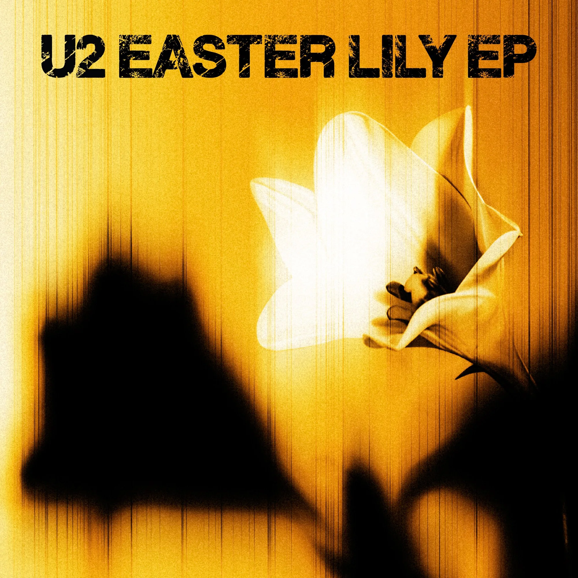
‘Easter Parade’
A beautific, anthemic outro singing a Greek phrase from the Bible that translates to, “Lord have mercy”. I bet no one had that on their Bingo card!
‘COEXIST (I Will Bless The Lord At All Times?)’
Who thought that in 2026 U2 would release a 6 minute, 48 second quiet, mostly-vocal song produced by Brian Eno that was “a lullaby for parents of children caught up in war”.
The question mark at the end of the song title.
Bono’s voice, equalised but otherwise raw and unprocessed; and with an occasional chorus effect applied.
“[The] girl of Guadalupe”?
The unexpected stinger/discordant chord at the end of the song/EP that has no musical or commercial reason to be there except that’s what the band/producer wanted (or wanted to leave in).
Thoughts about the whole EP
U2 when they’re being experimental, when they’re not trying to be commercial, when they’re singing about things that matter very deeply to them.
How this EP feels like a more mature version of U2 from their The Unforgettable Fire days.
Everyone has a chance to shine on this EP but, for my money, I think Larry Mullen Jr is the star of this album.
The EP title is a nod to Patti Smith’s 1878 album Easter, which I wouldn’t have otherwise sought out and listened to.